
Dripdrop Liquid Font Set: hand-inked drips for Y2K and rebellious branding
Design style
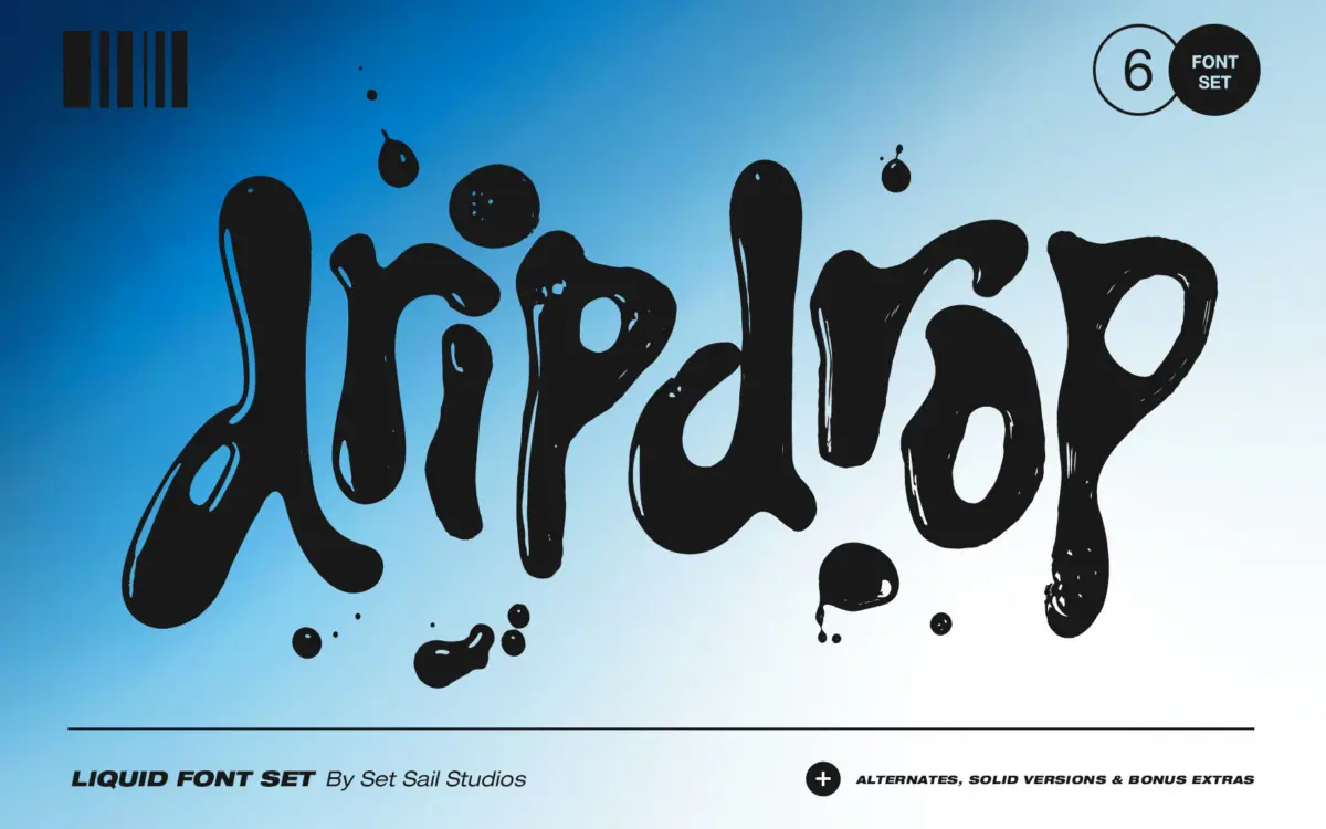
Dripdrop is built from actual ink squeezed onto paper, then digitised letter by letter, and it looks it. The strokes bulge and thin unevenly, drips run off the baseline, and the whole thing has the look of something made with a squeeze bottle rather than a pen. That’s the point. This isn’t a script trying to look elegant — it’s a display face chasing mess, gloss and unpredictability, closer to a texture experiment than conventional lettering.
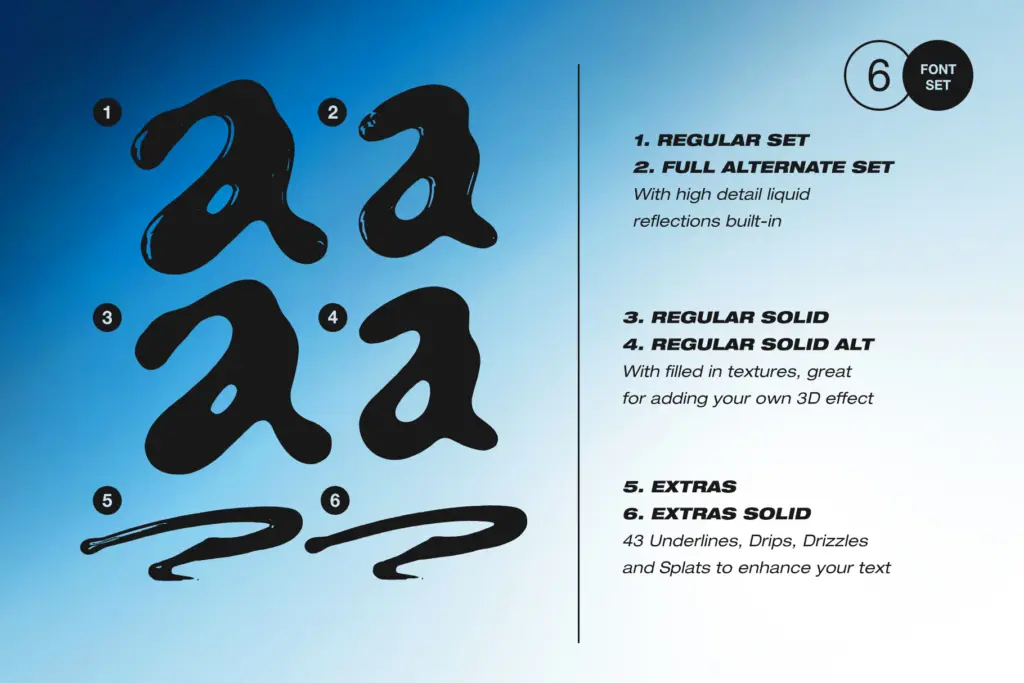
The six-file set gives you two distinct letterform styles (Dripdrop and Dripdrop Alt), plus a separate Extras font of drips, splats and underlines mapped to keyboard letters, each available in a glossy version with light reflections or a flat solid version. Switching between the two main alphabets mid-word breaks up repetition, which matters a lot with a face this idiosyncratic — repeated letters in the same word can otherwise look oddly identical for something meant to feel spontaneous.
Character set and features
Each core font covers uppercase, lowercase, numerals and punctuation, so you’re not stuck typing headlines only. The glossy versions carry rendered highlights that mimic wet ink catching light, which reads well at large sizes but adds visual noise as size drops. The solid companions strip that away for a flatter, punchier mark — useful when the glossy version gets too busy against a photograph or textured background.
The Extras font is the clever piece of the set: type any letter A through W (or a through t) and you get a drip, splash or underline rather than a character. It’s a workaround, not a proper OpenType feature set — no contextual alternates, no ligatures — so building compound effects means manually placing separate text layers rather than one font doing it automatically. That’s a real limitation if you want speed, but it does give more art-directed control than most novelty display fonts offer.
Use cases
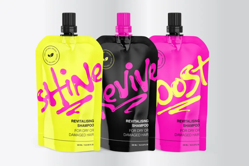
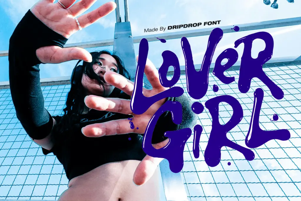
This is a font for moments, not paragraphs. It belongs on a single word, a short logotype, or a punchy line on a poster or product label — anywhere the brief calls for texture and attitude rather than legibility at length. Y2K-referencing graphics, streetwear branding, music and event posters, and packaging that wants a hand-touched, slightly chaotic mark are the obvious fits. The glossy variant suits anything aiming for a wet, almost slime-like finish; the solid variant works better where the design needs to stay legible at a distance or reproduce cleanly in a single colour.
It is not a body-copy font, and it won’t behave at small sizes — the drips and uneven strokes need room to read as intentional rather than smudged. Treat it as a display accent, pair it with a plain, quiet typeface for supporting text, and keep the alt fonts and extras in reserve for when a single-style set starts to feel repetitive.
What we liked, and what we didn’t
Strengths
- Real ink texture gives it a tactile, unpolished authenticity rare in novelty display fonts
- Two alphabet styles plus glossy and solid versions add real variation across six files
- The mapped Extras font gives more art-directed control than most drip-effect add-ons
Trade-offs
- Extras font requires manual layering rather than built-in contextual effects
- Legibility drops fast below display sizes, limiting it to short words and headlines
Dripdrop is a genuinely hand-made novelty display face that delivers real ink texture rather than a filter effect. It's built for short bursts of attitude, not for reading, and the Extras font needs manual layering rather than automatic behaviour, but as a mood-setting display tool it does its one job well.
Verdict

Tantype reviews typefaces in depth — every font is tested in real branding, editorial and screen layouts before a word gets written. 555+ fonts reviewed and counting.