
Racing Fonts: 11 Best Racing Fonts for Motorsport, Speed and Car Culture
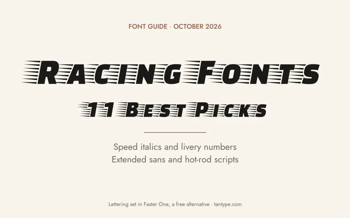
Racing fonts are typefaces that look fast: forward-leaning italics, wide extended capitals, heavy livery numbers and the brush scripts of hot-rod and drag-strip culture. Our top three picks are Fasthour, an 18-font speed family with oblique, outline and extruded styles; Akira Expanded, a caps-only extended sans for bold titles; and Racer, a condensed stencil face inspired by racing numbers.
All eleven fonts below are commercial Creative Market fonts, listed with the regular one-seat desktop price we saw on October 16, 2026, where the listing showed one. Three free Google Fonts options are further down.
Browse racing fonts on Creative Market Commercial fonts: check each listing for current pricing
What is a racing font?
“Racing font” is a shop label, not a type classification. It covers lettering borrowed from race cars, race posters and car culture, and most racing designs mix two or three of the styles below.
Speed italics
The most common racing look is a heavy sans pushed into a steep slant, often with sharp cuts or speed lines. Google Fonts’ notes on Faster One, a free pick below, describe the technique: it was “developed from a sans serif italics,” and its horizontal lines are meant to suggest “the image of the wind.”
Wide extended sans
Low, wide letters echo the shape of a race car, and the type behind this look is Italian. Alessandro Butti and Aldo Novarese drew Microgramma for the Nebiolo foundry in 1952, and Novarese followed it with Eurostile in 1962. Wikipedia’s Microgramma article says Chrysler, General Motors, Honda and Nissan used it for interior gauges, especially in the 1980s and 1990s, and that it was the face of several NASCAR numbers. Its Eurostile article notes use on some Peugeot and Citroën vehicles, and Fonts In Use documents Eurostile Bold Condensed in a 1970 Renault ad.
Livery numbers
Race numbers have to be read at speed. When Formula 1 enforced its numbering rules at the 2017 Spanish Grand Prix, ESPN reported that car numbers had to be “no less than 230mm high,” with “a minimum stroke thickness of 40mm,” in “a clearly contrasting colour to their background.” Liveries themselves began as national colours, which Wikipedia traces to the 1903 Gordon Bennett Cup; Formula 1 relaxed its sponsorship rules in 1968.
Vintage hot-rod and drag-racing scripts
Away from the circuits, American car culture has its own lettering: brush scripts, pinstriped panels and loud poster type. Wikipedia’s Kustom Kulture article names “wild pinstriped paintjobs” among the scene’s hallmarks and artists such as Von Dutch and Ed Roth among its shapers, with “Kustom Graphics” applied to “posters, flyers, T-shirts and logos.”
Formula 1’s own typeface, for context
F1 doesn’t use a retail racing font. Its identity by Wieden+Kennedy London was unveiled in November 2017, ahead of the 2018 season. Creative Review reports that its typefaces, F1 Regular, F1 Turbo and F1 Torque, were designed by the French designer Marc Rouault, and that the main face was meant to be “evocative of motorsport – there’s a kind of retro aspect to it.” None of the fonts below is F1’s typeface or any team’s or series’ official font.
The best racing fonts at a glance
- Fasthour: 18 fonts with oblique, outline and extruded styles.
- Akira Expanded: caps-only extended sans with an outline style.
- Racer: condensed stencil numbers and racing-stripe glyphs.
- Le Mans Classic: 1970s motorsport-poster type in two widths.
- Speed Demon: retro racing type in Regular and Slanted.
- Brute: heavy extended block face with an angular Speed style.
- Asphalt Racer: wide all-caps display with alternates and ligatures.
- Fast Track: a single all-caps speed font for posters and tees.
- Albergo: geometric script drawn from Italian motor-industry lettering.
- Hot Rush Font Duo: 1980s condensed sans and marker script.
- Scripter: bold vintage script with a geometric edge.
Best racing fonts on Creative Market
Prices are the regular one-seat desktop licence as listed on Creative Market on October 16, 2026. Prices change, so check the listing.
1. Fasthour
Burntilldead describes Fasthour as “a high-energy display font inspired by electric power, speed, and motion.” It’s an angular sans with sharp cuts, and the family is built for layering: Thin, Regular and Bold, with Oblique, Outline, Extrude and Extrude Oblique versions, 18 fonts in OTF, TTF and WOFF. The oblique styles give you the classic speed slant, and the extruded styles add a 3D block shadow without effects. Use it for event titles, race-day posters, gaming graphics and team merch. Desktop licence: $25.
See Fasthour on Creative Market · Read our Fasthour review
2. Akira Expanded
Typologic’s Akira Expanded, designed by Fadiel Muhammad, has the very wide, very heavy capitals of modern motorsport-style merch. It comes in Bold, Super Bold and Outline, in OTF, TTF and WOFF. It’s caps only, since the lowercase keys type capitals, and stylistic alternates are reached through an OpenType-capable app such as Illustrator or Affinity. The Outline style works layered over a solid style. Desktop licence: $20.
See Akira Expanded on Creative Market · Read our Akira Expanded review
3. Racer
Foundry73’s Racer is the pick for numbers. The listing calls it a “condensed sporty stencil” typeface, “inspired by racing numbers and Formula 1 race tracks.” Its spec list gives four weights (100 to 400), upper and lowercase, three alternate lowercase letters (k, w, x), multilingual support and racing-stripe glyphs, so you can set a number and its stripes in one font. Its stencil numerals suit door panels, helmets and kart bodies. It’s the priciest font here. Desktop licence: $60.
4. Le Mans Classic
Kazer Studio’s Le Mans Classic is “inspired by vintage motorsport racing,” in particular advertising posters from the 1970s. Creative Market’s roundup calls it simple yet eye-catching. It comes in two styles, Regular and Compressed, for a wide race name and a narrow date line. It has upper and lowercase, numerals, kerning on all character pairs and what the listing calls extensive language support. Use it for classic-car shows, heritage events and retro garage branding. Desktop licence: $15.
See Le Mans Classic on Creative Market
5. Speed Demon
Rillatype Studio describes Speed Demon as “a bold retro racing typeface inspired by vintage motorsport posters, street legends, and 80s–90s car culture.” It’s a heavy face with sharp edges, sold in two styles: Regular for “solid statements” and Slanted for “instant motion and drama,” in OTF and TTF. It suits street-racing and car-meet flyers, stickers, apparel and packaging with a 1980s or 1990s angle. The listing doesn’t state language support. Desktop licence: $19.
See Speed Demon on Creative Market
6. Brute
Deadbolt Design Lab calls Brute its best-selling font: “a functional heavy extended option for big and bold headlines.” It has two styles. Regular is a heavy block display face, and Speed is a sharper, more angular version that the designers say stays readable at small sizes. The specimen shows upper and lowercase. Use Regular for a team or event name and Speed for numbers, sponsor panels and promo graphics. Desktop licence: $20.
7. Asphalt Racer
Rafael Rybar’s Asphalt Racer is a “bold, dynamic, wide format, masculine sports display font.” It’s all caps, with stylistic alternates and ligatures that need ligature and contextual-alternate settings switched on in your app. The OTF has PostScript outlines that suit print and cutting plotters, which matters for vinyl decals, and web fonts are available from the designer on request. The listing pitches it at narrow surfaces such as bikes and sports equipment. See the listing for current pricing.
See Asphalt Racer on Creative Market
8. Fast Track
Adrian Pelletier’s Fast Track, sold by Build Interactive, is “an all-caps font with a distinct appearance of speed.” It’s a single font in OTF, so it’s the simplest pick here, and the designer’s suggested uses say a lot about its tone: “vintage racing posters, automotive t-shirts, motorcycle events, garage signs, kid’s cards.” Pair it with a plain sans for dates and details. Desktop licence: $15.
See Fast Track on Creative Market
9. Albergo
Albergo, from Sam OBrien’s shop, is “a geometric script inspired by Italian lettering from the motor industry.” Instead of brush texture, it’s built from clean curves and straight strokes, closer to badge and dealership lettering than to a sign painter’s script. The preview shows upper and lowercase. It’s a December 2025 release with little technical detail on the listing, so check the character set first. Use it for classic-car clubs, Italian-flavoured branding, garage logos and event menus. Desktop licence: $26.
See Albergo on Creative Market · Read our Albergo review
10. Hot Rush Font Duo
Sam Parrett’s Hot Rush pairs a clean condensed sans with a marker-pen script drawn with “long, fast, textured strokes.” It’s very 1980s, close to the motorsport decals and video packaging of the era. You get Hot Rush Script, Hot Rush Sans, a Striped Sans with vertical stripes through each letter, and italics of both sans styles. Everything is uppercase; in the script, the lowercase keys give a second set of capitals, and ten letters have end forms, plus four bracket swashes. The listing names 17 languages. Desktop licence: $22.
See Hot Rush Font Duo on Creative Market · Read our Hot Rush Font Duo review
11. Scripter
Sanborne’s Scripter is a “vintage meet modern script typeface with geometric touch,” suggested for “logo, automotive, games, posters.” It’s a bold, connected script, the closest pick here to the lettering on old speed-shop jackets and drag-strip posters, but with cleaner edges than a textured brush font, which helps for vinyl and embroidery. It’s one style in OTF and TTF. Pair it with Brute or Akira Expanded for a script-over-block logo. Desktop licence: $12.
See Scripter on Creative Market
How to choose a racing font
- Pick the era first. Extended sans like Akira Expanded read as modern motorsport and streetwear. Le Mans Classic and Albergo read as 1970s and earlier. Hot Rush and Speed Demon read as 1980s and 1990s, and Scripter suits hot-rod and drag-strip looks.
- Test numbers at size. Print a two-digit number as large as it will appear and step back several metres. Check that the 6, 8 and 9 stay open, especially in stencil or outlined styles.
- Use real obliques over fake slants. Fasthour, Speed Demon and Brute include slanted or speed styles. Skewing an upright font in software works for a quick mock-up, but it distorts curves.
- Plan for vinyl and wraps. Thin outlines and tight script joins lift or tear when cut. Solid weights and simple, untextured scripts cut more cleanly; save texture for print.
- Mind wide fonts in tight spaces. Extended faces eat width. A long team name on a narrow panel may need Le Mans Classic’s Compressed style or a condensed face like Racer.
- Don’t copy series or team marks. Use these fonts to build your own look. Series names, team logos and livery designs are usually protected as trademarks, and a lookalike font doesn’t change that.
For jerseys, varsity letters and other sports, see our sports fonts roundup. For the genuine Italian originals of the extended look, read our guides to Eurostile and Microgramma, both sold by URW and Linotype.
Free racing fonts
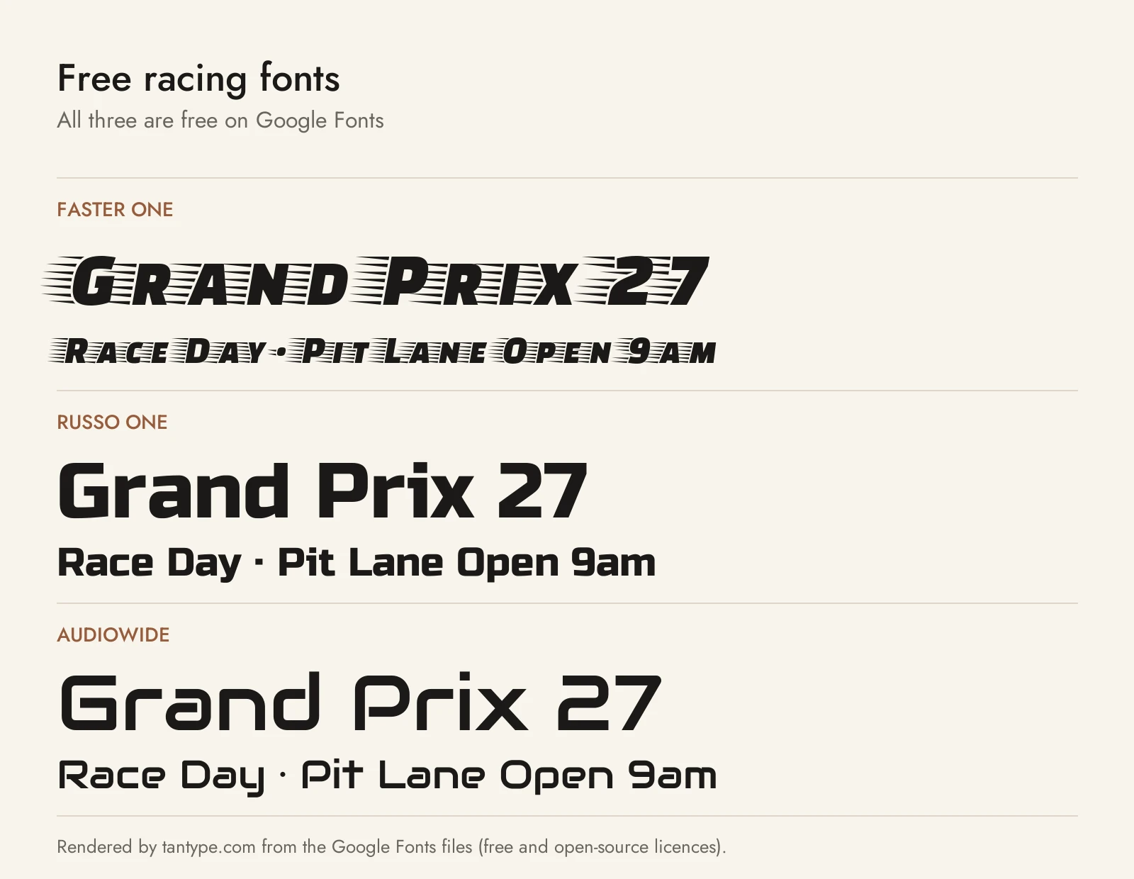
All three are on Google Fonts under the SIL Open Font License, which allows commercial use, including logos and merch.
- Faster One (Eduardo Tunni): a heavy italic with horizontal speed lines trailing every letter. It’s the most literal racing font here and the free match for Fasthour or Fast Track, but it’s a single style, and the lines make it unsuitable for small text.
- Russo One (Jovanny Lemonad): a heavy, squared upright sans for headlines and logotypes, with Cyrillic support. It’s a free stand-in for Brute’s Regular on numbers and team names, though it has no slanted or speed style.
- Audiowide (Brian J. Bonislawsky for Astigmatic): a wide, soft-cornered “technology styled” sans with nods to Handel Gothic. It gives you the extended look of Akira Expanded or Eurostile in a lighter, cleaner single weight, with lowercase.
Licensing: personal vs commercial use
Creative Market sells fonts under four licences: Desktop, Webfont, E-pub and App. Its font licence page says a Desktop licence lets the font appear in “unlimited commercial and personal projects,” including physical end products, packaging, social media and paid ads, as long as the font is rasterized and the files aren’t embedded. You buy one seat per user. Websites need a Webfont licence, and apps and games an App licence. Vehicle wraps and decals aren’t named, so check the full terms if that’s your main use.
Two rules matter for race teams and merch sellers. Print-on-demand is only allowed when you, the licensee, make the finished product, so a custom-number tool for customers isn’t covered. For logos, the font must be modified and not the dominant element, you must disclaim it if you register a trademark, and you can’t claim rights in the font itself. This is a summary, not legal advice.
Racing font FAQ
What is the best racing font?
For a full speed family, Fasthour. For a wide modern look, Akira Expanded or Brute. For car numbers, Racer. For vintage posters, Le Mans Classic or Speed Demon. For hot-rod scripts, Scripter or Albergo.
What font does Formula 1 use?
F1 uses its own custom typefaces, F1 Regular, F1 Turbo and F1 Torque, designed by Marc Rouault for the Wieden+Kennedy London identity unveiled in 2017. For a similar modern motorsport feel, try Akira Expanded or Fasthour.
What makes a font look like a racing font?
Mostly three things: a forward slant, wide or stretched letters, and heavy strokes. Speed lines, stencil breaks, outlines and racing stripes add to it.
Which font is used for race car numbers?
It varies by team and series, and many numbers are custom. Wikipedia notes that Microgramma has been used for several NASCAR numbers. For your own car, Racer, Brute and Russo One have numerals heavy enough to read at a distance.
Are there free racing fonts for commercial use?
Yes: Faster One, Russo One and Audiowide on Google Fonts are free under the Open Font License, including commercial use. A font labelled “free for personal use” elsewhere usually doesn’t cover merch or team graphics.
