
Perfectly Nineties Nostalgic Serif Font Free Download
Is Perfectly Nineties Nostalgic Serif free to download?
Perfectly Nineties Nostalgic Serif is a commercial font sold on Creative Market, so the full version needs a paid license. Get it from the official listing: Perfectly Nineties Nostalgic Serif font download.
Need something free? These serif fonts from Google Fonts are free for personal and commercial use:
Design style
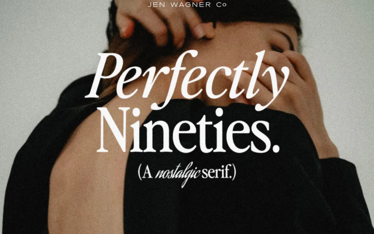
Perfectly Nineties draws on the particular flavour of serif that showed up in magazine mastheads and catalogue copy through the late 80s and into the 90s: moderate contrast, a slightly condensed skeleton, and a close, confident fit between letters. It isn’t a revival of any one historical face so much as a mood board distilled into a type family — that specific decade of print design where serifs still carried text but had started picking up a bit of fashion-magazine attitude.
The spacing is the thing you notice first. It’s set closer than most contemporary text serifs, which gives short settings — a pull quote, a product name, a headline — a dense, inky rhythm rather than an airy one. The designer has been upfront that this tightness was a deliberate choice for body text legibility, and it reads as intentional rather than an oversight: the letterforms are drawn to sit close without colliding, so the tightness doesn’t turn into crowding.
The italic is where the personality lives. It leans harder into the nostalgic reference than the roman does, with a bit more flourish in the terminals, and it’s clearly meant to be mixed into the same line of text rather than reserved for emphasis alone — a nod to that 90s habit of running regular and italic words together within a single headline.
Character set and features
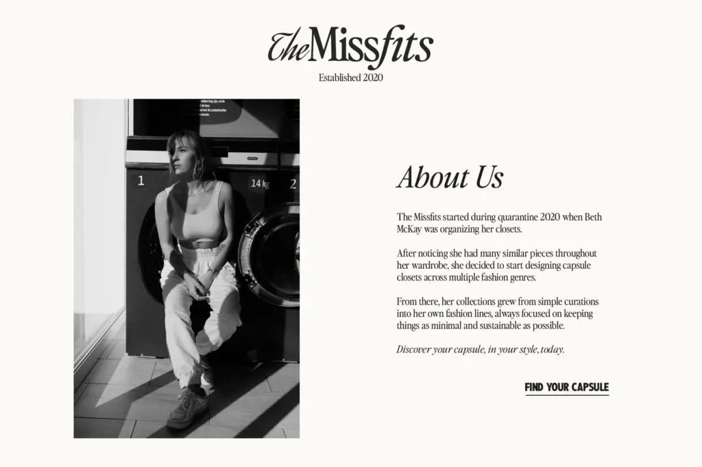
Both upper and lowercase are covered, with the italic as a full companion rather than a slanted afterthought. The letterforms hold their shape at small sizes, which matters given the tight spacing — open counters and square-ish bowls keep things from clogging up even when letters are sitting close. At display sizes the same tightness reads as a style choice, giving headlines a compact, confident block rather than a loose scatter of characters.
Because the default spacing was built with body text in mind, using it at large sizes benefits from manual tracking adjustments — pulling it in further for display work sharpens the effect rather than fighting against it. It’s a typeface that rewards a bit of hands-on kerning rather than one you drop in and walk away from.
Use cases
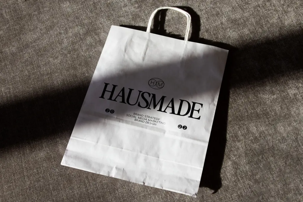
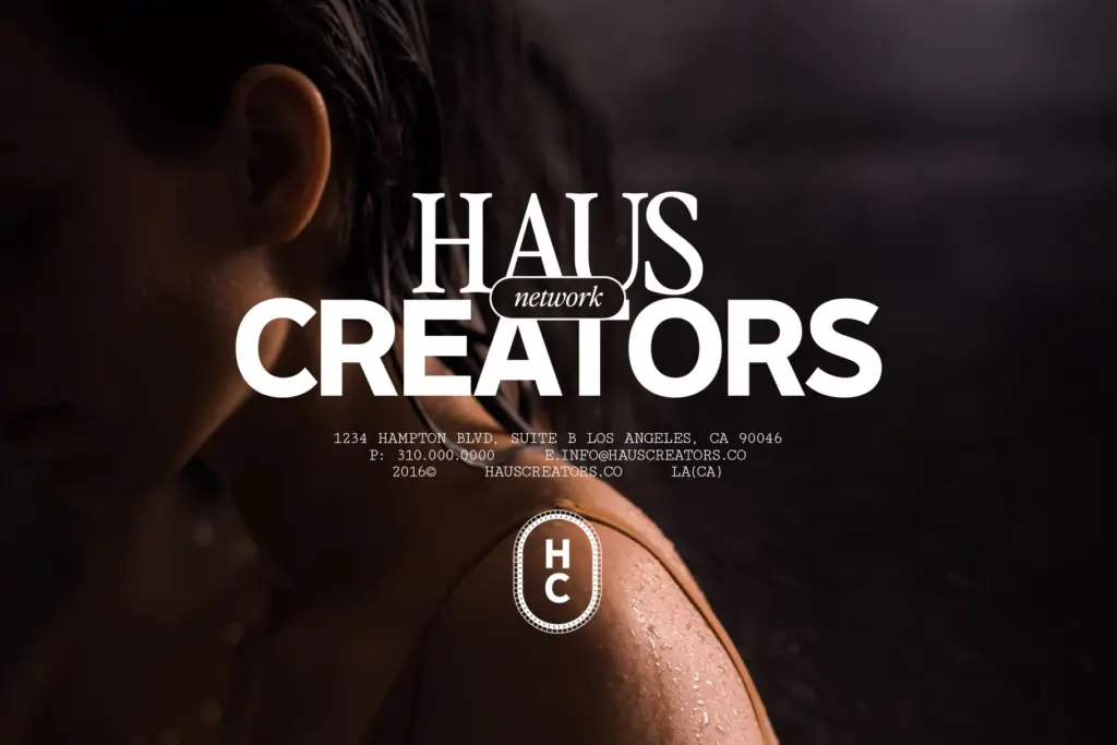
This is a serif for designers chasing a specific, era-specific nostalgia rather than a generic timeless serif. It suits fashion and lifestyle branding that wants a 90s catalogue reference, blog headers and editorial pull quotes, and quote graphics where the tight spacing reads as stylish rather than cramped. The roman-and-italic mixing trick works well for logotypes and wordmarks that want a bit of movement without going fully script.
It’s less suited to long-form body copy set at small sizes without adjustment, and less suited to brands wanting a neutral, era-less serif — this one has a date stamp on it, and that’s the point. For anyone working on packaging, social graphics, or branding built around a retro-feminine mood, it’s a reasonable, characterful choice; for anything needing broad historical neutrality, look elsewhere.
If you like retro editorial serifs, Windsor is the early-1900s classic with heavy rounded serifs that still turns up on posters and film titles.
We included Perfectly Nineties in our roundup of the best 90s fonts, alongside other picks in the same style.
What we liked, and what we didn’t
Strengths
- The italic has genuine character and mixes naturally with the roman within a single word or line
- Letterforms hold their shape at small sizes despite the tight default spacing
- Captures a specific, recognisable decade of serif design rather than a generic retro gesture
Trade-offs
- Tight spacing needs manual tracking adjustment for display sizes, adding extra setup work
- The strong era-specific flavour limits its use in brands wanting a neutral or timeless serif
Perfectly Nineties nails a specific nostalgic reference point and does it with a confident, well-drawn italic. It's not a neutral workhorse serif, and the default spacing needs adjusting for display use, but for retro-leaning branding and editorial quotes it does exactly what it sets out to do.

Tantype writes independent reviews of typefaces: what each font does well, where it falls short, what it suits, and where it is sold.