
Rage Machine: a spray-paint script for loud, street-styled headlines
Design style
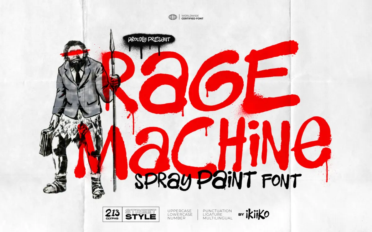
Rage Machine belongs to the spray-can-lettering tradition that graffiti-inspired fonts have been mining for years: uneven strokes, ragged edges, and letterforms that look like they were laid down fast, at arm’s length, with a nozzle rather than a nib. The texture is the whole point. Instead of clean vector outlines, the strokes carry a broken, slightly gritty edge that reads as overspray or a can running low on paint. There’s no attempt at restraint here — the letters lean, overlap and connect with a kind of forward momentum, which suits the brief of urban rebellion the name promises.
What separates a font like this from a good one is whether the roughness feels controlled or just noisy. Rage Machine mostly manages control: the basic skeleton of each letter is legible under the texture, so the effect reads as styling rather than damage. But because every letter carries the same aggressive slant and spray treatment, the design has one register. It shouts. There isn’t a quieter version of this alphabet, and it doesn’t want one.
Character set and features
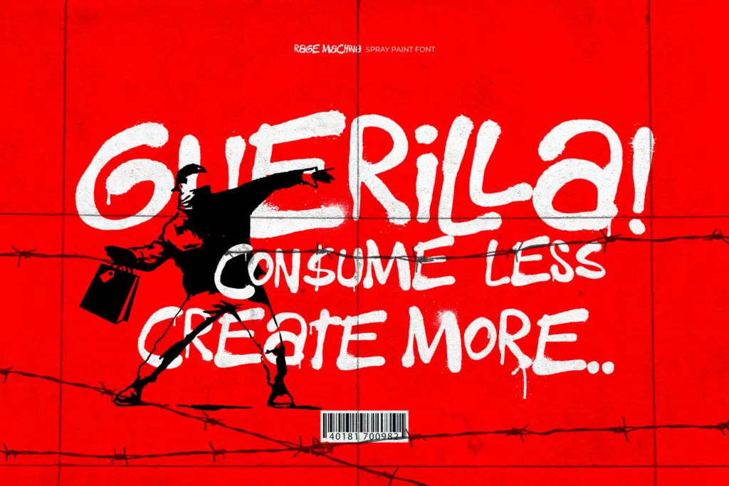
The set covers uppercase and lowercase, numerals, punctuation, and ligatures, which matters a lot for a font like this — hand-lettered, connected styles live or die on how well the joins between letters work, and ligatures are the mechanism that keeps a word looking like one continuous gesture rather than a row of separately-stamped stickers. Multilingual support is included as well, though how deep that support runs (accented characters, extended Latin sets) isn’t detailed, so anyone typesetting beyond basic English copy should proof the specific characters they need before committing a layout to it.
Because the style is built on irregularity, spacing needs a human eye rather than autopilot kerning. Words set straight out of the box can bunch or gap oddly, especially at the ligature points, so expect to nudge tracking and individual pairs when setting a headline rather than trusting the default metrics to carry a whole poster.
Use cases
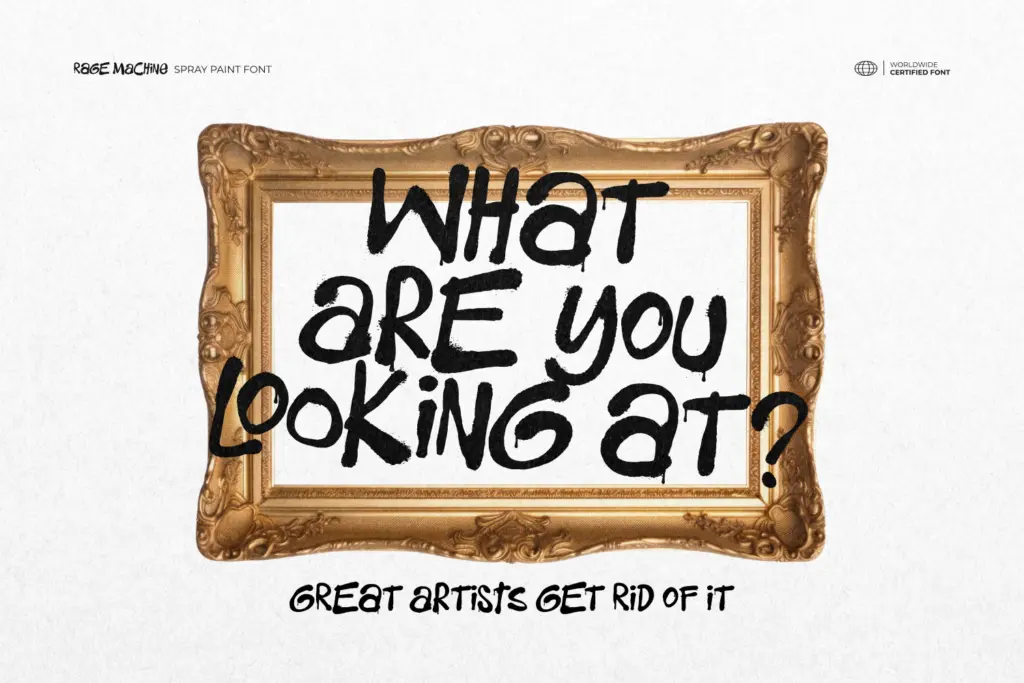
This is a single-word, single-line font more than a paragraph font — it’s built for the moment where a design needs one loud gesture: a poster headline, a mixtape or movie title card, a streetwear graphic, a logotype for a brand chasing an urban, DIY identity. Used at large sizes, where the spray texture and irregular strokes can actually be seen, it does its job convincingly. Shrink it down to body text or small captions and the texture collapses into mush — this is not a font for anything under display size.
It also has a strong point of view, which is a double-edged asset. It won’t sit quietly in a layout next to other type; it wants to be the loudest thing on the page, and pairing it with anything equally busy will fight for attention. Reach for it when the brief genuinely calls for graffiti energy — skate, street, youth culture, rebellion-themed packaging — and skip it when the project needs graffiti as a mood rather than a literal visual reference, since the style reads as very specifically “spray can” rather than generically “urban.”
What we liked, and what we didn’t
Strengths
- Convincing spray-can texture that reads as authentic graffiti at large sizes.
- Ligatures help connect letters into a single continuous gesture rather than isolated stamps.
- Strong, consistent point of view that suits streetwear and urban branding briefs directly.
Trade-offs
- Texture and legibility collapse quickly once the font is set smaller than display size.
- Default spacing and kerning need manual adjustment to avoid awkward bunching between letters.
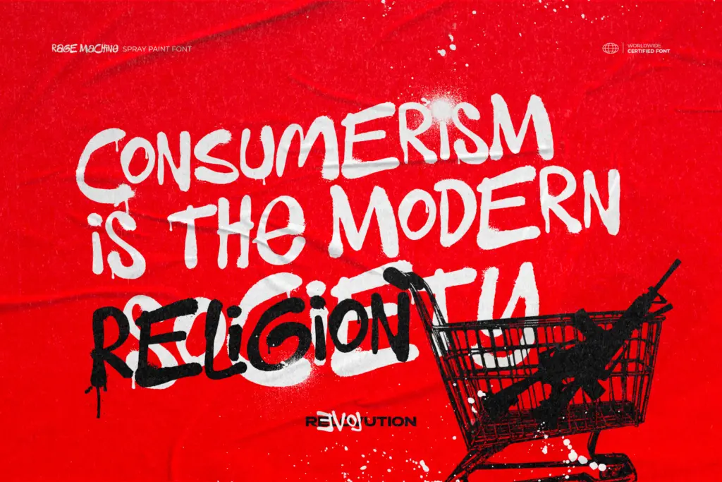
Rage Machine delivers a convincing, gritty spray-can texture that works well as a single loud headline or logotype. It's a one-note instrument, though — legibility drops fast below display sizes, and its aggressive style limits how often you'll reach for it outside street and youth-culture briefs.
Verdict

Tantype reviews typefaces in depth — every font is tested in real branding, editorial and screen layouts before a word gets written. 555+ fonts reviewed and counting.