Handwritten
3.9
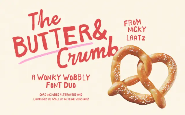
Butter And Crumb: a wobbly caps and chunky script duo for playful branding
Design style Butter And Crumb is built on deliberate imperfection. The duo pairs a wobbly, hand-drawn caps set with a…
 Tantype

Design style Butter And Crumb is built on deliberate imperfection. The duo pairs a wobbly, hand-drawn caps set with a…
Tantype
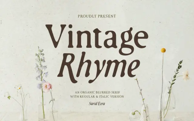
Design style Vintage Rhyme is a serif that trades crisp edges for a worn, printed-twice look. The strokes carry an…
Tantype
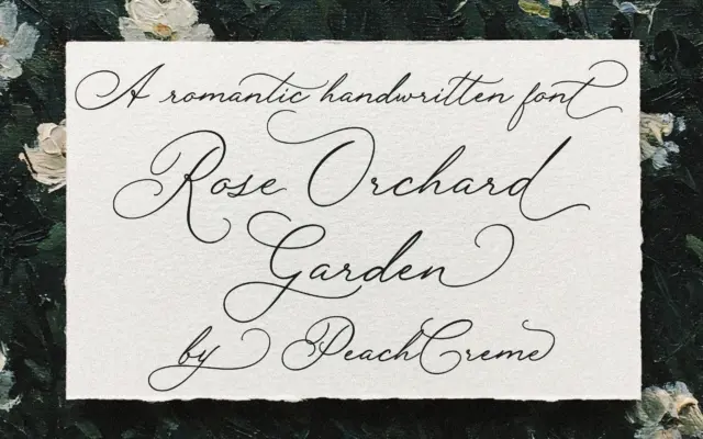
Design style Rose Orchard Garden sits in the well-populated field of handwritten wedding scripts, but it leans toward the looser,…
Tantype
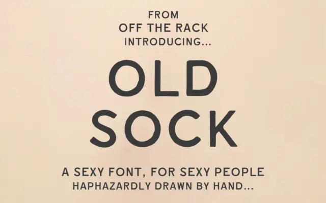
Design style Old Sock is a hand-drawn sans built around the wobble of old painted shopfronts and weathered signwriting. The…
Tantype
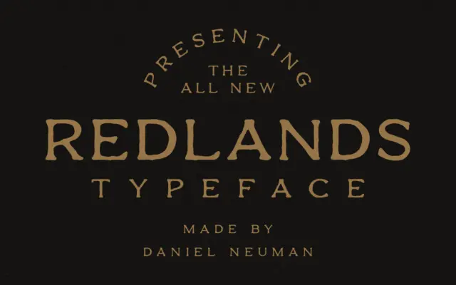
Design style Redlands is a display sans with a frontier-badge attitude, built as a duo: a Regular cut with smooth,…
Tantype
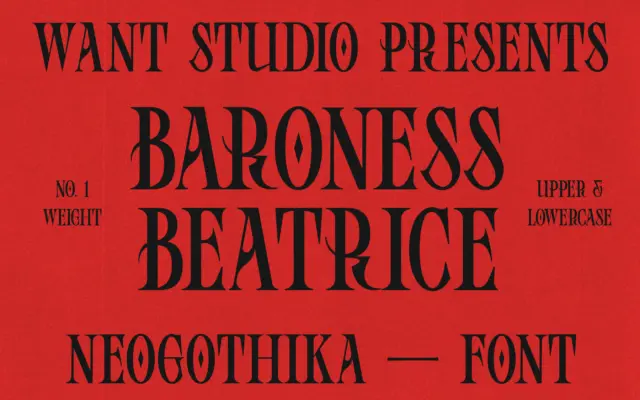
Design style Baroness Beatrice sits in that increasingly common space where blackletter structure gets filed down for modern taste. The…
Tantype
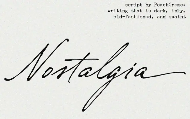
Design style Nostalgia belongs to the crowded family of connecting scripts built to imitate a fountain pen or dip nib…
Tantype
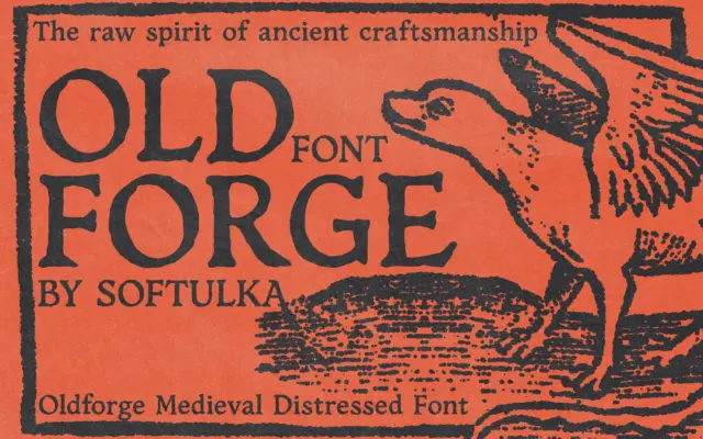
Design style Oldforge trades on roughness. The letterforms lean toward blackletter and medieval carving rather than any historical script proper…
Tantype
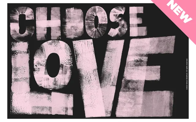
Design style Choose Love is a bold sans built from cardboard cutouts and an ink brayer, then scanned and turned…
Tantype