
Vintage Rhyme: a blurred, hand-worked serif for gritty vintage branding
Design style
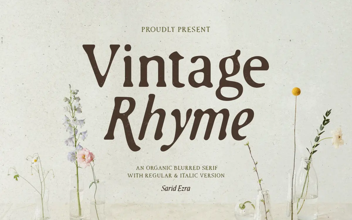
Vintage Rhyme is a serif that trades crisp edges for a worn, printed-twice look. The strokes carry an intentional blur, as though the letters were stamped with slightly too much ink and not enough pressure control. It reads as handmade rather than drawn on a grid, and that roughness is the whole premise of the design. There’s a regular and an italic, and the pairing feels like a single gesture rather than two separate exercises — the italic leans and loosens the serifs a bit further, but keeps the same textured skin.
The serifs themselves are soft and irregular rather than bracketed with any precision; some terminals look like they’re dissolving into the paper. This isn’t a font that wants mathematical consistency between letters — the charm is in the imperfection, and Sarid Ezra has clearly leaned into that rather than fighting it. It sits closer to a rubber-stamp or letterpress aesthetic than to a classic book serif, and it has more in common with hand-lettering references than with type-design conventions.
Character set and features
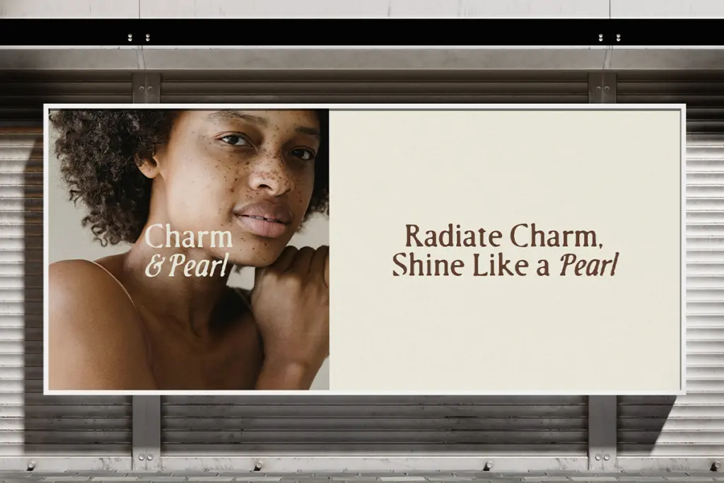
The regular and italic weights give you a modest but workable range for headline work — enough contrast between the two to differentiate a headline from a supporting line without switching typefaces entirely. The seller notes multi-language support, which extends its use beyond a narrow set of markets, though how deep that support goes (accented character coverage, extended Latin sets) isn’t something to take on faith without testing your specific language needs first.
What’s missing, structurally, is a true text weight or a cleaner companion style. This is a display face through and through — there’s no attempt to smooth the texture out for smaller sizes, so you’re working with one register: distressed, characterful, loud in a quiet way. That’s fine if you know that going in, but it means the family can’t do double duty as your body copy.
Use cases
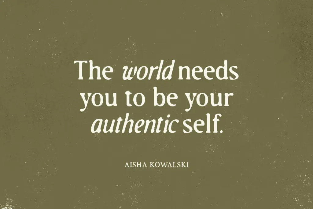
This is a font for labels, logotypes, and packaging that wants to look like it’s been through some weather — craft beer, small-batch goods, artisanal anything. It suits wedding stationery that’s aiming for rustic rather than polished, and it works well on textured paper stocks or in mockups with grain and print noise already added, since the blur reads as intentional rather than accidental in that context.
Where it struggles is in anything that needs cleanliness or precision: interface work, small-size legibility, or corporate branding that wants control rather than character. At small sizes the blur can tip into mush, so keep it to headlines, logotypes, and short lines of display text rather than paragraphs. Pair it with a plain, quiet sans or a restrained serif for supporting copy — something with clean edges to offset the roughness of Vintage Rhyme’s core letters, rather than compounding the texture with more texture.

What we liked, and what we didn’t
Strengths
- The blur effect feels deliberate and consistent across regular and italic, not like a filter applied afterward.
- Regular and italic pair naturally, giving some hierarchy options without switching typefaces.
- Strong fit for rustic, small-batch, and craft-style branding where texture is the point.
Trade-offs
- No clean text weight means it can't be used for anything beyond short headline-length copy.
- The blur can turn to mush at small sizes, limiting where it's legible.
Vintage Rhyme is a decorative serif built entirely around its worn, blurred texture, and it does that one job with conviction. It's suited to rustic branding and short display lines, but it isn't built to scale down or to carry body copy, so treat it as a headline specialist rather than a full working family.
Verdict

Tantype reviews typefaces in depth — every font is tested in real branding, editorial and screen layouts before a word gets written. 555+ fonts reviewed and counting.