
Choose Love: a cardboard-cut letterpress sans for gritty, handmade branding
Design style
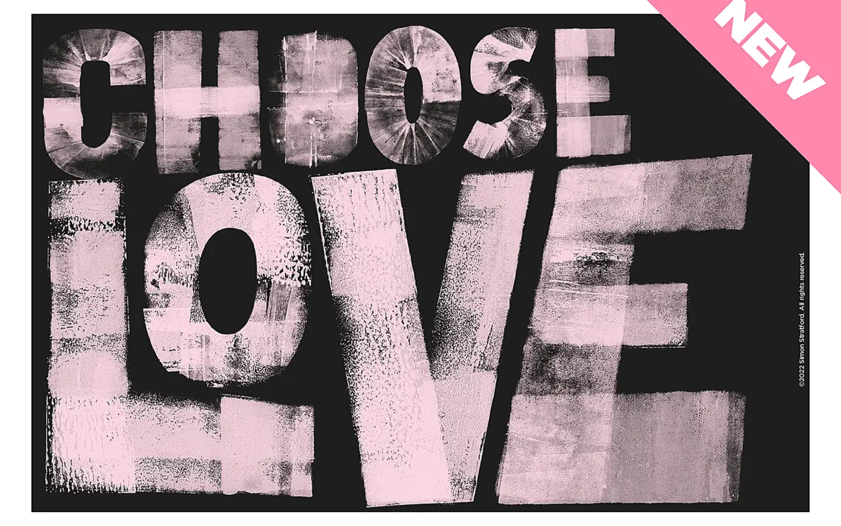
Choose Love is a bold sans built from cardboard cutouts and an ink brayer, then scanned and turned into a font. That process shows in every glyph. Strokes are uneven, edges are chewed up with ink bleed, and corners round off unpredictably where the brayer skidded. It reads as printed rather than drawn, which is the point. There’s no attempt to smooth the letterforms into something a vector program would produce naturally — the roughness is the design.
The letters sit on a heavy, condensed skeleton. Counters are tight, strokes are thick and fairly even in weight, and the whole thing has a stamped, industrial presence rather than a delicate hand-lettered one. It’s blunt where a lot of hand-printed fonts go for charm. If you want something that looks like it came off a t-shirt press or a protest placard rather than a greeting card, this is closer to that register.
Character set and features
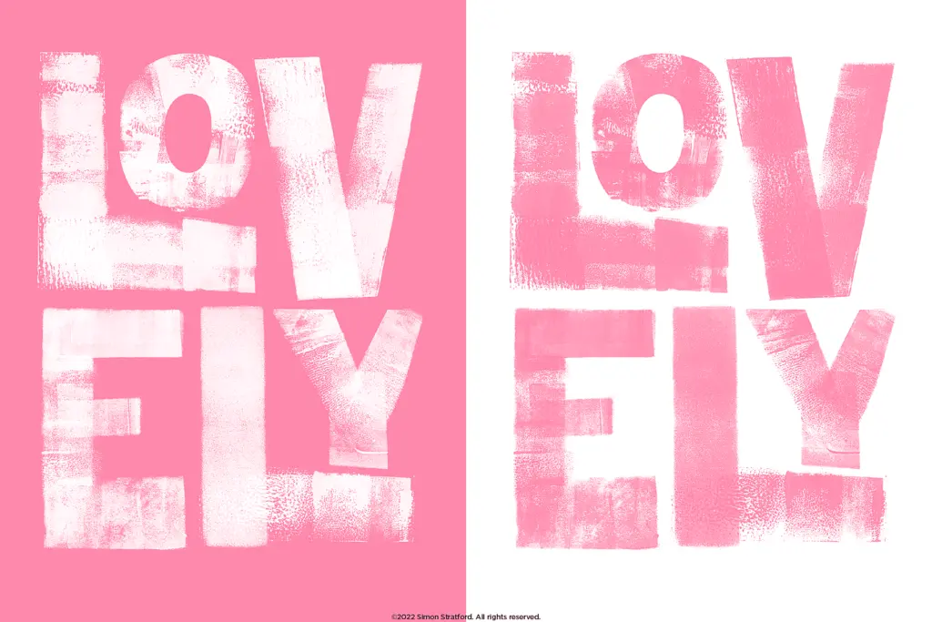
The font ships in three versions — a Standard OpenType set, an SVG colour/texture version, and an SVG version with ligatures — so you can pick between clean vector rendering and the full inked texture depending on the software and output you need. Each letter from A to Z comes with at least three alternates, which matters a lot here: because the ink-brayer texture is so visible, repeated letters in a word can look mechanically identical unless you swap in alternates, breaking the illusion that it’s a font at all. Used well, that variation is what sells the hand-printed effect.
Ligatures are supplied as a separate typeface rather than folded into the main file, which is a slightly clunky way to access them but workable once you know it’s there. There’s no mention of extended language support, so treat this as a Latin-alphabet display face and check coverage before using it for anything beyond English or similarly accented text.
Use cases
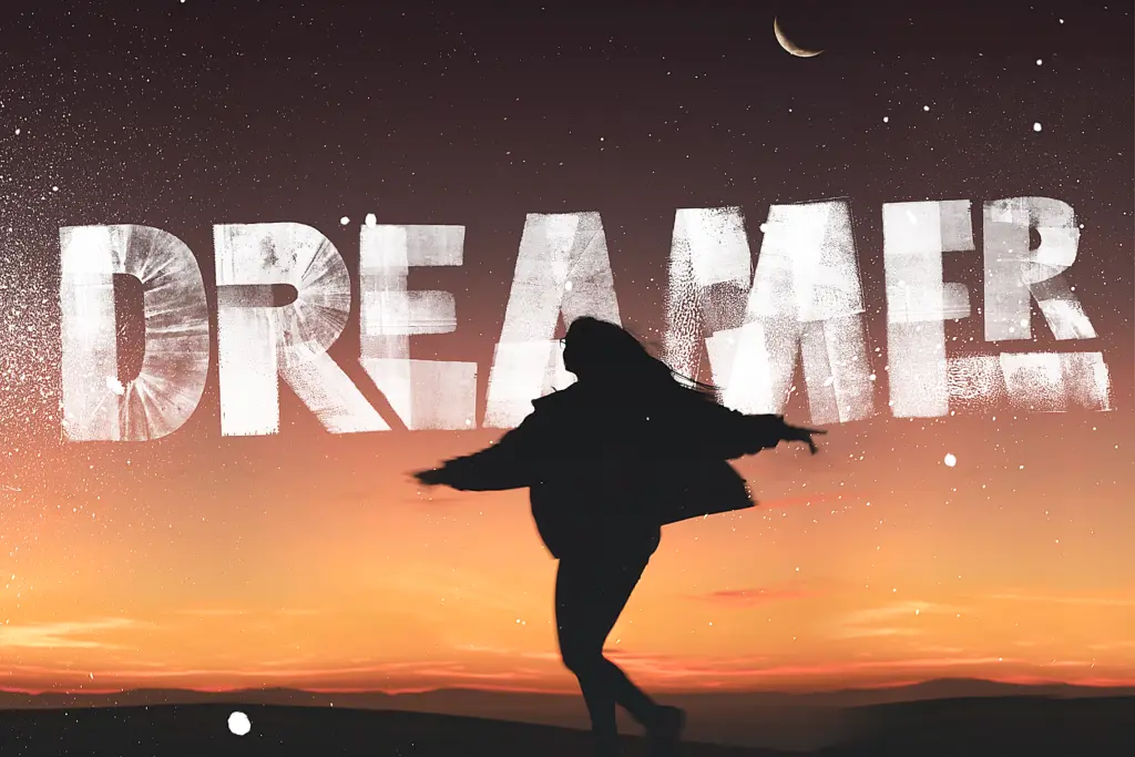
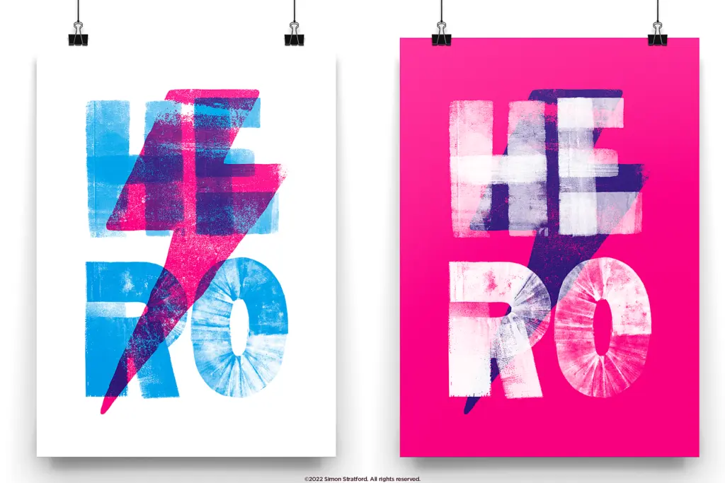
This is a font for headlines, not paragraphs — it’s not built for reading at length and shouldn’t be asked to. It earns its keep on posters, packaging that wants a handmade or artisanal feel, band merch, protest or activist graphics, and any branding project that’s deliberately avoiding a polished, corporate sans. The SVG versions with their ink texture work best big, where the print detail actually registers instead of turning to noise.
At small sizes or in tight paragraph settings the roughness stops reading as texture and starts reading as illegibility, so keep it to short lines — a word, a phrase, a logotype. Designers doing wedding stationery or anything genuinely elegant should look elsewhere; this typeface is loud and scruffy by design and doesn’t try to be refined. For the right brief — something that wants grit, DIY energy, and a printed-not-typed feel — the alternates and two output formats give it more range than most single-mood display fonts.
What we liked, and what we didn’t
Strengths
- Genuine printed texture from actual cardboard-and-ink production, not a filter effect
- At least three alternates per letter help avoid the repetitive look common in textured display fonts
- Three output versions (Standard, SVG, SVG Ligatures) give some flexibility between clean and fully textured use
Trade-offs
- Legibility drops fast below headline sizes, unsuitable for body text or long lines
- Ligatures live in a separate file rather than the main font, adding a setup step
Choose Love is a rough, ink-heavy display sans that commits fully to its handmade cardboard-and-brayer origin. The alternate letters do real work keeping the texture believable, but it's strictly a big, short-word typeface — push it into paragraphs or small sizes and it falls apart.
Verdict

Tantype reviews typefaces in depth — every font is tested in real branding, editorial and screen layouts before a word gets written. 555+ fonts reviewed and counting.