
Baroness Beatrice: a blackletter with a softened, contemporary edge
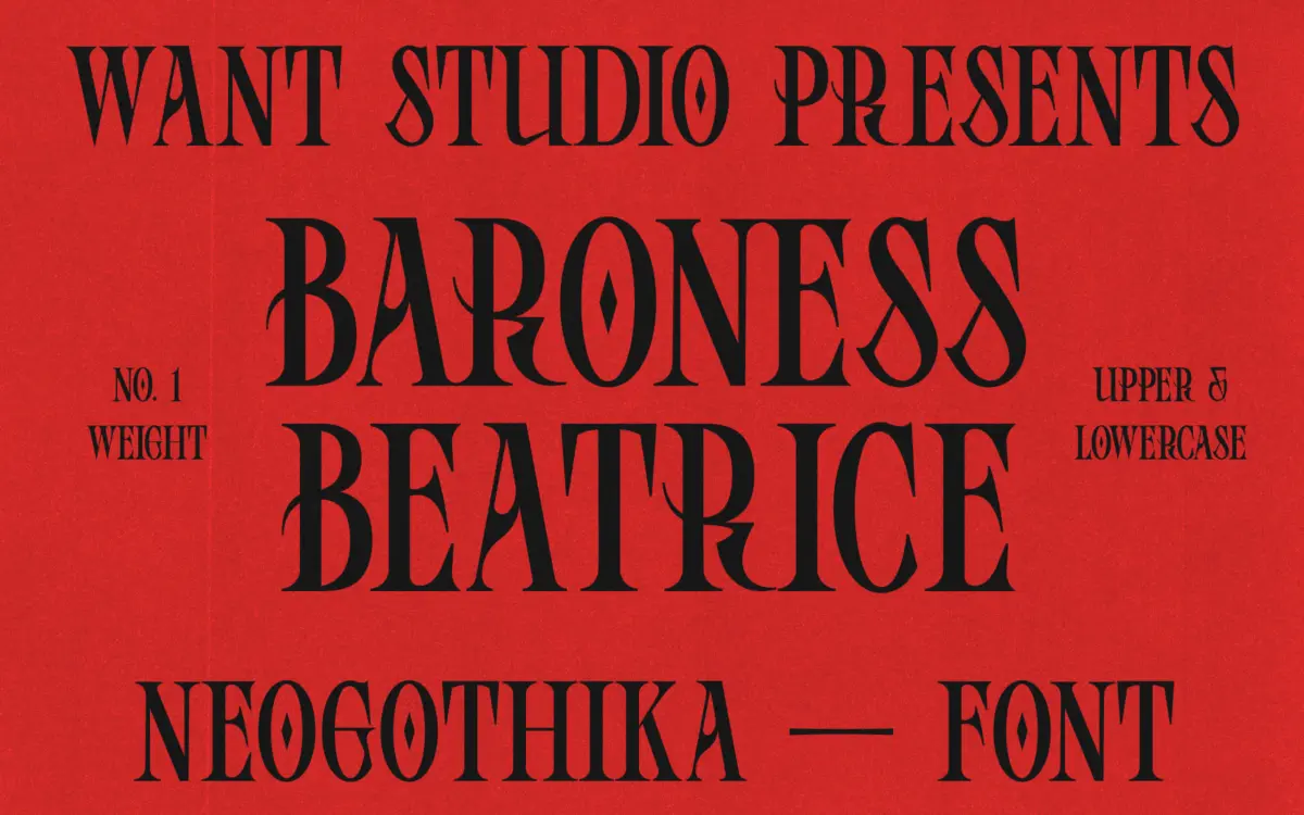
Design style
Baroness Beatrice sits in that increasingly common space where blackletter structure gets filed down for modern taste. The bones are still there — angular stems, broken curves, the dense vertical rhythm that reads as gothic at a glance — but the strokes have been softened and the counters opened up so it doesn’t read as heavy or historical as a true textura or fraktur. It’s less about medieval manuscripts and more about the blackletter revival you see in streetwear logos and fashion branding, where the style is a flavour rather than a full commitment.
The letterforms have a slight hand-finished irregularity to them, which gives the face some warmth rather than the rigid symmetry of a strict revival gothic. That’s a deliberate trade: it makes the font feel less austere, but it also means it won’t satisfy anyone looking for a historically accurate blackletter. This is a decorative interpretation, not a scholarly one.
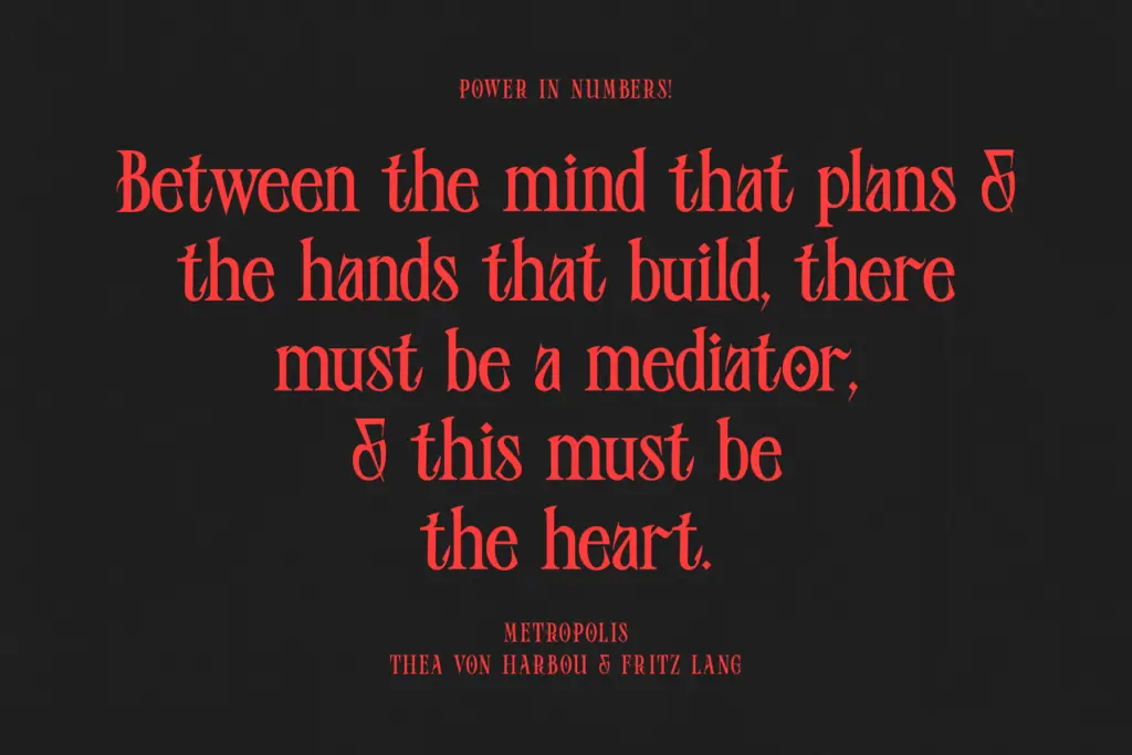
Character set and features
As a display face built for short bursts of text, Baroness Beatrice’s strength is in individual letter drawing rather than in text-setting features. The uppercase forms carry the most personality — flourished terminals, exaggerated diagonals on letters like K and R — while the lowercase settles into a steadier, more legible rhythm so it doesn’t collapse into ornament when set as a whole word. That balance matters for a blackletter face, since many in this category sacrifice lowercase legibility entirely in favour of drama.
Spacing is generous enough that words don’t clot together the way dense blackletter often does, which helps at the sizes this font is actually likely to be used. There’s no indication of extensive alternate characters or a script companion, so treat this as a single, self-contained display face rather than a flexible system with swappable parts. If you need multilingual support or extended punctuation, check the character map before committing rather than assuming broad coverage.
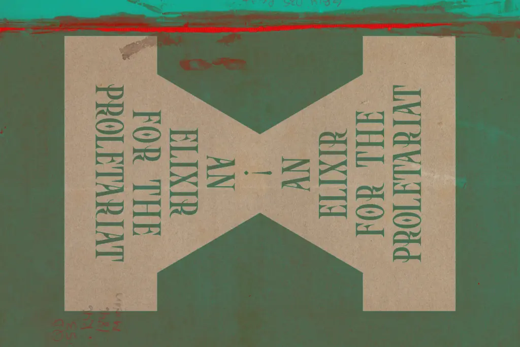
Use cases
This is a logo and headline font first. It earns its keep on branding work that wants a gothic reference without going full metal-band aesthetic — think craft beverage labels, apparel graphics, tattoo-adjacent branding, or any packaging design that wants a touch of old-world weight with a contemporary reading. It also has a place in editorial design for pull quotes or section openers where you want a strong visual anchor on the page.
Keep it out of body copy. Blackletter of any stripe fights against sustained reading, and this one, despite its softened forms, is no exception — it wants to be large, short, and looked at rather than read through. At smaller sizes the broken strokes and tight joins start to blur, so reserve it for headline sizes and give it room to breathe. Pair it with a plain, quiet sans or serif for supporting text; asking it to do double duty as both display and body font will undercut the very drama that makes it worth using.
What we liked, and what we didn’t
Strengths
- Uppercase forms have real character without tipping into illegibility
- Lowercase stays readable as whole words, unlike many dense blackletter faces
- Softened strokes make it usable in contexts too modern for a strict gothic revival
Trade-offs
- Not suited to anything beyond short headline or logo-length text
- Broken joins blur at smaller sizes, limiting it to display use only
Baroness Beatrice takes the blackletter template and files down its edges into something more wearable for contemporary branding. It's a solid, if narrow, tool for logos and headlines rather than a flexible text system, and it needs generous sizing to hold together.
Verdict

Tantype reviews typefaces in depth — every font is tested in real branding, editorial and screen layouts before a word gets written. 555+ fonts reviewed and counting.