
Rose Orchard Garden: a romantic script for wedding stationery and invitation headers
Design style
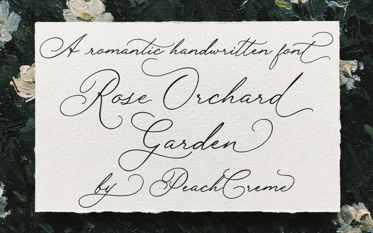
Rose Orchard Garden sits in the well-populated field of handwritten wedding scripts, but it leans toward the looser, more personal end of that spectrum rather than the tightly engineered calligraphic scripts that dominate the category. The strokes have long entry and exit curves, and the letters carry small irregularities of the kind you’d expect from an actual pen rather than a vector tool smoothing everything into consistency. That’s the intended effect, and it mostly lands: the font reads as handwritten rather than digitally perfected, with a slightly loose, unhurried rhythm running through the baseline.
The contrast between strokes is gentle rather than dramatic, which keeps the letterforms from feeling fragile. It’s a font built around charm rather than drama — there’s no attempt at high-contrast flourish or theatrical swash work dominating the design. Instead it aims for something closer to a well-practiced hand: warm, a little imperfect, legible at conversational sizes.
Character set and features
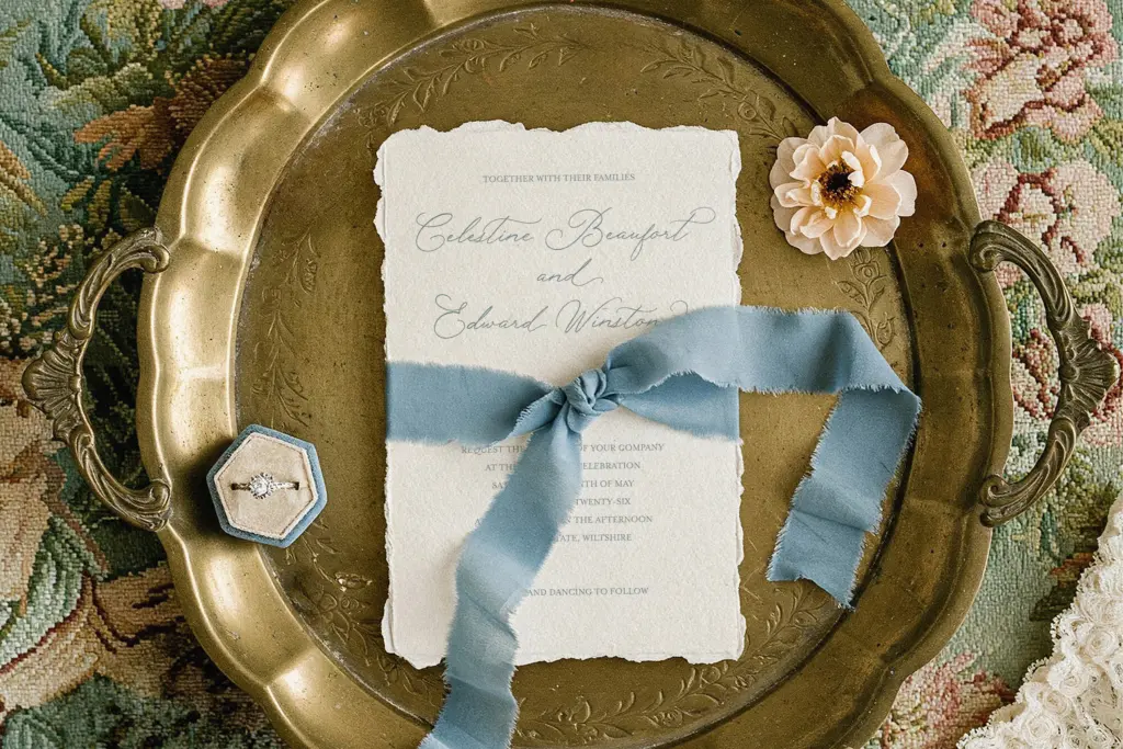
The font includes alternate letterforms for at least some uppercase and lowercase characters, which is useful in a script face where repeated letters in the same word or line can otherwise look mechanically identical. Swapping in alternates breaks up that repetition and helps the line feel more like continuous handwriting rather than a font doing an impression of handwriting.
There’s also a bolder weight included alongside the primary style. The difference between the two is subtle rather than a full weight jump, but it’s a sensible inclusion: script fonts often lose definition at small sizes, and having a slightly heavier option gives you a way to hold legibility on a printed menu card or a small caption line without switching to a different typeface entirely.
Buyers should check the specimen images closely before committing to a layout, since the exact scope of the alternate set and any ligatures isn’t something you can infer from the name alone. Scripts like this live or die on those extra glyphs, and the seller’s own materials are the only reliable guide to what’s actually included.
Use cases
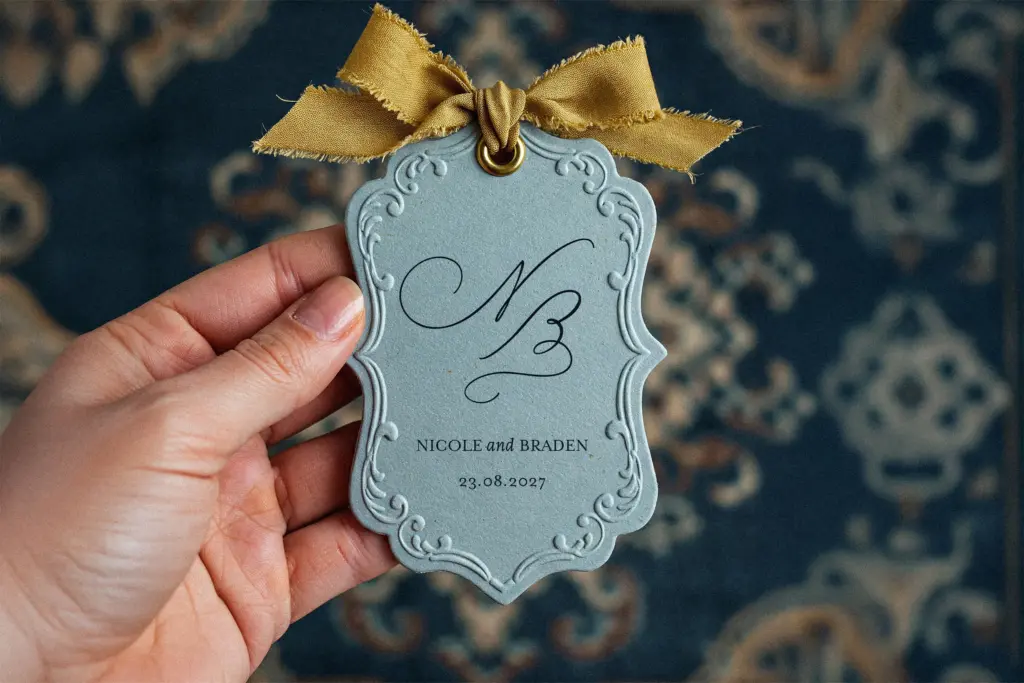
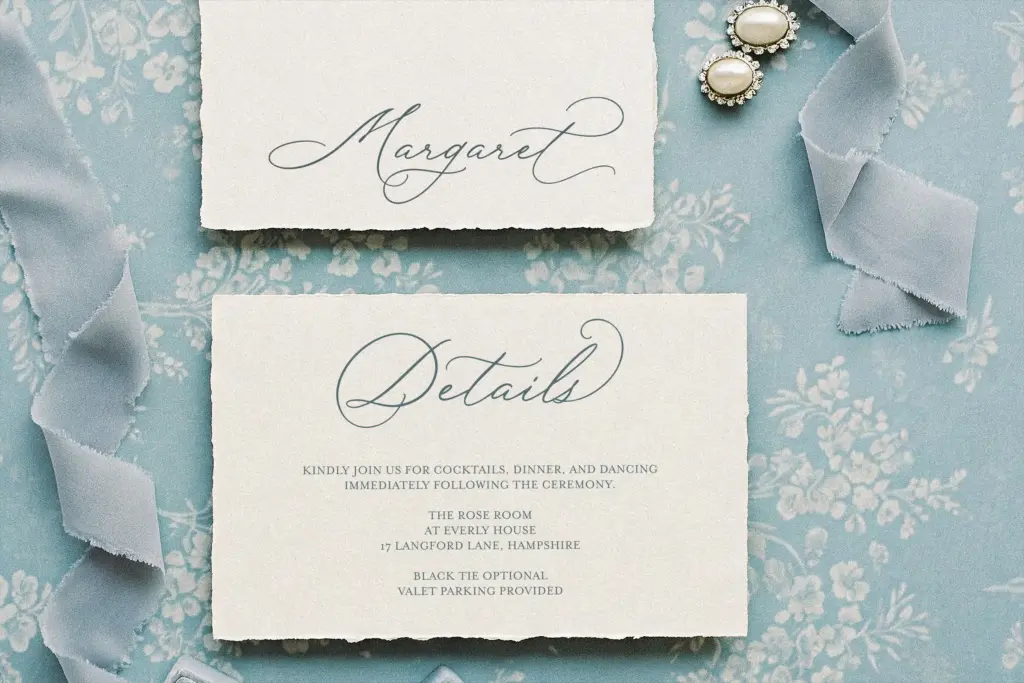
This is a font for the jobs the marketplace tags suggest: wedding invitations, save-the-dates, place cards, and short romantic headlines on greeting cards or personal stationery. It’s built for moments of a few words at a generous size — a couple’s names, a date, a short quote — not for setting paragraphs. Push it into body copy and the flowing joins that look charming in a heading start working against reading speed.
It also has a period-adjacent quality that some buyers are clearly hunting for: a slightly ornate, old-world feel that suits invitations or packaging going for a heritage or antique-romance mood rather than a stark modern one. Designers doing branding for florists, boutique stationers, or small luxury goods brands with a similar softness in their positioning could reasonably reach for this rather than a stricter calligraphy face. It won’t suit a brand wanting crisp, contemporary minimalism, and it isn’t a workhorse text face — but within its intended lane, headline and accent work for romantic, ornamental contexts, it does the job it was drawn for.
What we liked, and what we didn’t
Strengths
- Alternate uppercase and lowercase letterforms reduce repetition in short lines of text
- Included bolder weight adds a practical option for small-size legibility
- Loose, slightly irregular stroke work gives it a genuinely handwritten feel rather than a mechanical one
Trade-offs
- Long joining strokes make it unsuitable for anything beyond short headline-length text
- The romantic wedding-script category is heavily saturated, so it doesn't distinguish itself dramatically from comparable options
Rose Orchard Garden is a competent, warm-feeling wedding script with enough alternate glyphs to avoid the repetitive look that plagues cheaper script fonts. It's built for short romantic headlines rather than reading text, and the market for this exact style is crowded, but it does its narrow job well.
Verdict

Tantype reviews typefaces in depth — every font is tested in real branding, editorial and screen layouts before a word gets written. 555+ fonts reviewed and counting.