Serif
3.9
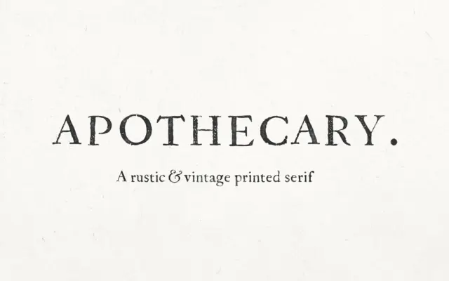
Apothecary Serif: a distressed period serif for old-book branding
Design style Apothecary Serif takes its cues from eighteenth-century print press texts, and it wears that reference plainly. The letterforms…
 Tantype

Design style Apothecary Serif takes its cues from eighteenth-century print press texts, and it wears that reference plainly. The letterforms…
Tantype
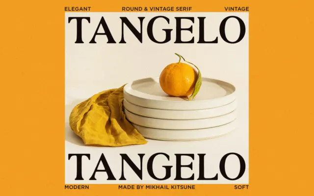
Design style Tangelo sits in that familiar territory of rounded, softened serifs that designers reach for when they want something…
Tantype
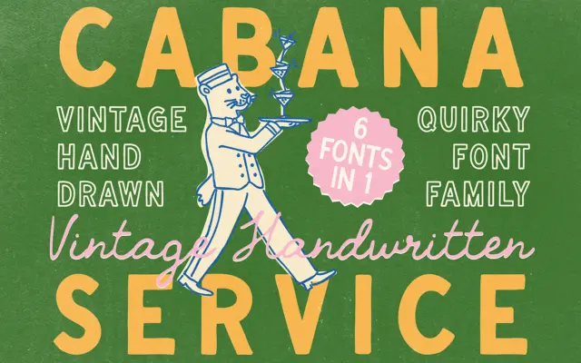
Design style This is a hand-drawn sans with the deliberate wobble of someone lettering a menu board rather than setting…
Tantype
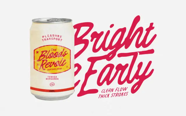
Design style Dreamies Retro Script sits in the thick-nibbed, mid-century family of scripts — the kind of lettering you associate…
Tantype
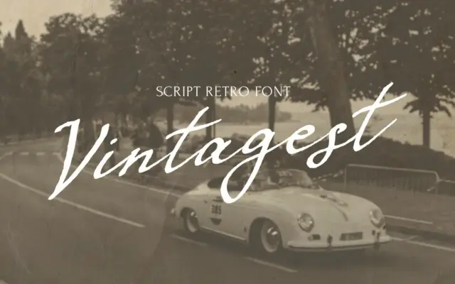
Design style VINTAGEST is a handwritten script built around the mark of a flat, ink-loaded pen rather than a pointed…
Tantype
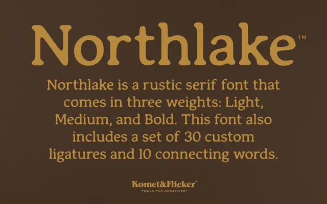
Design style Northlake is a serif built on soft geometry. The serifs are present and sturdy, but their corners have…
Tantype
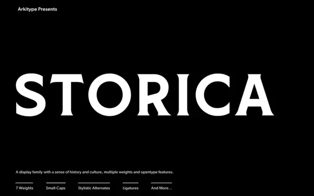
Design style Storica leans on the proportions of classical roman lettering — the kind carved into stone rather than set…
Tantype
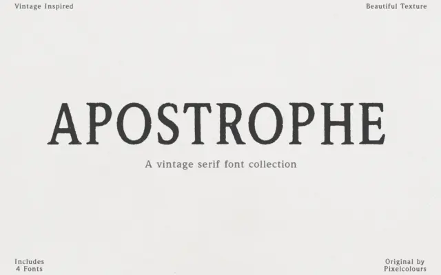
Design style Apostrophe leans hard into the look of old letterpress and antique type specimens. The strokes carry visible texture…
Tantype
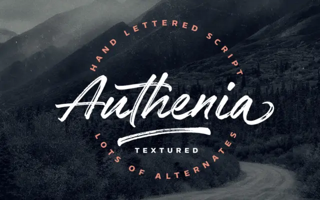
Design style Authenia Textured is a brush script drawn quickly and loosely, then scanned and vectorised while keeping the dry-brush…
Tantype