
Old Sock: a hand-drawn vintage sans for signage and rough-edged branding
Design style
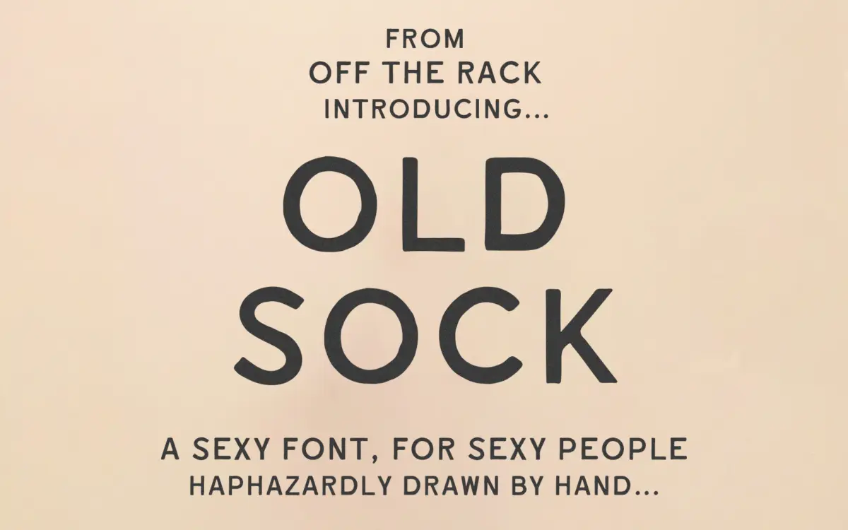
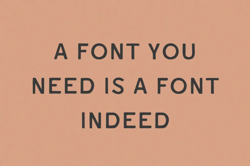
Old Sock is a hand-drawn sans built around the wobble of old painted shopfronts and weathered signwriting. The strokes aren’t ruled off with a straightedge; you can see where a brush or marker dragged slightly heavy on the downstrokes and thinned out on the turns. Letters lean a touch off true vertical here and there, and no two matching curves are quite identical, which is the point: it’s meant to read as painted, not typeset.
The weight sits somewhere between casual and slab-bold, dense enough to hold up as a standalone display face rather than needing a companion for support. Terminals are blunt and squared rather than rounded, which keeps the letters from feeling too soft or cartoonish. It’s rough, but it’s not sloppy — there’s a consistent hand behind the inconsistency, if that makes sense, and it reads as a deliberate style choice rather than an unfinished draft.
Character set and features
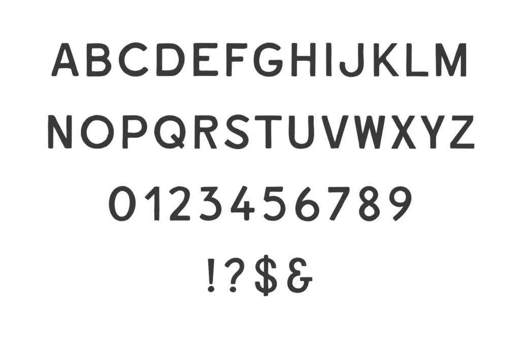
The set is intentionally narrow: uppercase A–Z, numerals 0–9, and basic punctuation. There’s no lowercase, no accented characters, and no alternates or ligatures to speak of. That means every word set in this font comes out as a run of caps, which suits the signage reference well — old hand-painted signs were almost always uppercase — but it does mean the font can only do one register. You’re not going to set body copy, subheads, or anything requiring mixed case. Anyone who needs a lowercase companion or wider language support will need to look elsewhere or plan around the gap from the outset.
Because the character set is so limited, the file itself is simple to work with: what you see is what you get, no digging through OpenType panels for hidden features. That’s a plus for speed but a minus for flexibility — there’s no way to vary the texture of a word beyond retyping it.
Use cases
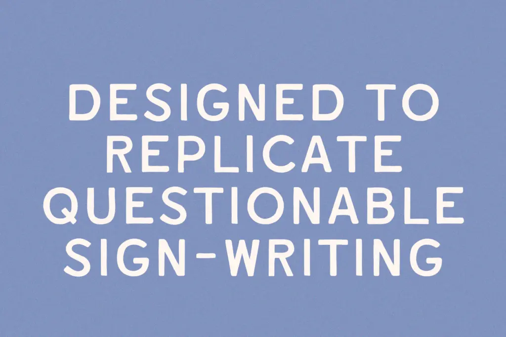
This is a font for short bursts of text where the vintage, hand-lettered feel is the whole message: a badge on a craft product label, a header on a menu, a word or two on packaging, or a mocked-up sign in an illustration. It works well anywhere a designer wants to suggest history or handmade authenticity without commissioning custom lettering. Logo lockups for small businesses — bakeries, barbershops, breweries — are a natural fit, especially where the brand is already leaning into a retro or rustic identity.
It’s less useful for anything requiring sentence-case text, longer passages, or a polished, contemporary look. Because it’s all caps with only rudimentary punctuation, extended reading is uncomfortable and clumsy to set. Treat it as a one-note instrument: very good at that one note, but don’t ask it to carry a full composition.
What we liked, and what we didn’t
Strengths
- Convincing hand-painted wobble that reads as deliberate rather than sloppy
- Bold, dense strokes make it strong as a standalone display or logo mark
- Straightforward file with no complicated features to dig through
Trade-offs
- No lowercase letters at all, so it can't set mixed-case text
- Very basic punctuation and no accented characters limit language use
Old Sock does a specific job well: short, punchy, hand-painted-looking headlines and logo marks with a vintage signage feel. The uppercase-only, basic-punctuation character set keeps it from doing much else, so budget for a companion font if you need lowercase or body text.
Verdict

Tantype reviews typefaces in depth — every font is tested in real branding, editorial and screen layouts before a word gets written. 555+ fonts reviewed and counting.