
Oldforge: a distressed medieval display face for fantasy and game titles
Design style
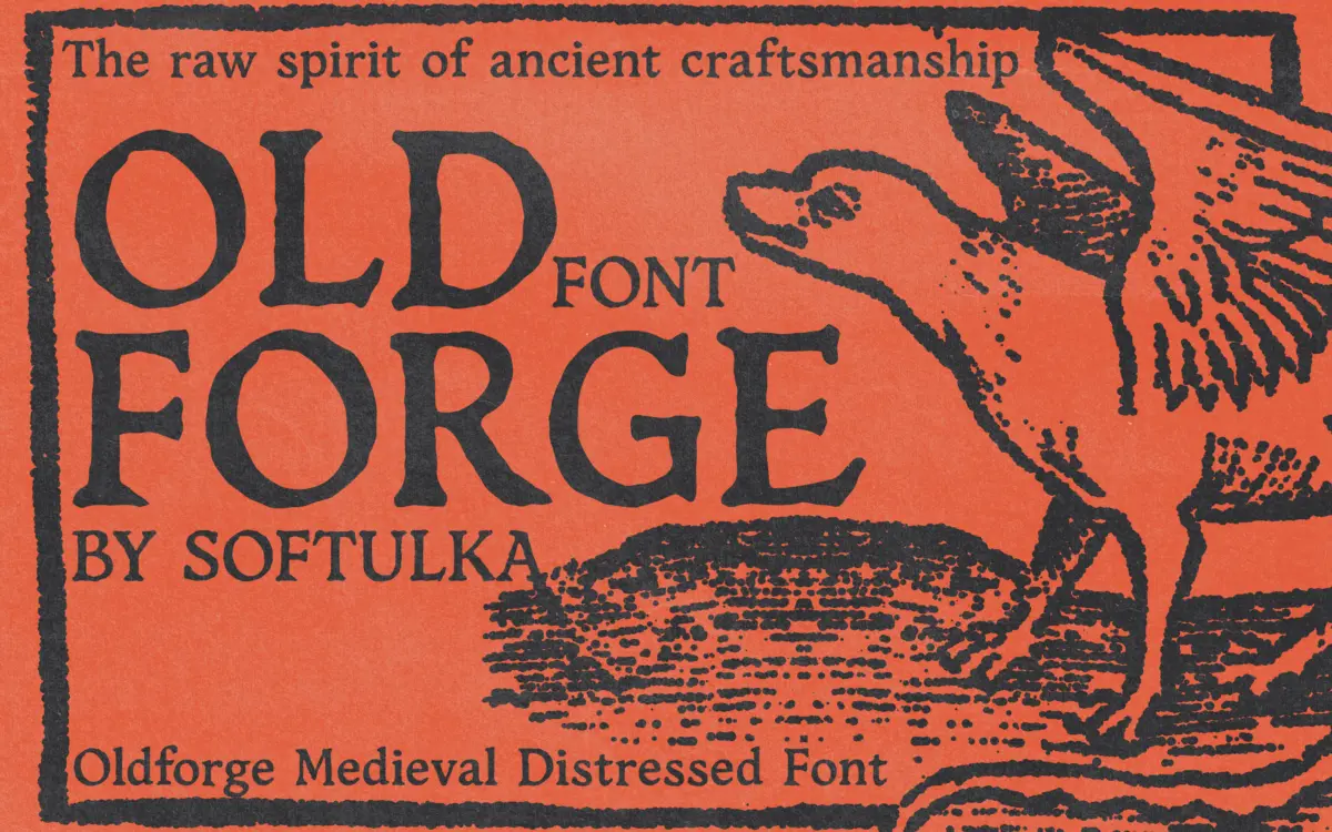
Oldforge trades on roughness. The letterforms lean toward blackletter and medieval carving rather than any historical script proper — thick, uneven strokes, corners that don’t quite meet, and edges that look chipped or gouged rather than drawn. There’s no attempt at uniform contrast or a consistent stroke weight; the distress is baked into the letter construction itself, not just applied as a texture layer afterward, which gives it a more integrated, less filtered look than a lot of grunge-effect fonts.
The irregularity is the point, but it also means the font has one register. Every character commits fully to the worn, hand-forged look, so there’s no clean variant to fall back on when the concept calls for a lighter touch. This is a font that knows exactly what it wants to be and doesn’t hedge.
Character set and features
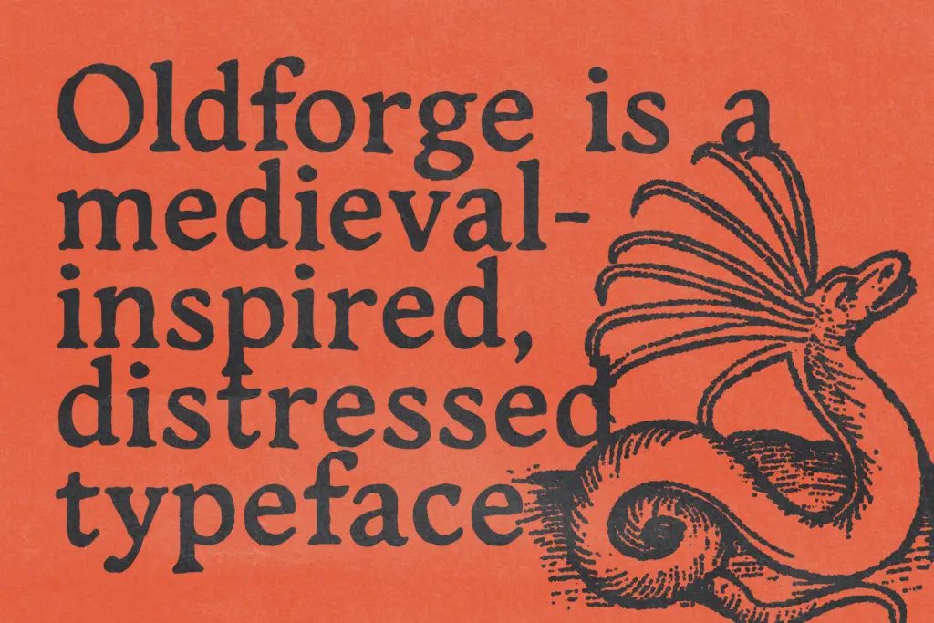
As a script-category display face, Oldforge is built for short bursts of text rather than paragraphs — titles, single words, logotypes. The irregular baseline and inconsistent stroke terminals that make it feel handcrafted also make sustained reading tiring; your eye has to work to parse each letter individually rather than gliding across a word shape, which is fine at headline sizes and a real liability anywhere smaller.
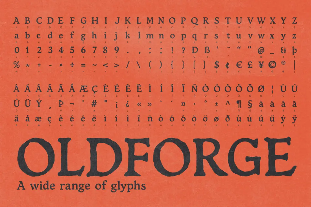
The file comes in OTF, TTF, and WOFF formats, which covers desktop design work and basic web use without much fuss. There’s a preview PDF included, which is worth checking carefully before committing to a layout — with a font this stylised, you want to see every glyph you plan to use rendered at the size you plan to use it, since distressed display faces often have a handful of characters that read less clearly than the rest.
Use cases
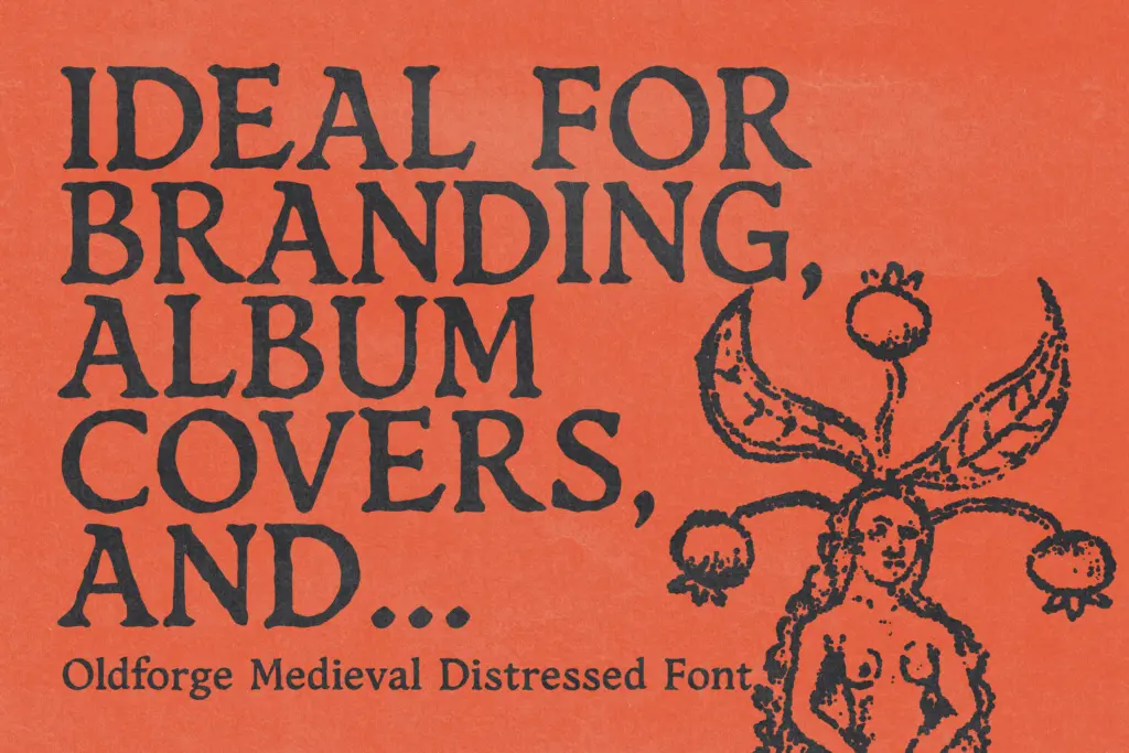
This is a font for setting a mood in one or two words. Game titles, fantasy book covers, tavern signage, poster headlines for anything set in a vaguely medieval or ancient world — Oldforge does that job efficiently. It has the kind of surface texture that reads instantly as “old” and “forged by hand,” which is exactly the shorthand a lot of fantasy branding is chasing.
It’s less useful outside that lane. Body copy is off the table entirely — the irregularity that reads as character at 80pt reads as a legibility problem at 12pt. It’s also not a font you’d reach for if the brief needs restraint; there’s no quiet version of Oldforge, no way to dial back the distress for a client who wants
What we liked, and what we didn’t
Strengths
- The distress feels built into the letterforms rather than layered on as a filter
- Delivers an instant medieval, hand-forged mood without extra styling
- Works cleanly for single words and short titles in fantasy or game contexts
Trade-offs
- Legibility drops fast below display sizes, ruling out body or caption use
- The single aggressive register offers no restrained alternative for softer briefs
Oldforge does one thing — worn, hand-forged medieval texture — and does it convincingly at headline sizes. It's a strong pick for fantasy and game branding but has no quiet mode and no place in running text.
Verdict

Tantype reviews typefaces in depth — every font is tested in real branding, editorial and screen layouts before a word gets written. 555+ fonts reviewed and counting.