
Redlands: a rugged western sans built for badges and stamps
Design style
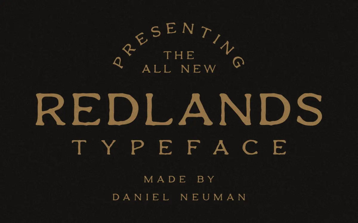
Redlands is a display sans with a frontier-badge attitude, built as a duo: a Regular cut with smooth, slightly rounded strokes, and a Stamp version that roughens those same shapes with worn, distressed edges. The letterforms are chunky and geometric at their core — squared bowls, blocky terminals, generous x-height — which keeps the design legible even when the Stamp texture chews into the outlines. This is not a font trying to look handmade in the calligraphic sense; it reads more like carved wood or inked rubber stamps, which fits the western, trail-worn mood it’s going for.
The Stamp variant is the more distinctive of the two. Its broken edges and uneven ink spread give it a printed-under-pressure feel, the kind of texture you’d expect on a crate label or a saloon sign. Regular, by contrast, is fairly plain on its own — a solid, sturdy sans that mostly exists to give the Stamp version somewhere to stand next to. Neither cut has much stylistic range beyond the western-badge lane; this is a typeface with one clear idea, executed with a decent hand.
Character set and features
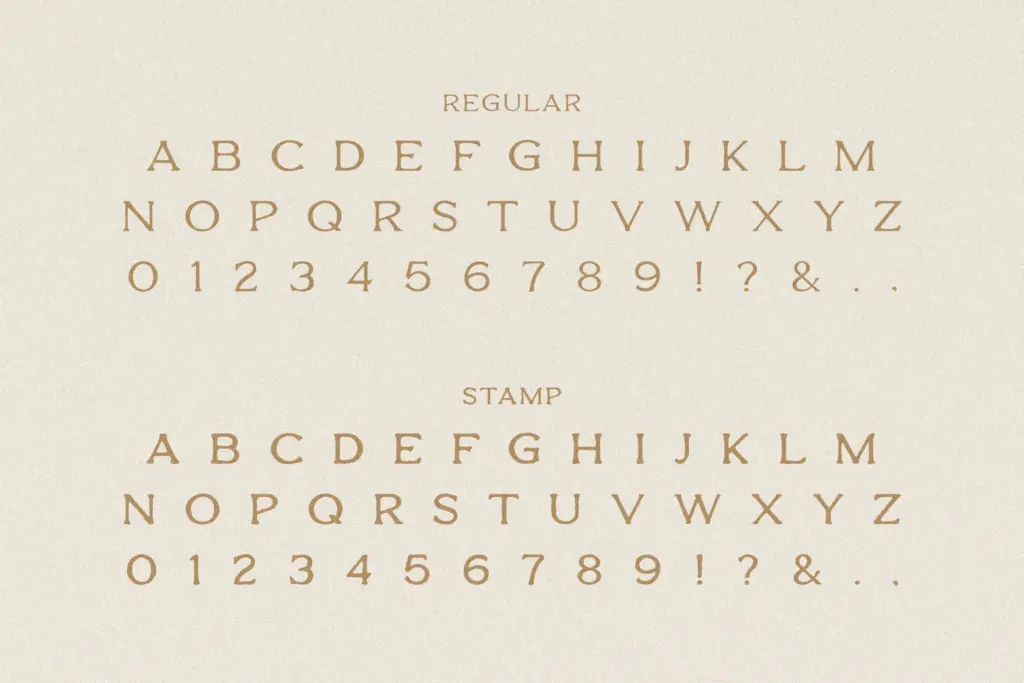
The set is single-case: A–Z, numerals 0–9, and basic punctuation. There’s no lowercase, no small caps, no extended Latin diacritics, so anything requiring accented characters or bilingual text will need a substitute. That single-case structure is common in badge and stamp lettering, where the whole point is uniform block capitals, but it does mean Redlands isn’t a font you reach for when you need continuous reading text or a full editorial hierarchy — it’s built to be set short, in caps, and left alone.
Because the character set is limited to caps and numerals, spacing and kerning matter more than they would in a full alphabet family, and here the letters sit comfortably together without obvious gaps or collisions in typical badge-style words. The Stamp texture is baked into the outlines rather than applied as a separate effect layer, so it behaves predictably in any layout software — no filters or plugins required, just drop in the font and set your type.
Use cases
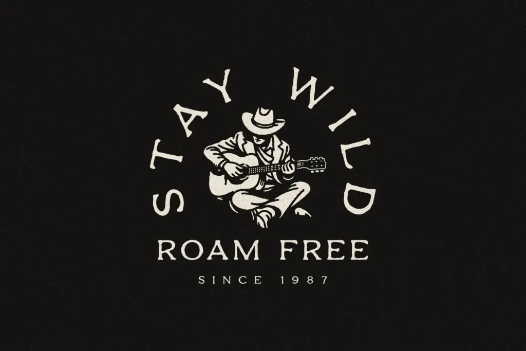
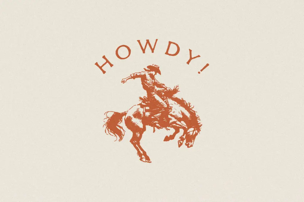
Redlands is suited to short-form, high-impact lettering: logo lockups, badges, stamps, product labels, packaging for outdoor or heritage-branded goods, apparel graphics, and signage with a western or adventure theme. Think craft breweries, camping gear, ranch-style branding, farmers’ market signage, or any project leaning into rugged Americana. The Regular cut can carry a clean word or two on its own, but it earns its keep mostly as a companion to the Stamp version — pairing the two together, one for structure and one for texture, is where the duo actually delivers on its premise.
It’s not a font for body copy, long headlines, or multilingual projects, and the lack of a lowercase limits how much personality it can bring to a full brand system by itself. Used within its lane — short words, badge shapes, western or outdoor themes — it does the job cleanly and without fuss.
What we liked, and what we didn’t
Strengths
- The Stamp cut's distressed edges read convincingly as worn rubber-stamp or crate-label lettering.
- Blocky, geometric letterforms stay legible even under the rough texture.
- The two cuts work well paired together for a structure-plus-texture badge look.
Trade-offs
- Single-case set with no lowercase or diacritics limits it to short caps-only lettering.
- Regular on its own is a fairly generic block sans without much identity.
Redlands does one job well: rugged, stamp-style badge lettering with a western edge. It's limited by its single-case, caps-only character set, so don't expect it to carry a full brand system alone, but for short western or outdoor-themed lockups it delivers exactly what it promises.
Verdict

Tantype reviews typefaces in depth — every font is tested in real branding, editorial and screen layouts before a word gets written. 555+ fonts reviewed and counting.