Serif
3.7
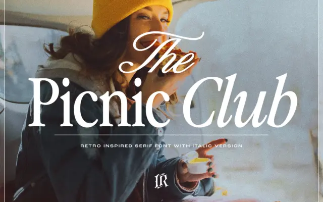
The Picnic Club: a groovy 80s-inspired serif for retro branding
Design style The Picnic Club leans on a specific decade rather than a vague idea of “vintage.” The letterforms carry…
 Tantype

Design style The Picnic Club leans on a specific decade rather than a vague idea of “vintage.” The letterforms carry…
Tantype
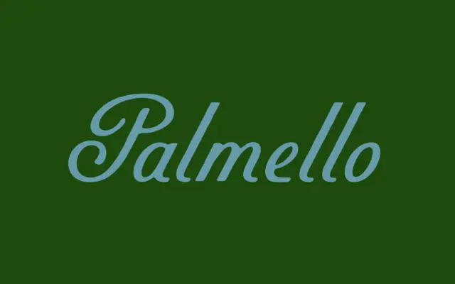
Design style Palmello belongs to the sign-painter school of script: letters that reference brush and pen work but don’t try…
Tantype
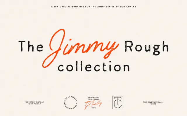
Design style Jimmy Rough is a collection rather than a single face: a sans, a serif and a monoline script,…
Tantype
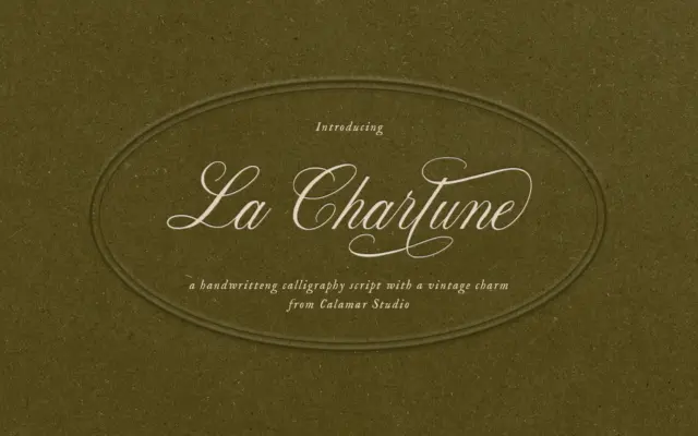
Design style La Charlune takes the bones of copperplate script — the steep slant, the thick-thin contrast built from pressure…
Tantype
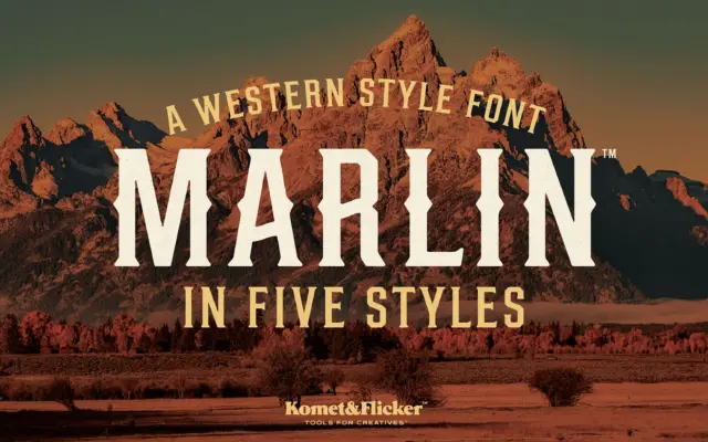
Design style Marlin sits squarely in the old-west signage tradition: condensed slab serifs, heavy vertical stress, and slightly worn edges…
Tantype
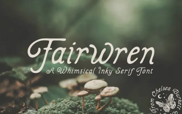
Design style Fairwren is a bold serif built on solid, slightly irregular strokes with inky edges that suggest a nib…
Tantype
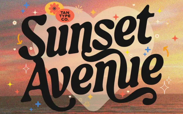
Design style TAN-SUNSET sits in serif territory but leans hard into personality rather than restraint. The strokes carry noticeable contrast,…
Tantype
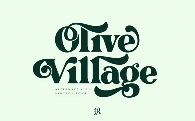
Design style Olive Village leans into a very specific decade. The curves are rounded and slightly bulbous, the contrast is…
Tantype
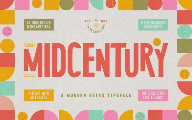
Design style MidCentury Typeface is an uppercase-only display face pitched squarely at the poster-and-book-jacket look of the 1950s. The letters…
Tantype