
Millie June: a hand-drawn serif with vintage southern charm
Design style
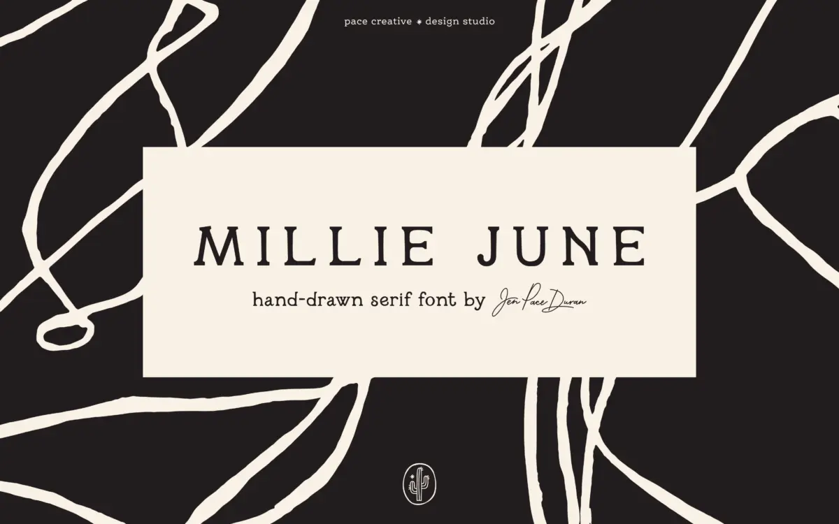
Millie June sits in that crowded space where hand lettering meets serif structure, but it earns its place through restraint rather than flourish. The letterforms carry small serifs at the terminals of strokes, drawn with the slight waver of a pen moving at a consistent but unhurried pace. Nothing here is polished into vector perfection, and that’s clearly the point. Strokes vary in weight in a way that reads as intentional wobble rather than sloppy digitising, and the baseline shifts just enough to suggest handwriting without tipping into illegibility.
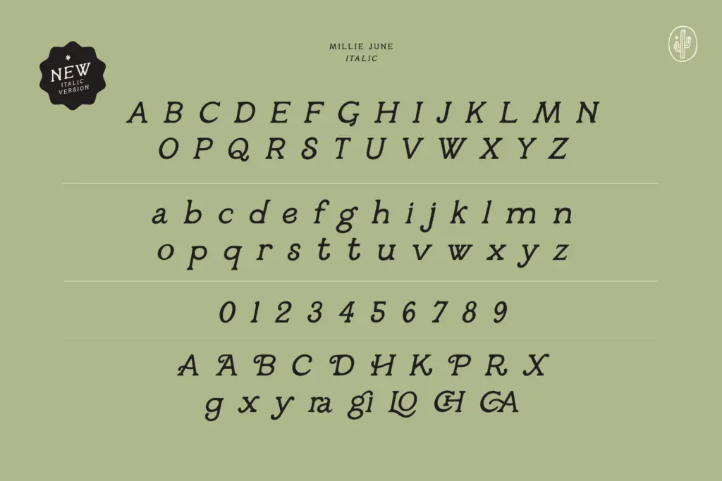
The vintage reference is legible in the letter construction itself: bowls that don’t quite close, crossbars set slightly off-centre, serifs that flare unevenly from one letter to the next. It reads as a font pulled from an old grocery sign or a hand-painted shop window rather than a script built for a screen. The italic companion leans the same imperfections at an angle, which keeps the pairing consistent rather than feeling like two separate personalities bolted together.
Character set and features
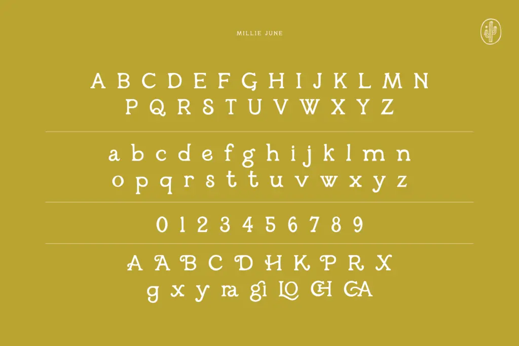
The set covers upper and lowercase, numerals, and a run of special characters, alongside alternate letterforms for both cases. The alternates matter more than they might in a cleaner script — swapping in a different lowercase a or g breaks up repetition across a line of text, which is where hand-drawn fonts often reveal their seams. Used well, the alternates disguise the fact that the font is, underneath, a repeating set of glyphs rather than genuine handwriting.
The regular and italic styles function as a functional pair rather than a full family — there’s no bold or light weight to lean on for hierarchy, so any contrast in a layout has to come from size, colour, or pairing with a second typeface. Multilingual support is included, which extends its reach beyond English-language projects, though as with any hand-drawn face, extended character coverage is worth checking against the specific language needs of a project before committing.
Use cases
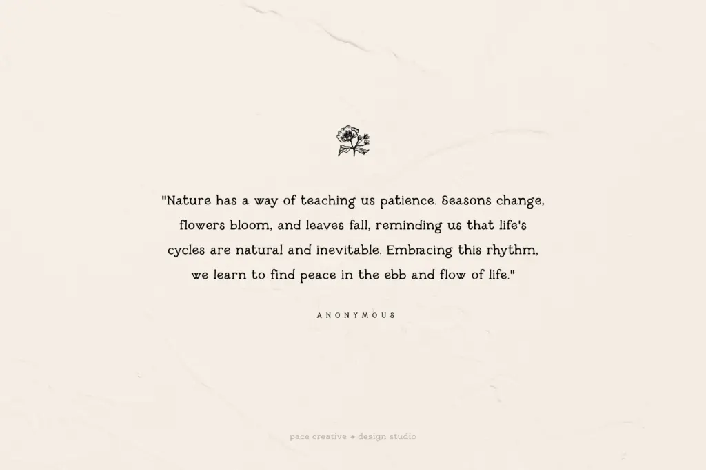
Millie June is built for short bursts of text: a logotype, a product label, a wedding invitation’s opening line, a packaging flourish. It has the kind of imperfection that reads warmly at display sizes — headlines, monograms, badge-style branding — but the same wobble that gives it charm at 60pt starts working against it below body-text sizes, where the irregular baseline and variable stroke weight cost readability rather than add character.
It suits brands built around nostalgia: farmstands, bakeries, small-batch goods, southern or rustic branding, stationery that wants warmth over precision. It’s less suited to anything needing crisp legibility at small sizes or a font that needs to carry long passages of text. Treat it as a voice for a few words at a time, not a workhorse for paragraphs, and it does its job well.
What we liked, and what we didn’t
Strengths
- Alternate letterforms genuinely reduce repetition across a line of text
- The italic companion shares the same imperfect, hand-drawn logic as the regular weight
- Vintage southern character comes through clearly without tipping into gimmick
Trade-offs
- No bold or additional weights, so hierarchy has to come from elsewhere in the layout
- Variable baseline and stroke weight make it unreliable below display sizes
Millie June is a competent hand-drawn serif with genuine vintage character, best used for short display text rather than body copy. Its alternates and italic give it enough range for branding and stationery work, but it's a display font first and a text font never.
Verdict

Tantype reviews typefaces in depth — every font is tested in real branding, editorial and screen layouts before a word gets written. 555+ fonts reviewed and counting.