
Regards: a retro serif display face built for alternates and swash play
Design style
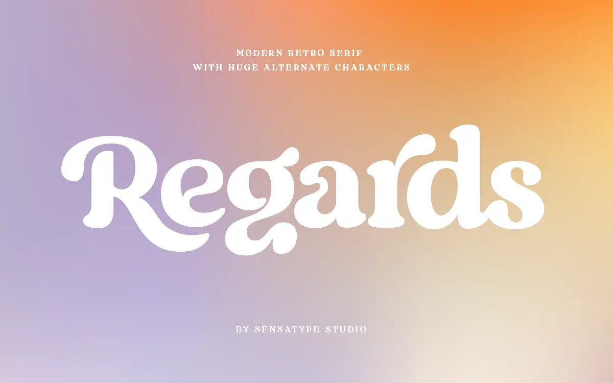
Regards sits in that well-populated corner of type design where a serif skeleton gets bent toward something warmer and less formal. The contrast is moderate rather than dramatic — you won’t find the hairline thins of a fashion serif here. Instead the strokes stay fairly even, with a slight thickening at the joins that gives the letters some weight without turning them heavy. The curves lean generous, terminals round off softly, and the overall impression is closer to a hand-finished signage letter than a text serif that happens to be dressed up for display work.
What marks it as ‘retro’ rather than plain traditional is the way certain letters break formation. Look at the bowls on the lowercase g or the tail on the y, and you’ll see a designer reaching for character over consistency. That’s the point of a font like this: it’s not meant to disappear into a paragraph, it’s meant to be noticed at large sizes, on a label or a headline, where its quirks read as personality rather than noise.
Character set and features
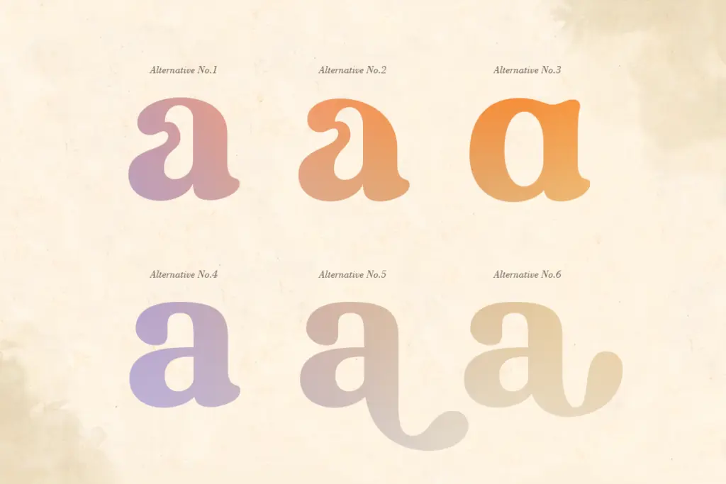
The headline feature is the alternate set — over 100 stylistic alternates across the character range, which is a substantial swap library for a single display face. In practice this means the same word can be set several different ways depending on which alternates you pull in, letting you soften a wordmark’s rhythm or add a flourish to a single capital without touching kerning by hand. Ligatures are included too, so common letter pairs can connect rather than sit side by side as two separate shapes.
The set covers uppercase and lowercase, numerals, punctuation, and accented characters for Western European languages, so it’ll handle the diacritics that basic Latin sets often skip. There’s no mention of extended language support beyond that, so treat it as a Western-market font rather than one built for broader multilingual work. The stylistic alternates are the real substance of the package — everything else is competent but standard for a display serif at this level.
Use cases
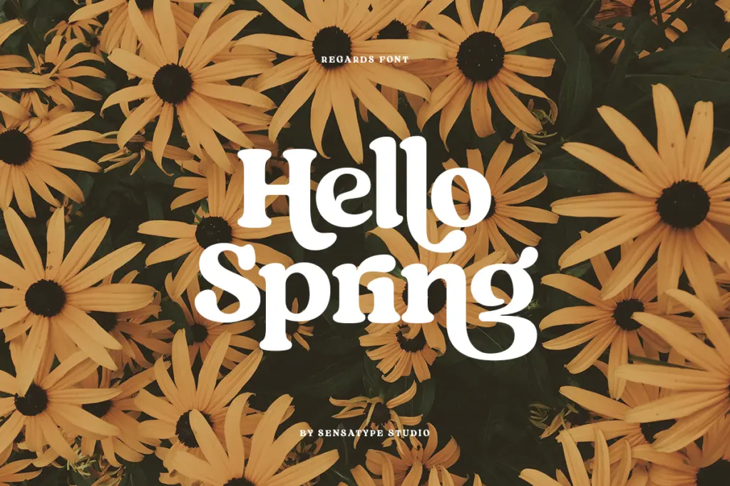
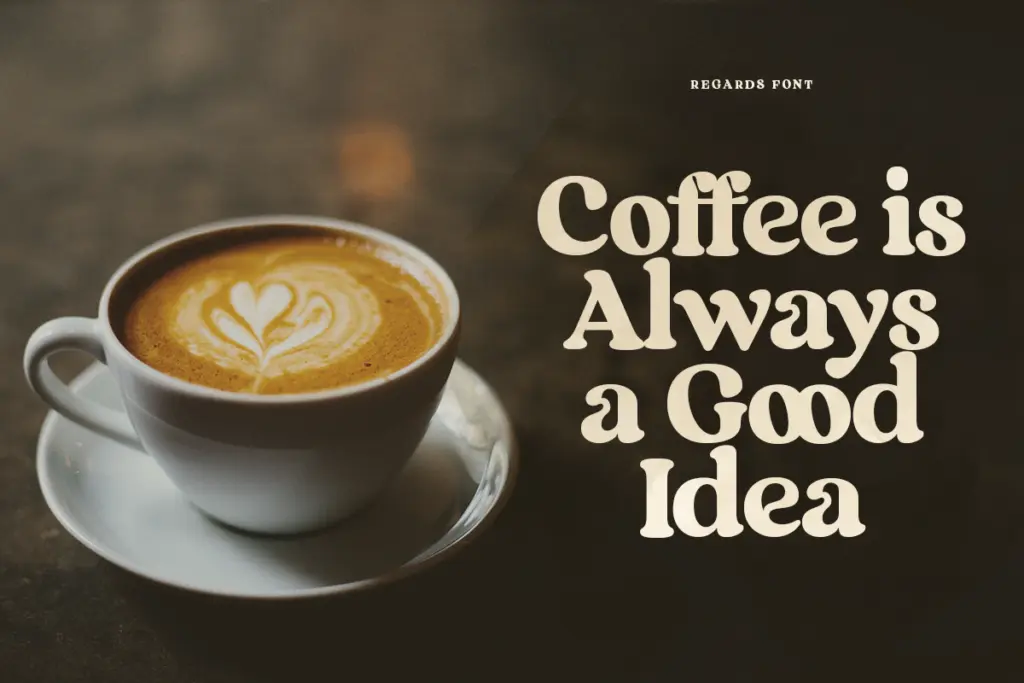
This is a font for short bursts of text: a logotype, a product label, a wedding invitation’s headline line, a social media graphic, a packaging front panel. The moderate contrast keeps it legible at the sizes those jobs call for, and the alternates give designers room to customise a lockup so it doesn’t look like it came straight out of the box. It’s well suited to branding work where a bit of vintage warmth is wanted but a script font would feel too soft or too hard to read.
It’s not a font for body copy or long-form editorial text — the alternates and the slight irregularity in the letterforms would work against readability at small sizes and in dense paragraphs. Keep it to headlines, wordmarks, and short display lines, and let the alternates do the work of making each application feel distinct.
What we liked, and what we didn’t
Strengths
- Over 100 stylistic alternates give real flexibility for customising logotypes and headlines
- Moderate contrast keeps the retro character legible at display sizes
- Ligatures and accented character support add polish for European-language branding work
Trade-offs
- Not designed for body text or long-form reading
- The retro-serif-with-swashes style is common in this market, so it doesn't stand far apart from similar display serifs
Regards does one job well: giving a retro-leaning wordmark or headline some customisable personality through its large alternate set. It's not built for reading in bulk, and the style itself is a familiar one in the display-serif space, but the execution is solid and the swash options genuinely useful.
Verdict

Tantype reviews typefaces in depth — every font is tested in real branding, editorial and screen layouts before a word gets written. 555+ fonts reviewed and counting.