Serif
3.6
Perandory: a sharp-edged vintage-inspired serif for display work
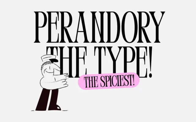
Design style Perandory is a display serif built around tension rather than comfort. The brief describes it as inspired by…
 Tantype

Design style Perandory is a display serif built around tension rather than comfort. The brief describes it as inspired by…
Tantype
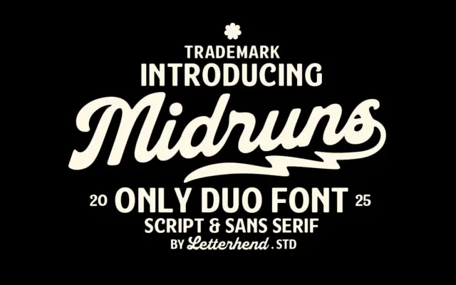
Design style Midruns pairs a heavyweight brush script with a companion sans, both built around the same retro-signage instinct. The…
Tantype
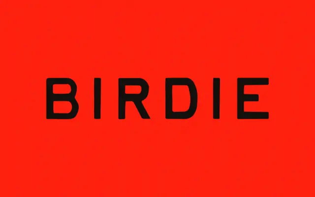
Design style Birdie sits in the well-worn territory of vintage-print lettering: uneven baselines, ink-heavy strokes, and edges that look like…
Tantype
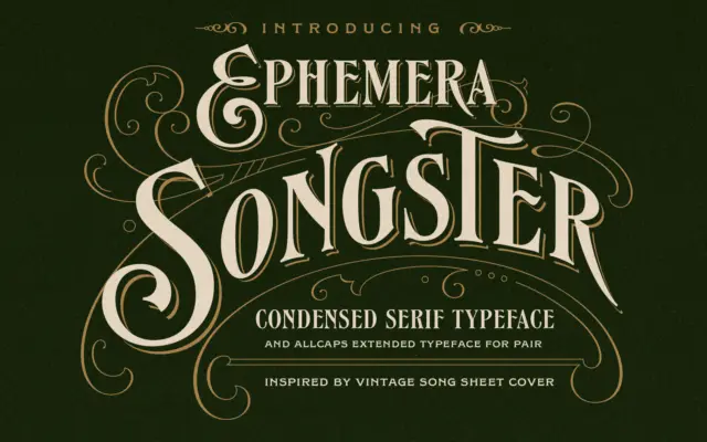
Design style Songster pulls from the lettering found on 19th-century song sheet covers, and it shows in the details rather…
Tantype
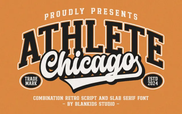
Design style Chicago Athlete pulls from the collegiate athletics playbook: thick slab serifs, squared bowls, and a deliberate wobble in…
Tantype
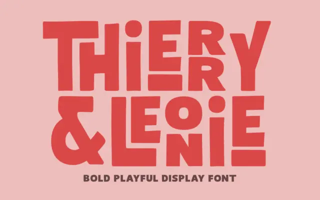
Design style Thierry Leonie sits in that overlap between hand-lettering and display sans, drawn with a bold, condensed skeleton that…
Tantype
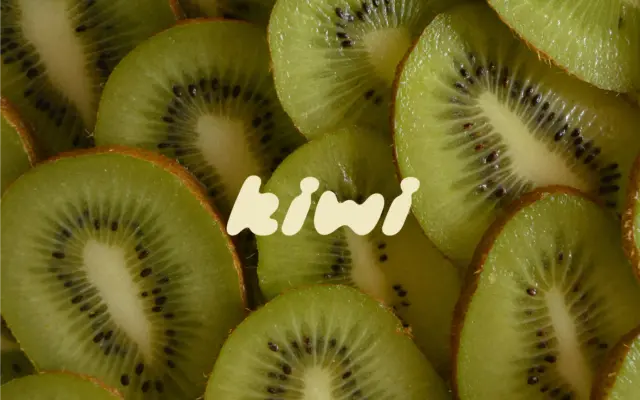
Design style Kiwi Juicy Display is a hand-drawn, slanted display face built from thick, rounded strokes that all lean the…
Tantype
Design style Heartbreak Eighties Retro Serif sits at the thicker end of the slab-serif family, with the rounded, slightly inflated…
Tantype
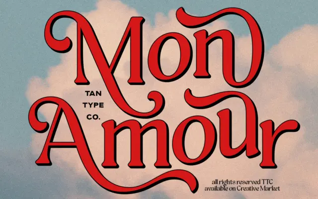
Design style Mon Amour pulls from 70s lettering — the kind of hand-lettered logotype you’d find on a record sleeve…
Tantype