
Swell: a geometric display sans with retro alternates for bold branding
Design style
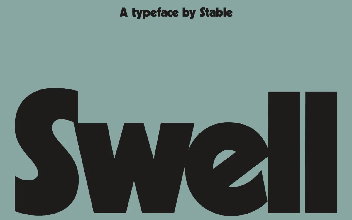
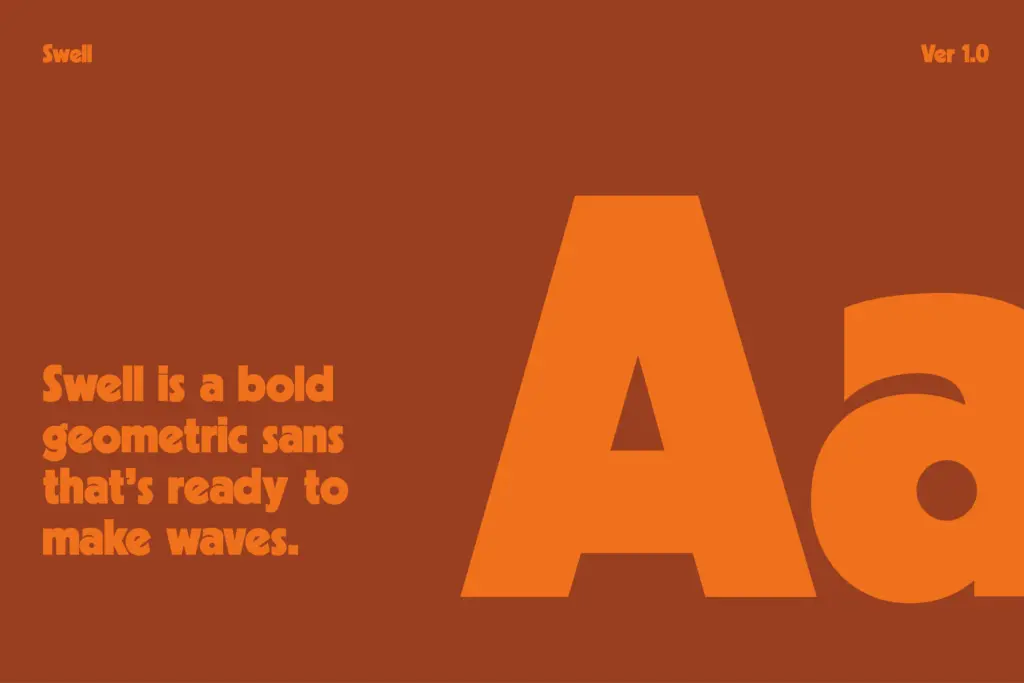
Swell sits in the lineage of chunky geometric sans faces like Kabel Black, but it doesn’t just reissue that shape. The letterforms lean on near-perfect circles and single-story constructions, the kind of geometry that made 1970s display sans faces feel both mechanical and friendly at once. Strokes are heavy and even, with counters kept generously open so the black weight doesn’t clog up at smaller sizes. There’s a bounce to it — a lowercase g or a rounded a that nods toward the era of Avant Garde and its more novelty-leaning cousins, without tipping into pure novelty itself.
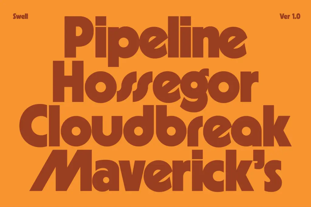
The geometric rigidity is loosened just enough by the alternates, which is really where the design’s point of view lives. Swap in a few of the more eccentric characters and the whole word shifts register, from clean corporate sans to something closer to a surf shop sign or a retro soda label. That range within one family is the main design achievement here — it’s less a single voice than a set of related voices you can dial toward.
Character set and features
The set covers uppercase, lowercase, numerals and punctuation, plus more than fifty alternate glyphs. That’s a substantial alternates package for a display face, and it changes how you’d actually use the font day to day — this isn’t a typeface you set once and forget, it’s one you sit with in a type tool, swapping glyphs until a wordmark clicks. Letters inspired by Marvin and Blippo show up as the more playful options: bouncier terminals, unconventional joins, shapes that read as retro-futurist rather than strictly geometric.
Because the alternates are optional rather than forced, the base character set stays usable on its own — solid, legible, a bit blunt. The extras are for when a project calls for personality rather than neutrality. Worth noting: at heavy weight and tight geometric shapes, some of the more novelty alternates lose legibility fast in long strings of text, which is expected of a display face but worth keeping in mind before setting a full headline in the wildest glyphs.
Use cases
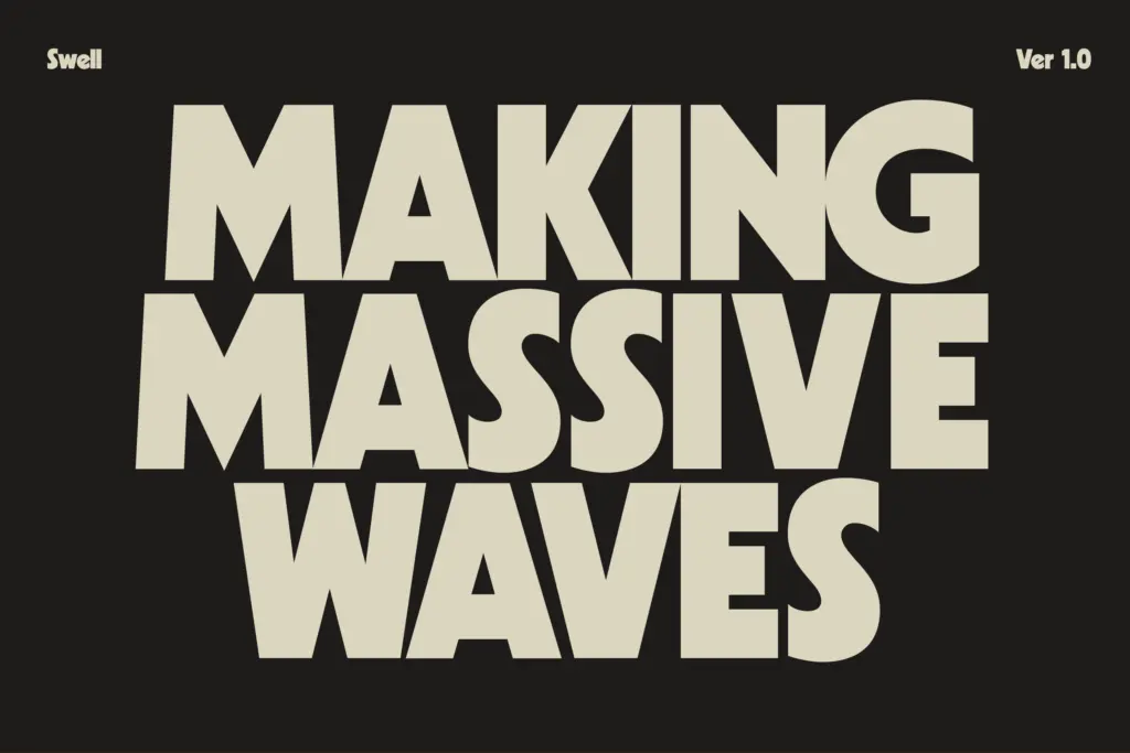
Swell is built for short-form, high-impact type: logotypes, packaging headlines, posters, merch, anything where a word or two needs to carry a retro-geometric attitude. The alternates make it well suited to branding work where a client wants
What we liked, and what we didn’t
Strengths
- Over 50 alternates give real range from clean geometric to novelty retro
- Even, confident stroke weight that reads well at large sizes
- Base character set stays legible without relying on the alternates
Trade-offs
- Some novelty alternates lose clarity when set in longer strings
- Best suited to short display use, not general text setting
Swell is a confident geometric display sans that earns its retro references without simply copying them. It's best used short and loud, where its bulk and alternates can do their job, rather than as a workhorse text face. Designers who like tuning glyphs to find a wordmark's personality will get the most out of it.
Verdict

Tantype reviews typefaces in depth — every font is tested in real branding, editorial and screen layouts before a word gets written. 555+ fonts reviewed and counting.