
Bazook: an ultra-bold geometric sans built for 80s-flavoured headlines
Design style
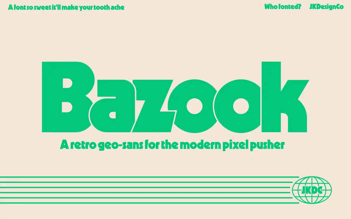
Bazook is a single-weight display sans that leans hard into the geometric-sans-gone-heavy tradition of Kabel and Geo 231, but pushed further into cartoon territory. The letters are built from circles, near-perfect verticals and diagonal cuts, then inflated until the counters get small and the strokes get chunky. Bowls on letters like B, P and R read as almost round, and the overall texture is closer to a badge or a logotype than to running text. There’s a deliberate friction between the sharp diagonal terminals on the R and K and the bubbly curves elsewhere, which is where the retro-tech feel comes from — part cassette-deck branding, part sci-fi cereal box.
It’s a font with a strong point of view rather than a neutral workhorse. The proportions are wide, the weight is unapologetically heavy, and nothing about it tries to disappear into a layout. That’s the job it was drawn for.
Character set and features
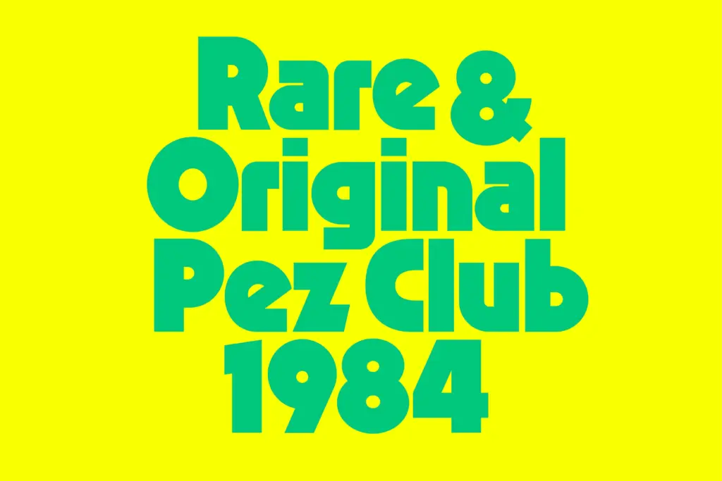
Bazook ships as a single style, Regular, with no companion weights or italics. That single-mindedness keeps the design coherent — there’s no lighter cut to dilute the geometric heaviness — but it also means you’re locked into one register of loudness throughout a project. Diacritic support covers the common Latin-script marks needed for French, Spanish, German and the Scandinavian languages, so it can carry short multilingual headlines without falling back to a substitute font, though anything beyond basic accented characters should be checked before a print run.
At this weight, letterspacing and kerning matter more than usual. The counters are tight enough that tracking needs a light touch in all-caps settings, and lowercase, where used, benefits from a bit more room than the default metrics assume. There’s no small-caps or alternate glyph set to speak of — what you see in the specimen is what you get, which keeps expectations honest.
Use cases
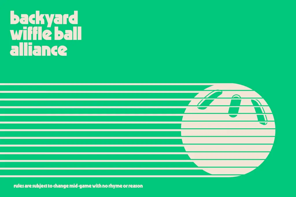
This is a headline font, full stop. It wants big point sizes: packaging fronts, poster type, logotypes, app icons, cassette-tape or vinyl-sleeve pastiche, anything trading on a late-70s/early-80s retro-tech mood. Set at a few words and a lot of size, the geometric bulk and bubble curves do their job well, and it holds up against bold colour and busy backgrounds, which is exactly the environment it was drawn for.
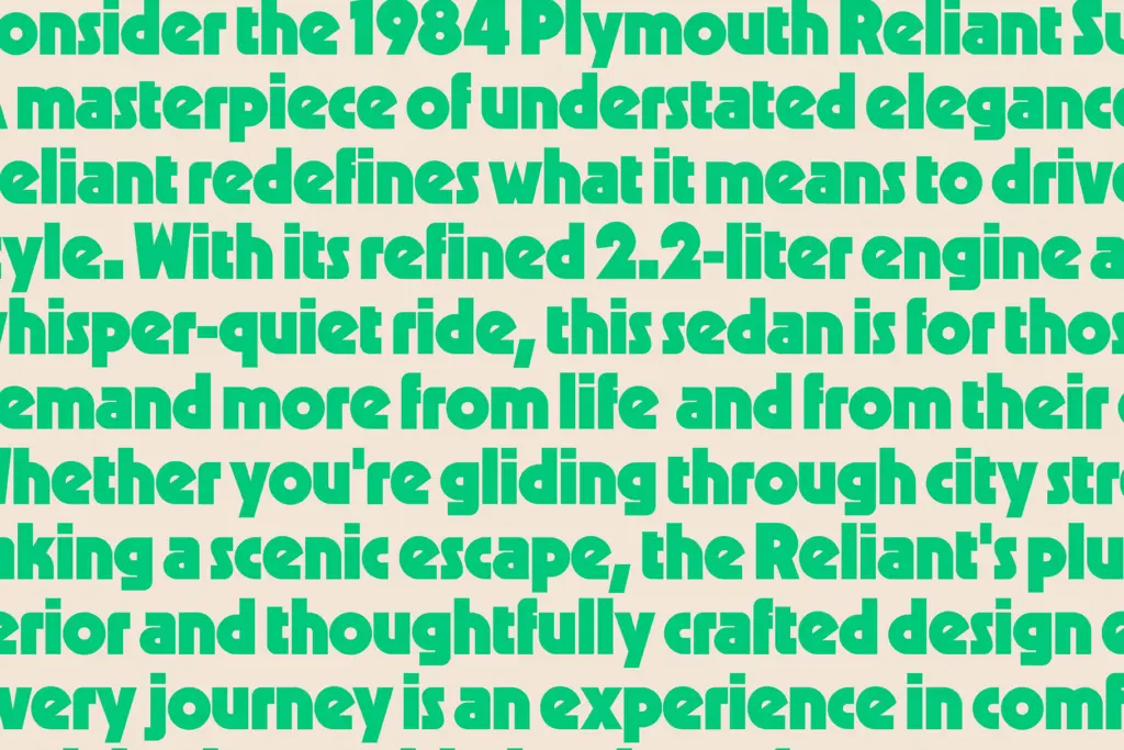
It is not built for body copy, captions, or anything that needs to be read in a paragraph. The tight counters and heavy weight that make it punchy at large sizes turn into a legibility problem the moment it’s dropped below display size — words start to clump into shapes rather than read as letters. It also has no way to soften its personality: there’s no light or regular-weight sibling to lean on if a brief calls for a quieter, secondary moment. Anyone drawn to this font should already have a headline in mind, because that’s the only job on offer.
What we liked, and what we didn’t
Strengths
- Strong, consistent retro-geometric character that suits packaging and badge-style logotypes
- Heavy weight and rounded bowls give it real presence at large sizes
- Diacritic coverage lets it handle short headlines in several European languages
Trade-offs
- Single weight only, with no lighter or italic companion for secondary text
- Tight counters make it unreadable below display sizes without careful tracking
Bazook is a loud, single-purpose display sans with a clear retro-tech personality drawn from Kabel-style geometric sans traditions. It does one job — big, bold headline type — very well, but its tight counters and single weight limit it outside of that lane. Good for packaging and logotype work; wrong tool for anything that needs to be read at length.
Verdict

Tantype reviews typefaces in depth — every font is tested in real branding, editorial and screen layouts before a word gets written. 555+ fonts reviewed and counting.