
Big Bird: a rough-edged stamp face for vintage marks and labels
Design style
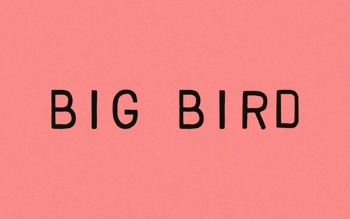
Big Bird belongs to the stamp-and-seal school of hand-drawn lettering: the kind of face that looks like it was cut into rubber before it was cut into a font file. The strokes carry a deliberately worn quality, with thick-to-thin transitions that don’t quite repeat the same way twice. That’s the point. The designer describes it as a lighter-handed follow-up to an earlier, heavier stamp face, and you can feel that intention in the letters — the strokes are trimmed down rather than blocky, so the overall texture reads as scratchy rather than stamped-flat.
It sits in a familiar lineage of distressed vintage lettering, but it doesn’t lean on heavy grunge textures to do the work. The character comes from the drawing itself — irregular baselines, slightly uneven stroke widths, terminals that don’t finish cleanly. That restraint is worth noting, because a lot of typefaces in this genre substitute Photoshop noise for actual variation in the letterforms. Big Bird’s imperfections are baked into the outlines, which tends to age better across different applications and sizes.
Character set and features
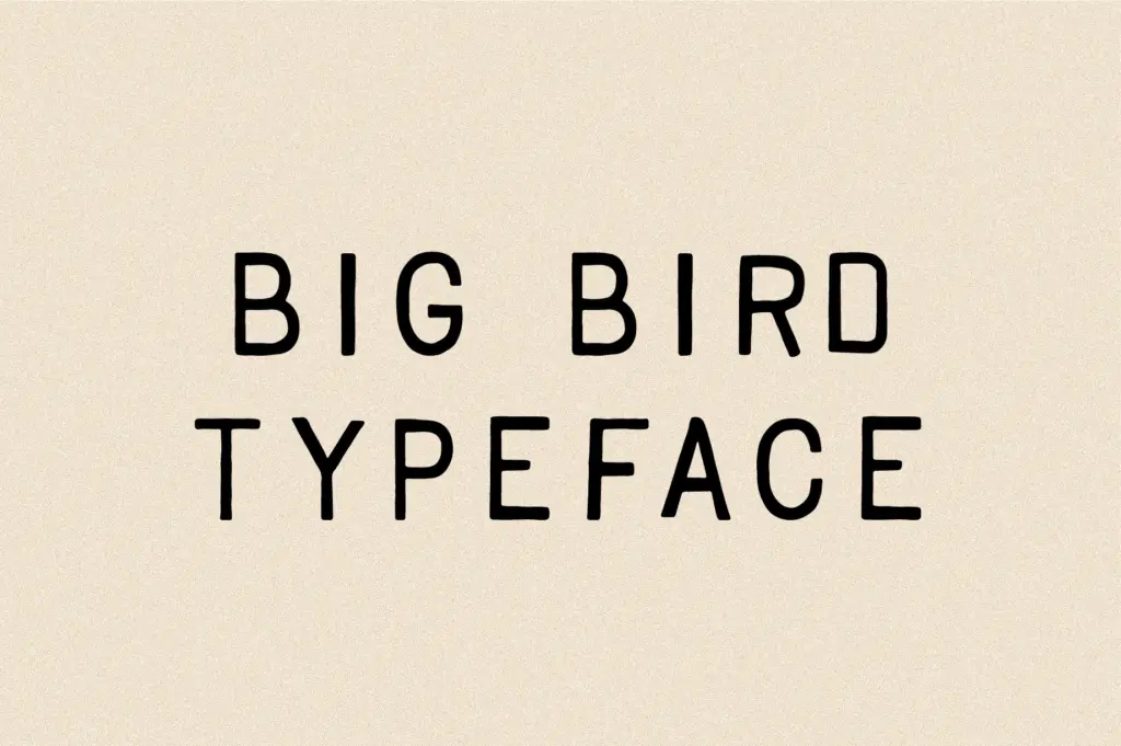
The letterforms are unmistakably hand-drawn rather than traced from a script model — there’s no calligraphic logic connecting the letters, no consistent nib angle. Instead each character looks like it was drawn separately and then assembled, which suits the stamp conceit but means the face reads more as a display alphabet than as handwriting proper. Language support extends across Western European diacritics, including characters needed for Icelandic and Welsh, which is a reasonable spread for a display face and opens it up to a wider range of European-market packaging and branding work without falling back on a workaround font.
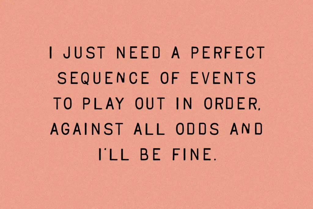
Because the strokes vary in weight and the baseline wanders slightly, tight setting isn’t really an option. Letters need room to breathe or the irregularities start to look like kerning problems rather than character. At larger display sizes that’s a non-issue; the roughness reads as intentional texture. Push it down into body-text territory, though, and the inconsistencies stop looking charming and start looking like noise — this is a headline and mark-making face, not a paragraph face, and it doesn’t pretend otherwise.
Use cases
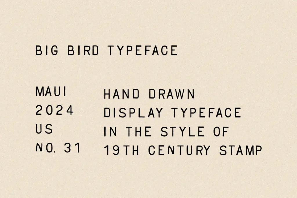
The obvious home is anything that wants to look stamped, aged or official-but-imperfect: product labels, packaging bands, badges, postmarks, market and craft branding. It also does well on merchandise — patches, tags, hang-tags — where a bit of roughness reads as authenticity rather than error. Editorial use works for section headers or pull quotes where a vintage, slightly irreverent tone is wanted, though it shouldn’t be asked to carry long passages of text.
It pairs naturally with a plain, quiet sans or slab for supporting text, since Big Bird itself is doing all the personality work and doesn’t need competition from a second decorative face. Wedding stationery is plausible if the couple wants a rustic rather than formal tone, but this isn’t an elegant-script typeface — treat it as a stamp mark, not a monogram face, and it will do its job well.
What we liked, and what we didn’t
Strengths
- Irregularities are drawn into the letterforms rather than applied as texture overlays
- Covers Icelandic and Welsh diacritics, unusually broad for a display face
- Reads as authentically worn at label and badge sizes without extra effects
Trade-offs
- Uneven baseline and stroke weight make it unusable for anything approaching body text
- Personality is strong enough that it needs a plain partner face rather than another display font
Big Bird is a competent, textured stamp face that earns its worn-in look through actual drawing rather than added grunge. It's built for headlines, labels and badges, not paragraphs, and it knows its lane. A solid pick for vintage packaging and branding work, less useful anywhere text needs to stay tidy.
Verdict

Tantype reviews typefaces in depth — every font is tested in real branding, editorial and screen layouts before a word gets written. 555+ fonts reviewed and counting.