
Wilden: a rough-edged handdrawn display face for vintage branding
Design style
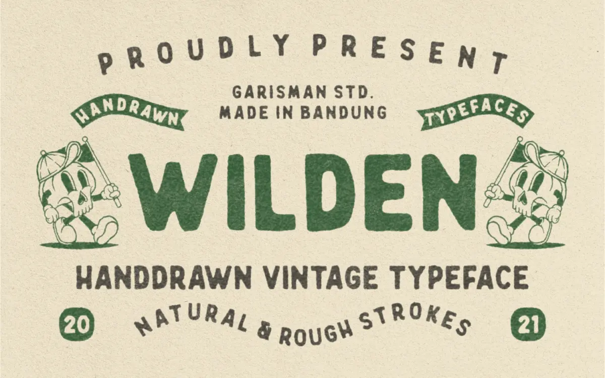
Wilden reads as a handdrawn display letter built for a worn, printed-badge look rather than a general text face. The strokes carry the slightly uneven pressure of a marker or brush-pen sketch, so verticals bow a little and terminals stop short rather than resolving cleanly. Caps are wide and squared-off, giving the face a stamped, workshop feel that suits the vintage brief it was drawn for. There’s no pretence of geometric precision here, and that’s the point: the imperfection is the design decision.
The letterforms sit closer to a single-story, casual print style than a formal script or blackletter revival, so ‘vintage’ in this case means mid-century signage and packaging rather than Victorian ornament. The weight is fairly heavy and consistent across the alphabet, which helps it hold up as a logotype mark rather than a paragraph face.
Character set and features
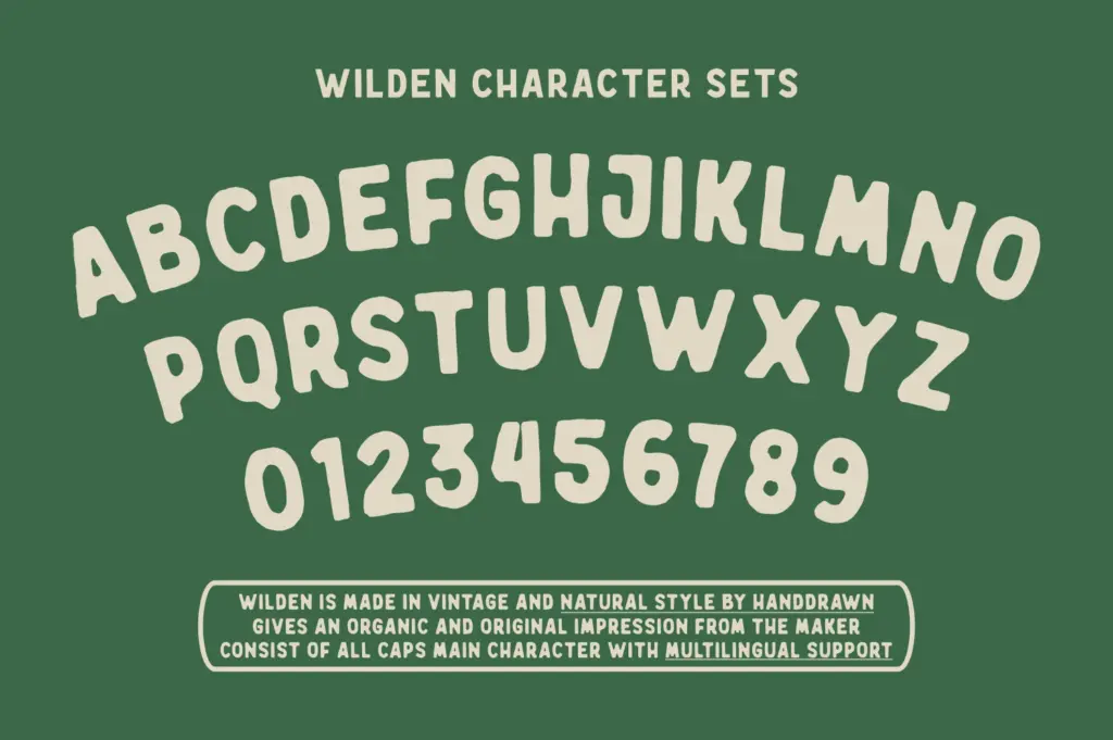
The set is capitals-led, with alternate cap styles included alongside standard numerals and punctuation. PUA encoding means the extra characters and swash variants are reachable through Character Map or Font Book rather than buried in OpenType features that not every app will expose, which is a practical touch for buyers who don’t work in software with full OpenType panels. Multilingual character support covers a reasonable spread of Western European languages, so accented setting in French, Portuguese, or Nordic languages should work without hunting for missing glyphs.
Don’t expect a script font’s contextual joining or a large ligature set — Wilden is built as a display alphabet with variant caps, not a connected hand-lettering system. The illustration bonus mentioned in the update is a nice extra but doesn’t change what the font itself does, which is provide a single confident vintage mark-making voice rather than a flexible family of weights or widths.
Use cases
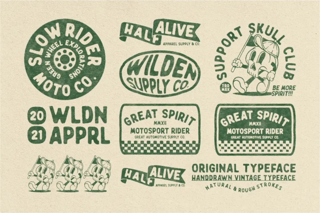
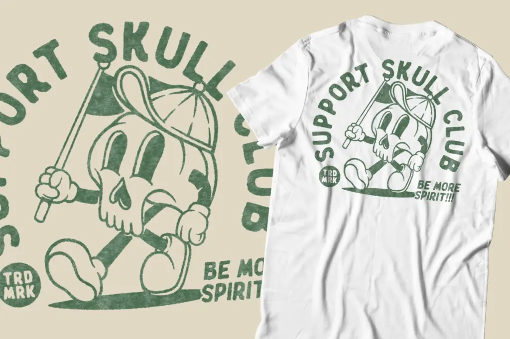
This is a logotype and badge font first. It’s suited to the jobs the seller lists: t-shirt graphics, packaging labels, stamped business cards, posters, and quote graphics where you want a handmade, slightly distressed feel without drawing custom lettering from scratch. Pair it with clean supporting type for body copy — Wilden is not meant to carry a paragraph, and pushing it below display sizes will lose the texture that makes it work at all.
It’s a strong fit for craft, food, and apparel branding that wants a nostalgic, unpolished mark rather than a slick modern wordmark. Because the weight and roughness are fixed rather than adjustable across a family, it’s less useful if a project needs a range of weights for hierarchy — you’ll be reaching for a second typeface to do the supporting work. For a single vintage display voice used deliberately and sparingly, though, it does its job without overcomplicating things.
What we liked, and what we didn’t
Strengths
- PUA encoding makes alternate caps and extra glyphs accessible without needing full OpenType feature support
- Consistent heavy weight gives it presence as a standalone logotype or stamp mark
- Multilingual character coverage across 14 languages handles accented Western European text
Trade-offs
- Single weight and style limit its use for hierarchy-heavy layouts that need lighter or condensed variants
- The handdrawn roughness that gives it character also makes it unsuitable for anything below display size
Wilden is a competent, single-voice vintage display font that does exactly what its rough, handdrawn caps promise: stamped, worn, workshop-style branding marks. It's not built for body text or for projects needing a range of weights, but as a logotype and packaging accent it holds its own.
Verdict

Tantype reviews typefaces in depth — every font is tested in real branding, editorial and screen layouts before a word gets written. 555+ fonts reviewed and counting.