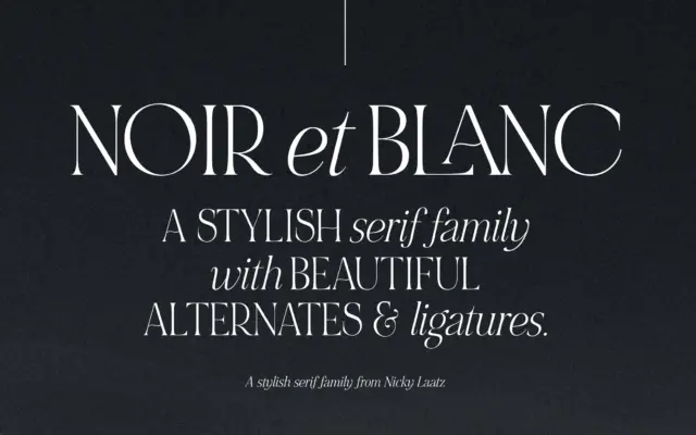
NOIR et BLANC: a contrast serif duo for editorial and branding work
Design style NOIR et BLANC is built around a deliberate mismatch: bold, high-contrast uppercase serifs paired with a slanted, lower-contrast…
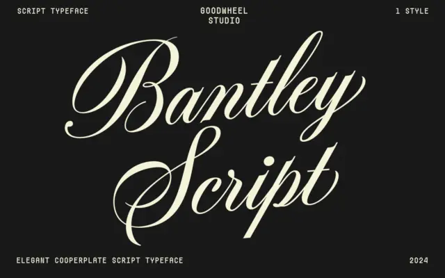
Design style Bantley Script draws on the copperplate calligraphy tradition, the family of scripts built around a pointed nib and…
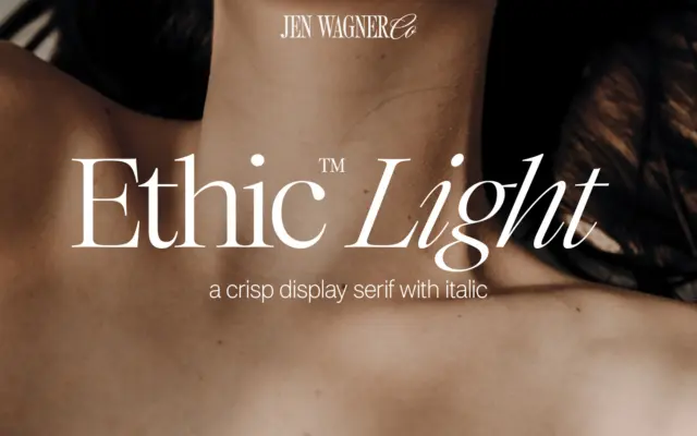
Design style Ethic Light sits in the lineage of high-contrast display serifs, the kind that look like they were cut…
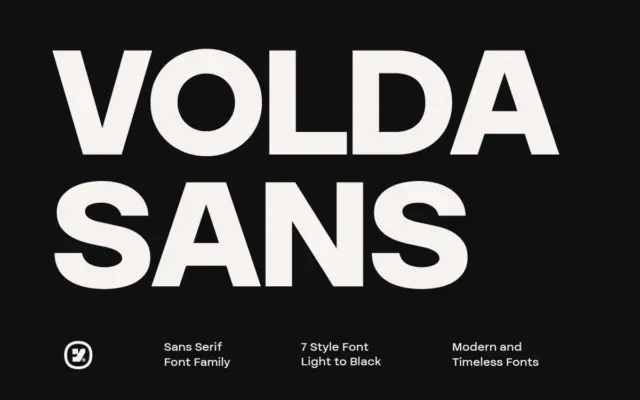
Design style Volda Sans sits in the well-populated middle ground of contemporary grotesques: even stroke modulation, a slightly tightened x-height,…
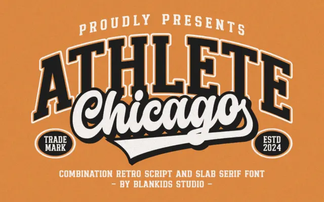
Design style Chicago Athlete pulls from the collegiate athletics playbook: thick slab serifs, squared bowls, and a deliberate wobble in…
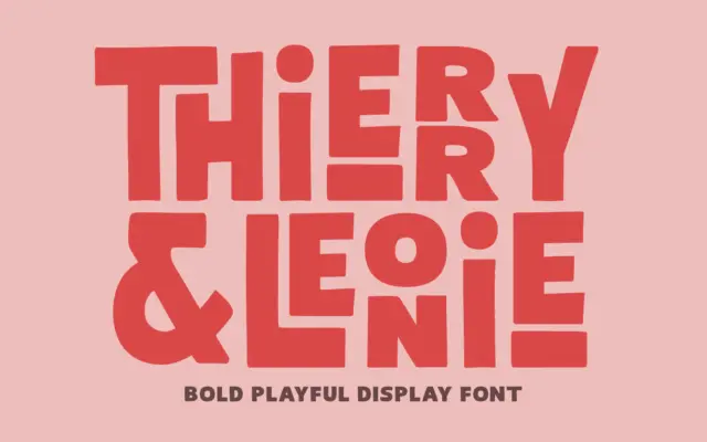
Design style Thierry Leonie sits in that overlap between hand-lettering and display sans, drawn with a bold, condensed skeleton that…
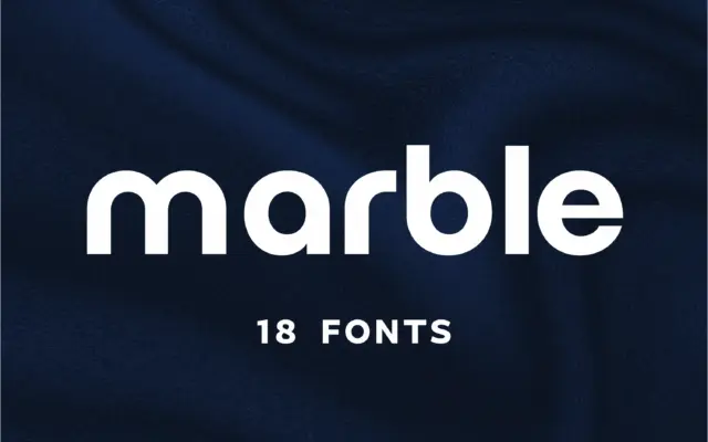
Design style Marble sits in the geometric-minimalist camp of sans serifs, the family of letterforms built from near-perfect circles and…
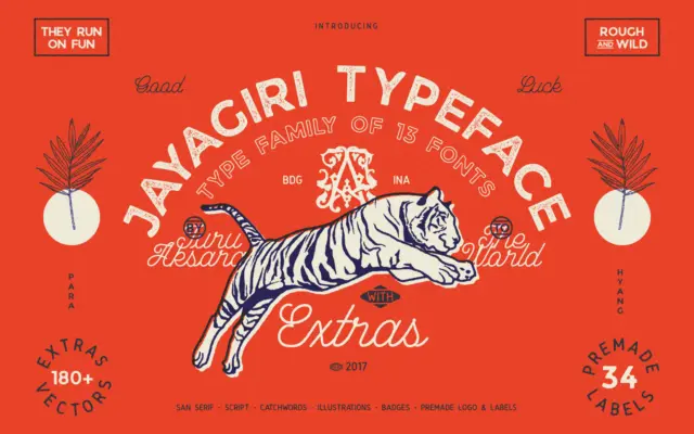
Design style JA Jayagiri is a brush-inflected display face built on a rough, hand-drawn skeleton. The strokes carry uneven edges…
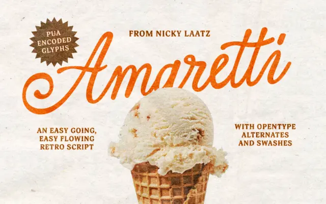
Design style Amaretti belongs to the family of calligraphic scripts built to look hand-lettered rather than machine-drawn, and it pulls…