
Marble: a geometric sans built for logo marks and headline work
Design style
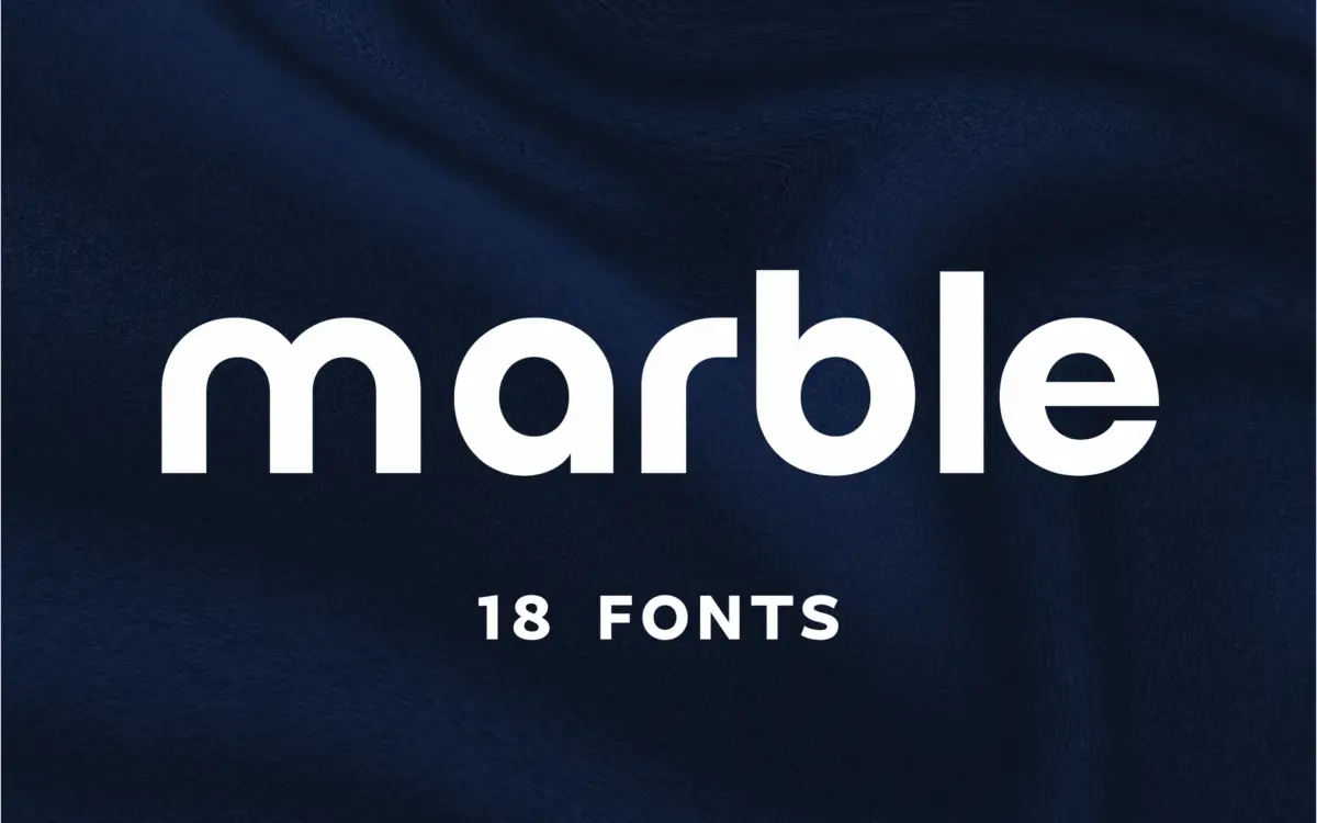
Marble sits in the geometric-minimalist camp of sans serifs, the family of letterforms built from near-perfect circles and straight stems rather than the humanist compromises of a text face. The proportions are confident: wide apertures, consistent stroke weight, and a general refusal to add flourish anywhere it isn’t earning its keep. There’s a slight tightening in the counters of letters like ‘e’ and ‘a’ that gives the face a bit more personality than the stock geometric sans, though it never strays into eccentric territory.
What stands out is the restraint. Marble doesn’t try to be distinctive through gimmick — no swapped terminals, no unusual ductus — it’s distinctive through proportion and spacing discipline. That’s a reasonable strategy for a logo font: the letterforms need to disappear into the mark rather than compete with it. The trade-off is that on its own, set as a paragraph, it reads as competent rather than memorable. This is a face designed to be looked at in short bursts — a wordmark, a headline, a nameplate — not read continuously.

Character set and features
The glyph set covers the Latin alphabet with the punctuation and numerals you’d expect from a branding-oriented release, plus Cyrillic support, which widens its usefulness for agencies working across European markets. Kerning has clearly had attention: pairs that usually cause trouble in geometric sans faces — ‘AV’, ‘To’, ‘LT’ — sit tightly without touching, which matters more in a logo font than almost anywhere else, since a single ugly kerning pair in a wordmark gets baked into a brand for years.
There isn’t a wide range of weights or an italic to speak of in what’s been supplied — this is a single-purpose tool rather than a full family with the kind of weight ladder you’d want for setting body copy or building a complex editorial hierarchy. If you need a sans that scales from footnotes to billboards, Marble on its own won’t get you there; it’s built to do one job at large sizes and do it cleanly.
Use cases
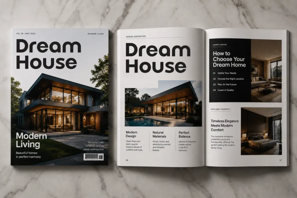
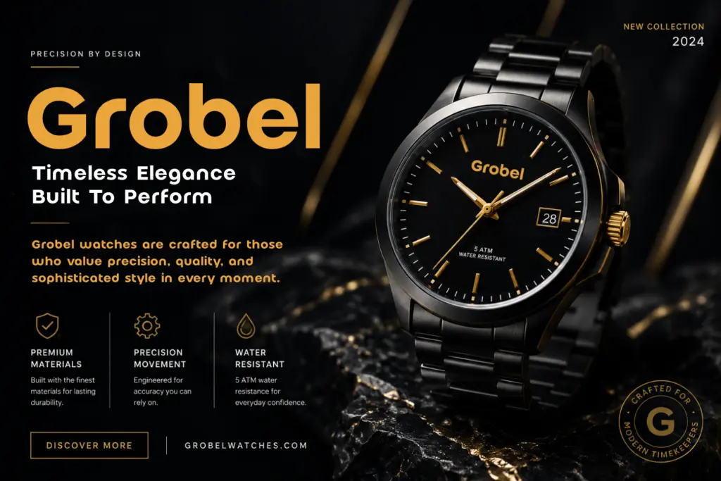
Marble is well suited to wordmarks, logotypes, and short headline treatments where the letterforms need to read as a unit rather than a sentence. Fashion, cosmetics, architecture and tech identity work — the brief’s suggested territory — makes sense given the geometric restraint and the slightly cool, corporate temperament of the letterforms. It would also work as a display face for packaging callouts, business card lockups, or app icon wordmarks where a handful of characters need to carry a lot of visual weight.
It’s less suited to anything requiring sustained reading: body text, long-form editorial, or dense UI copy will expose the lack of a full weight range and the geometric sans’s inherent stiffness at small sizes. Treat it as a logo and headline tool, pair it with a proper text face for anything beyond a few words, and it does its intended job without fuss.
What we liked, and what we didn’t
Strengths
- Kerning on typically troublesome pairs like AV and LT is genuinely tight and clean
- Cyrillic support extends its usefulness beyond Latin-only branding work
- Consistent geometric proportions make it read well as a compact wordmark
Trade-offs
- No visible range of weights limits its use to a single register rather than a full hierarchy
- Stiffens noticeably at small sizes and isn't built for continuous reading
Marble is a tidy, well-kerned geometric sans aimed squarely at logotypes and short headline treatments. It does that job cleanly but offers little beyond it — no weight range, no real presence in body text — so buyers should treat it as a specialist tool rather than a workhorse family.
Verdict

Tantype reviews typefaces in depth — every font is tested in real branding, editorial and screen layouts before a word gets written. 555+ fonts reviewed and counting.