
Thierry Leonie: a bold condensed script for playful branding work
Design style
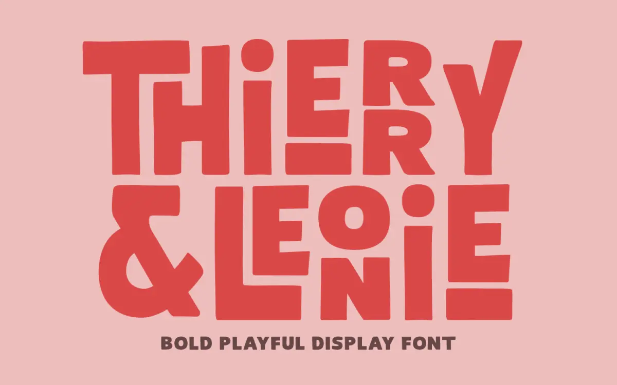
Thierry Leonie sits in that overlap between hand-lettering and display sans, drawn with a bold, condensed skeleton that leans toward mid-century signage rather than contemporary script trends. The strokes are thick and even, the counters tight, and the whole thing reads more like a marker-drawn logotype than a formal script. There’s a rounded, friendly quality to the terminals that softens the boldness, but it never tips into cute — the condensed proportions keep it feeling sturdy and graphic rather than delicate.
What gives it its personality is the joinery. Letters lean into each other, some connecting through ligatures, others just crowding close enough to suggest a single continuous gesture. It’s not a calligraphic script built on consistent slant and pressure; it’s closer to a lettering artist’s rough sketch cleaned up into a usable font. That gives it charm but also a slightly loose, informal rhythm that won’t suit anything asking for polish or restraint.
Character set and features
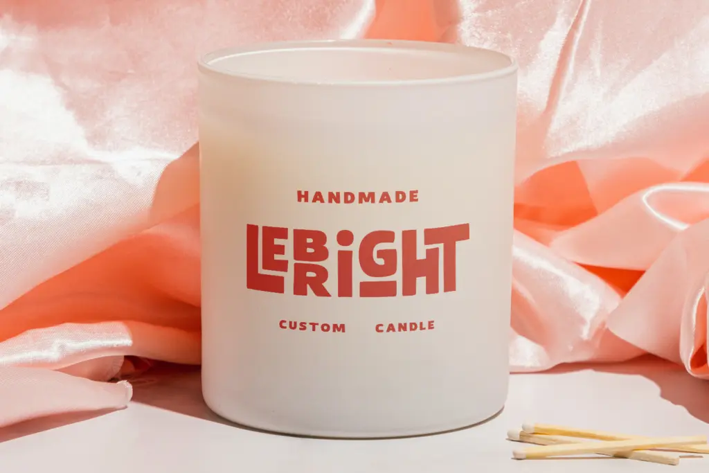
The ligature set is the main feature worth noting, and it’s substantial. Common letter pairs swap into joined alternates automatically or through stylistic sets, which is what lets the font read as continuous lettering rather than a row of separate glyphs. This matters because the base letterforms, on their own, are fairly plain condensed sans shapes — it’s the connections and swashes doing the personality work.
Because the design is condensed and bold by default, there isn’t much room to push weight or width for hierarchy within a single piece of type. You’re largely working with one voice: loud, close-set, and cheerful. That’s fine for a single headline or logotype, less useful if you need the font to flex across a layout with multiple levels of emphasis. Diacritic and extended character support isn’t something the brief specifies, so anyone setting non-English copy should proof it before committing.
Use cases
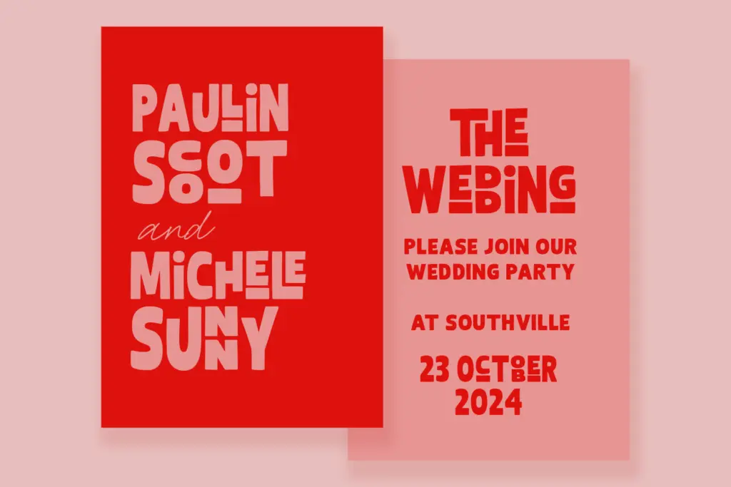
This is a logotype and headline font first. It does well on menu boards, packaging blurbs, poster mastheads, and short brand names where a handful of characters get to occupy real space — the ligatures and tight spacing look intentional at large sizes and lose coherence the smaller you go. Anything under display size starts to muddy, since the joins and condensed counters need room to breathe.
It pairs naturally with quirky food and beverage branding, kids’ products, event signage, and anything wanting a retro-tinged, hand-made feel without going full script-calligraphy. It’s less suited to editorial text, anything needing multilingual reliability, or brands wanting a quieter, more restrained mark — the font has one register, and it’s turned up. Designers should plan to use it sparingly: a wordmark, a headline, maybe a badge lockup, rather than a whole system of type.
What we liked, and what we didn’t
Strengths
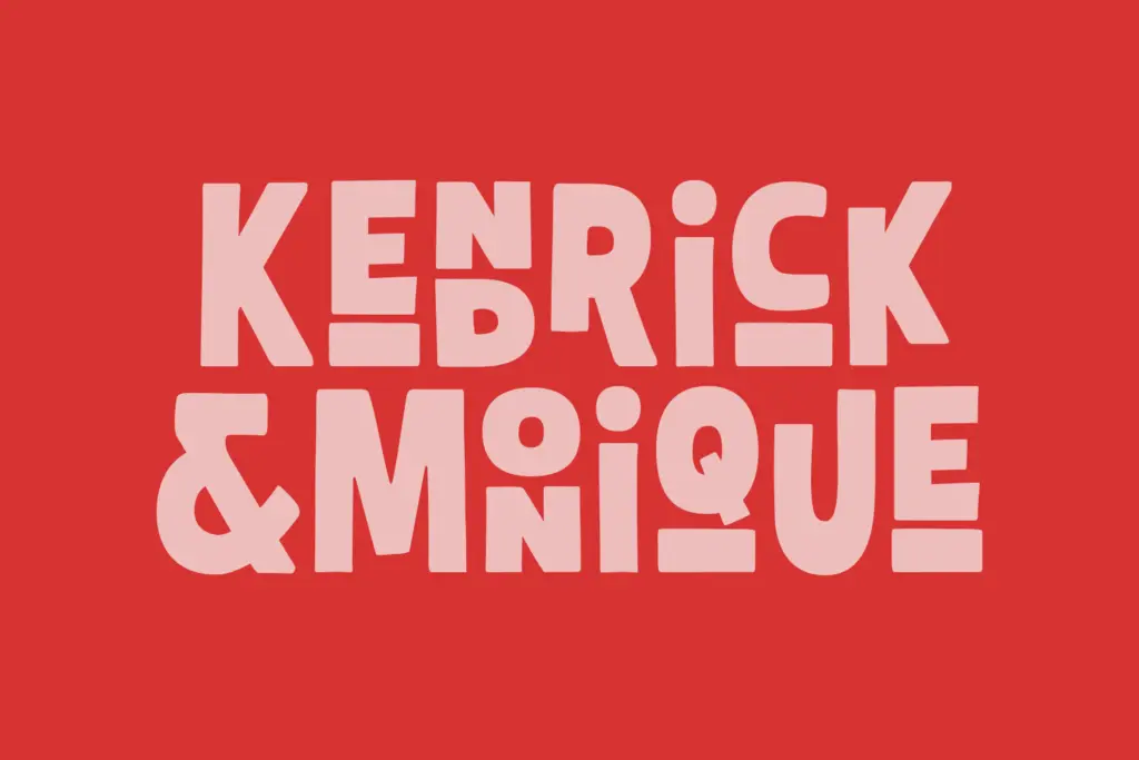
- Ligature set makes joined letter pairs read as continuous hand-lettering rather than separate glyphs
- Bold condensed proportions give it presence on packaging and signage at large sizes
- Rounded terminals keep the boldness feeling friendly rather than aggressive
Trade-offs
- Tight spacing and joins lose clarity quickly below display size
- Single weight and width mean little room for internal hierarchy within a layout
Thierry Leonie is a solid choice for a single loud headline or logotype where personality matters more than legibility. Its ligature-driven joins give it charm at large sizes, but the condensed, single-register design limits how far it can stretch across a project. Best used sparingly, not as a workhorse.
Verdict

Tantype reviews typefaces in depth — every font is tested in real branding, editorial and screen layouts before a word gets written. 555+ fonts reviewed and counting.