
Chicago Athlete: a varsity slab-and-script duo for team-branded logos
Design style
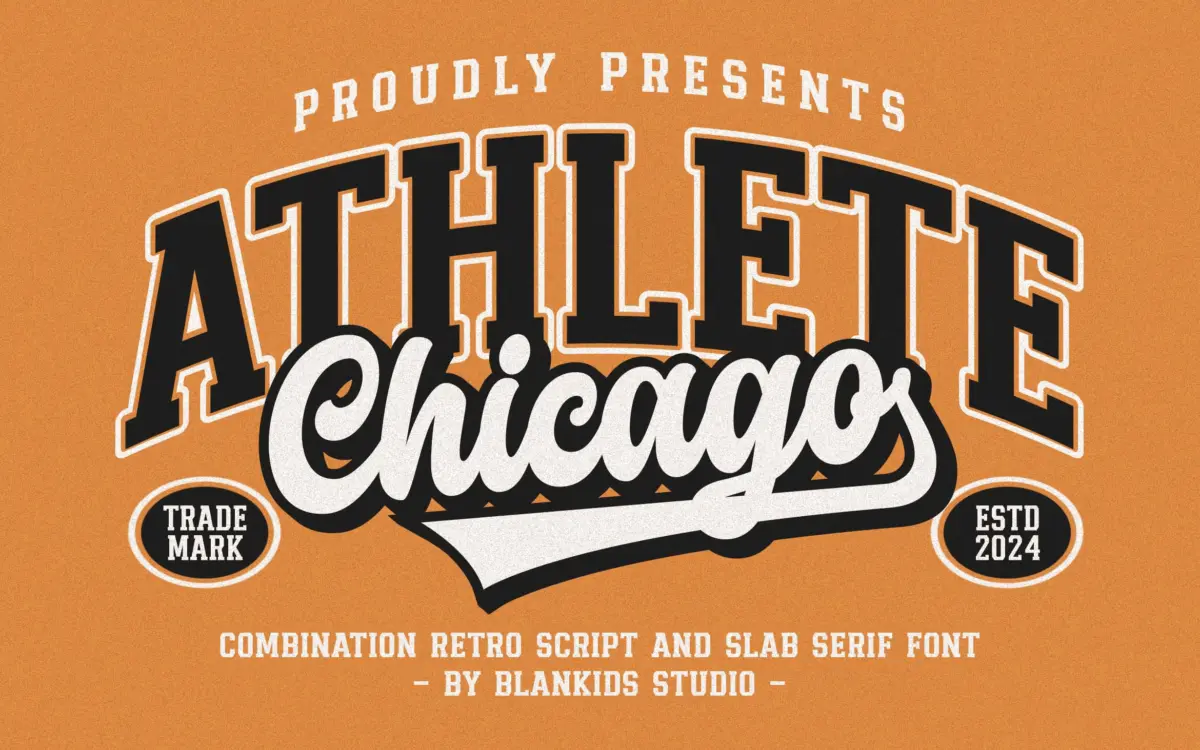
Chicago Athlete pulls from the collegiate athletics playbook: thick slab serifs, squared bowls, and a deliberate wobble in the strokes to suggest a hand-cut letterpress plate rather than a vector file. The slab weights carry the heaviest visual load — bracketed serifs, blunt terminals, and a slight unevenness in stroke width that reads as intentional roughness rather than sloppiness. It’s the kind of texture that photocopies and screen-prints well, which is clearly the point.
The script companions lean into varsity script territory — the kind of looping, slightly leaning cursive you’d see stitched on a letterman jacket. They’re built to sit inside or beside the slab caps rather than stand alone, and they work best that way. On their own, the scripts feel thin and a bit generic; paired with the slab, they earn their keep as the secondary voice in a two-line lockup.
Character set and features
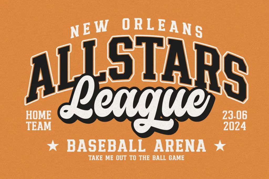
Four fonts ship in the family: two slab serif styles and two scripts, each covering uppercase and lowercase, numerals, and standard punctuation. There’s no mention of alternates, ligatures, or extended language support, so treat this as a Latin-only, no-frills set rather than a feature-rich OpenType build. That’s fine for what it’s for — badge and crest work rarely needs swash alternates — but designers hoping for stylistic variety within a single style will need to do that legwork with layering and scale rather than glyph substitution.
The lowercase in the slab styles is serviceable but secondary; the font is clearly drawn with all-caps lockups in mind, and lowercase paragraphs of any length start to show the rougher edges of the letterforms — inconsistent baseline texture that reads as charming at display size becomes distracting once you’re setting more than a word or two. The numerals are a strong point: chunky, sport-jersey-ready, and probably the most useful single element in the set for anyone doing team or event numbering.
Use cases
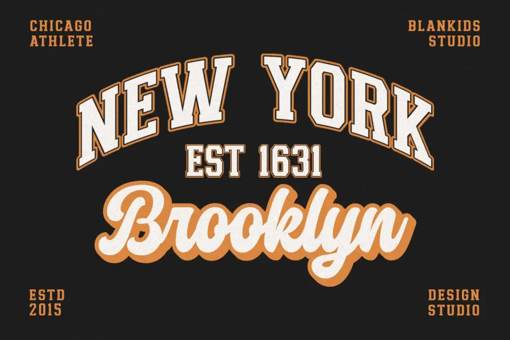
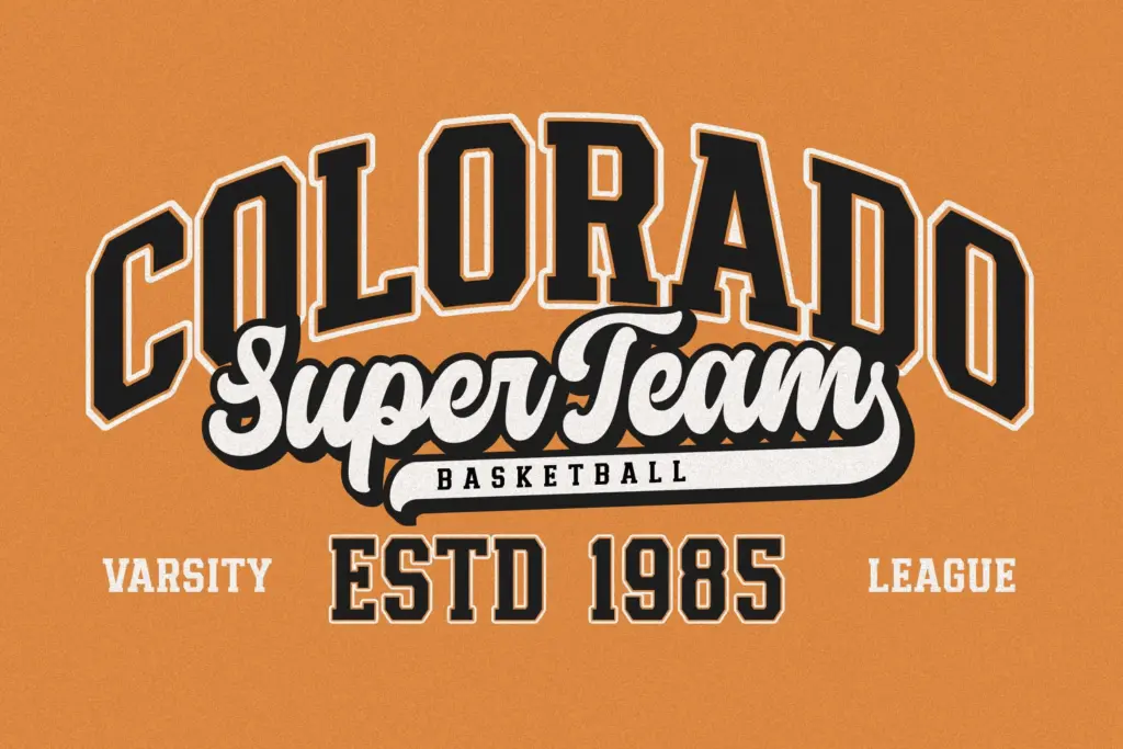
This is a logotype and badge font first. Team crests, varsity jacket graphics, product packaging that wants a nostalgic sports-league feel, gig posters for anything with a retro-Americana bent — Chicago Athlete slots into all of that without much persuasion needed. The four-font structure is built around a specific formula: slab for the main word, script for a tagline or secondary line, and that combination does look considerably more finished than either style alone.
It’s less suited to anything requiring sustained reading — body copy, editorial text, long-form packaging copy — where the deliberate roughness turns into friction. And because the retro-sporty aesthetic is so specific, it won’t quietly disappear into a brand system the way a neutral slab would; it commits you to a look. For the right brief — apparel, sports branding, nostalgic promotions — that commitment is exactly the value. For anything more restrained, it’ll fight the rest of the layout.
What we liked, and what we didn’t
Strengths
- Slab weights have genuine letterpress-style texture that suits crest and badge work
- Numerals are chunky and well-suited to jersey or team-number use
- Slab and script styles are designed to pair, giving a finished two-line lockup without extra work
Trade-offs
- Lowercase paragraphs reveal roughness that undermines readability beyond short phrases
- Script styles feel thin and generic when used without the slab companion
Chicago Athlete does one job well: varsity-style logotypes and badges with a retro sporting feel. It's not built for reading at length or for brands wanting a neutral, flexible voice, but within its lane it's a confident, usable set.
Verdict

Tantype reviews typefaces in depth — every font is tested in real branding, editorial and screen layouts before a word gets written. 555+ fonts reviewed and counting.