
NOIR et BLANC: a contrast serif duo for editorial and branding work
Design style
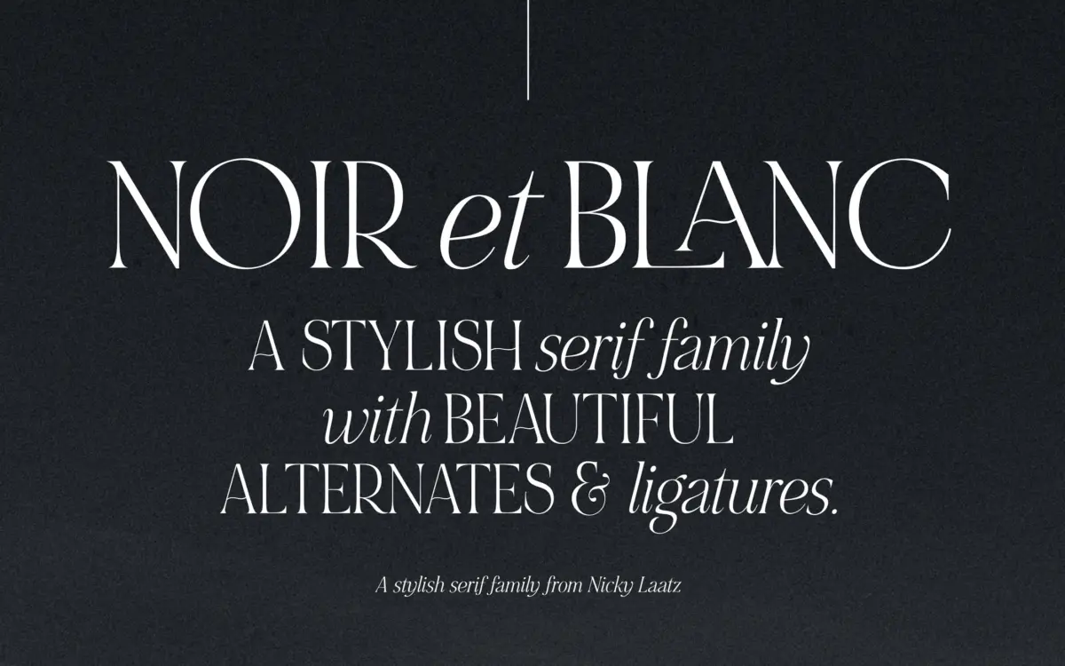
NOIR et BLANC is built around a deliberate mismatch: bold, high-contrast uppercase serifs paired with a slanted, lower-contrast italic lowercase. The idea is that you mix the two together rather than use either as a complete alphabet on its own. The uppercase has real weight to it — thick vertical strokes, sharp bracketed serifs, a kind of theatrical stance that reads as confident rather than fussy. The italic lowercase is softer, with more taper in the stroke and a looser, handwritten quality that keeps it from feeling like a straight didone.
The name gives away the intent. This is a black-and-white typeface in spirit as much as in colour palette: it wants stark backgrounds, generous negative space, and copy that isn’t afraid of a large point size. It comes in three lightly varying weights, which is a modest but useful range — enough to shift emphasis without needing a whole family of intermediate cuts.
Character set and features
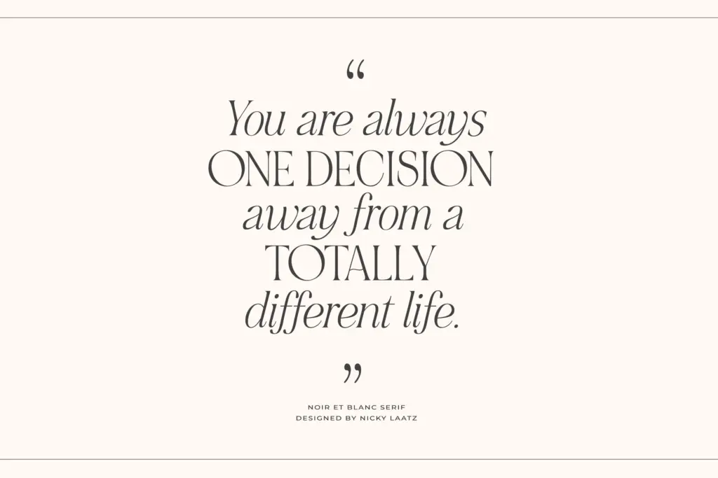
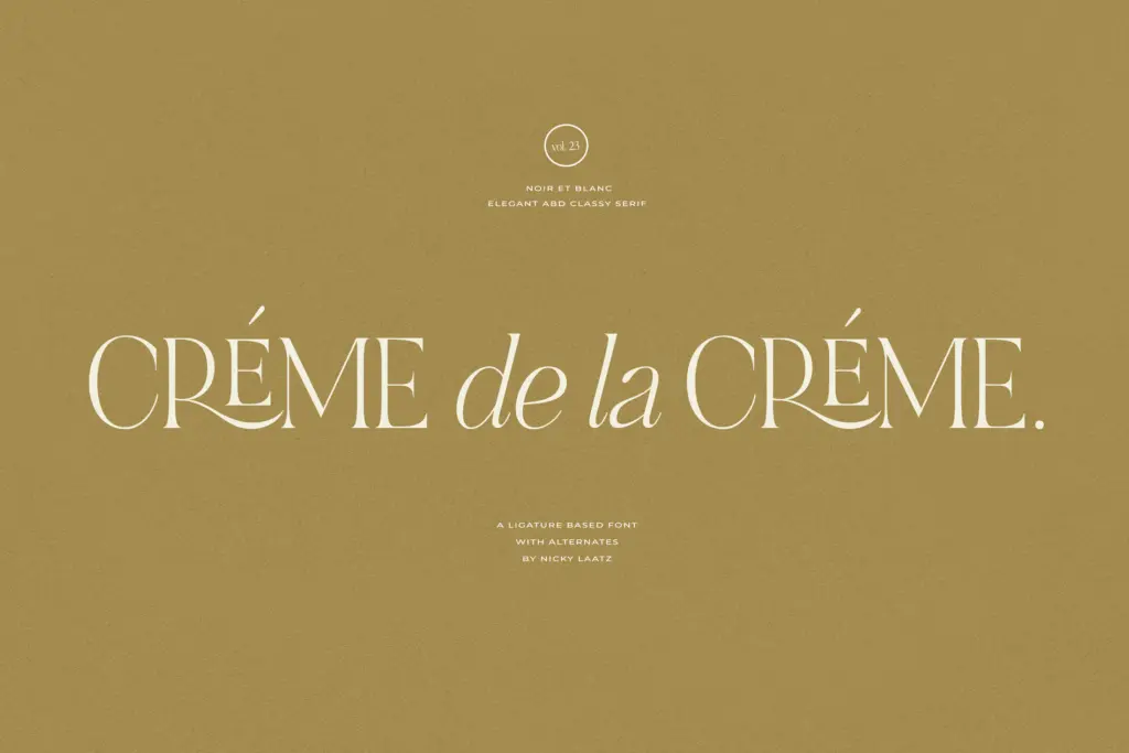
The ligatures and alternates are where the design earns its keep. There’s a set of connecting ligatures for the italic lowercase that link letters into small flourishes, plus swash alternates for select capitals. Used sparingly, on a word or two, they give the typeface a sense of occasion — a monogram, a title line, a single word on a cover. Used across a whole paragraph, they get busy fast; this is not a typeface built for long-form alternate use, and the seller doesn’t pretend otherwise.
Accessing those ligatures and alternates requires OpenType-aware software; without it you get the standard glyph set, which is competent but noticeably plainer than the marketing images suggest. The included Canva-ready files are a practical nod to that gap, since Canva’s OpenType support has historically been limited. Language support covers several Western European languages — Danish, Finnish, French, German, the Nordic languages, Portuguese and Spanish among them — so accented setting in those languages should hold up.
Use cases
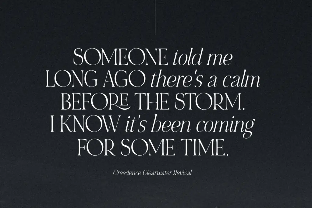
This pairing works best as a display device: a logotype, a wordmark, a large headline on a poster or a book cover, a monogram for stationery. The contrast between the bold uppercase and the sultry italic lowercase gives a wordmark two distinct voices in one setting, which is a genuinely useful trick for branding work that wants a bit of drama without commissioning two separate typefaces.
It is not a body-text serif, and treating it as one will disappoint you — the bold uppercase is too heavy and too idiosyncratic for paragraphs, and the connected italic lowercase loses clarity below a certain size. Where it earns its place is in short-form settings: invitation lettering, packaging front-of-pack type, editorial drop caps and section openers, a single line on a business card. Anyone doing quiet, minimal branding with an occasional flourish will get more mileage from it than someone needing a full-service text family.
What we liked, and what we didn’t
Strengths
- The bold uppercase and sultry italic lowercase genuinely complement each other as a mixed-case display device
- Connecting ligatures and swash alternates give wordmarks a distinctive, handmade flourish when used sparingly
- Three weights and a Canva-ready pack make it workable across a reasonable range of design tools
Trade-offs
- Not suited to body text — legibility drops fast at smaller sizes and in longer passages
- Full ligature and alternate access requires OpenType-capable software, so casual users may only see the plainer default glyphs
NOIR et BLANC is a striking display pairing built for short bursts of type — logos, monograms, headline moments — not for setting paragraphs. The ligatures and alternates add real character when used sparingly, but they demand OpenType-aware software and restraint from the designer using them.
Verdict

Tantype reviews typefaces in depth — every font is tested in real branding, editorial and screen layouts before a word gets written. 555+ fonts reviewed and counting.