
Bantley Script: a copperplate-style script for polished branding work
Design style
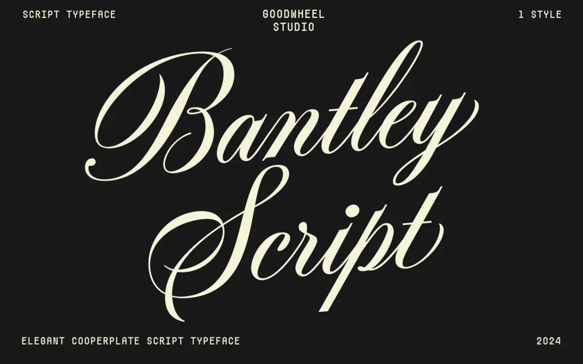
Bantley Script draws on the copperplate calligraphy tradition, the family of scripts built around a pointed nib and a controlled contrast between thin upstrokes and heavier downstrokes. That heritage is visible in the way the strokes swell and taper — nothing here is drawn with a flat pen, and the letters keep a consistent diagonal stress that gives the whole set a formal, engraved quality rather than a loose, brush-drawn one.
The swashes are the most obvious design decision. Capitals extend into long entry and exit strokes, and several lowercase letters carry ascender or descender flourishes that reach well outside the x-height. Used sparingly, these give headlines a sense of occasion. Used in a run of body text, they would collide constantly, so this is a font that expects to be set large, short, and with room around it.
Stroke endings are handled with more restraint than the swashes suggest. Rather than a single blunt terminal repeated everywhere, the font varies how strokes finish depending on what follows, which keeps the rhythm from feeling mechanical. It reads as a script that was drawn letter by letter with an eye on how pairs of letters actually meet, not just a single glyph shape duplicated across the alphabet.
Character set and features
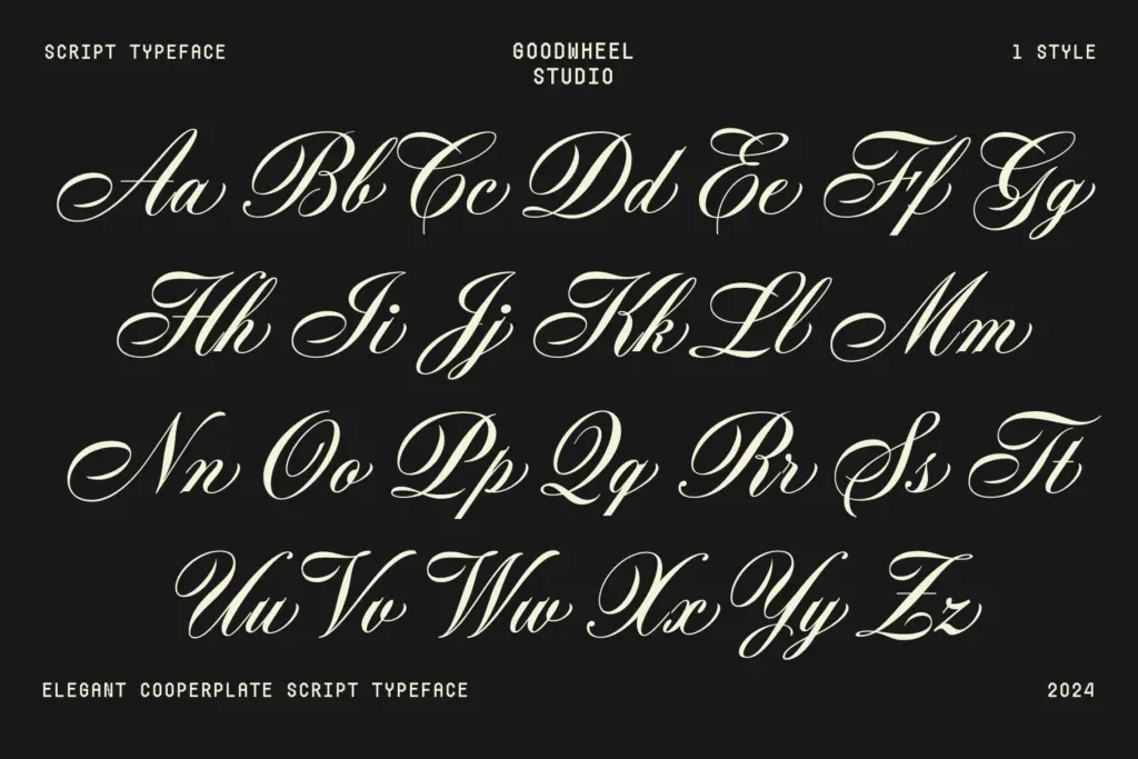
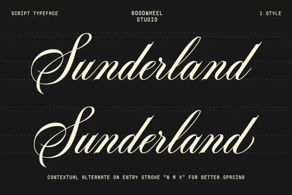
The seller lists contextual alternates for n, m and x, aimed at improving spacing where these letters would otherwise crowd their neighbours or clash with a following swash. That’s a sensible, narrow fix rather than a sweeping alternate system, and it matters because scripts with this much lateral reach are prone to awkward collisions without it.
Ascender and descender swashes extend the character set beyond plain letterforms, giving designers a way to open or close a word with more flourish without switching to a separate display face. Fractions are included too, a small but practical addition for anyone setting recipe cards, measurements, or pricing in a menu.
Language support is described as covering 68 languages under a Windows 1252 character set, which suggests reasonable coverage of Western European diacritics rather than full Unicode-scale reach. Anyone working in a language with less common accented characters should check the glyph list before committing a layout to it.
Use cases
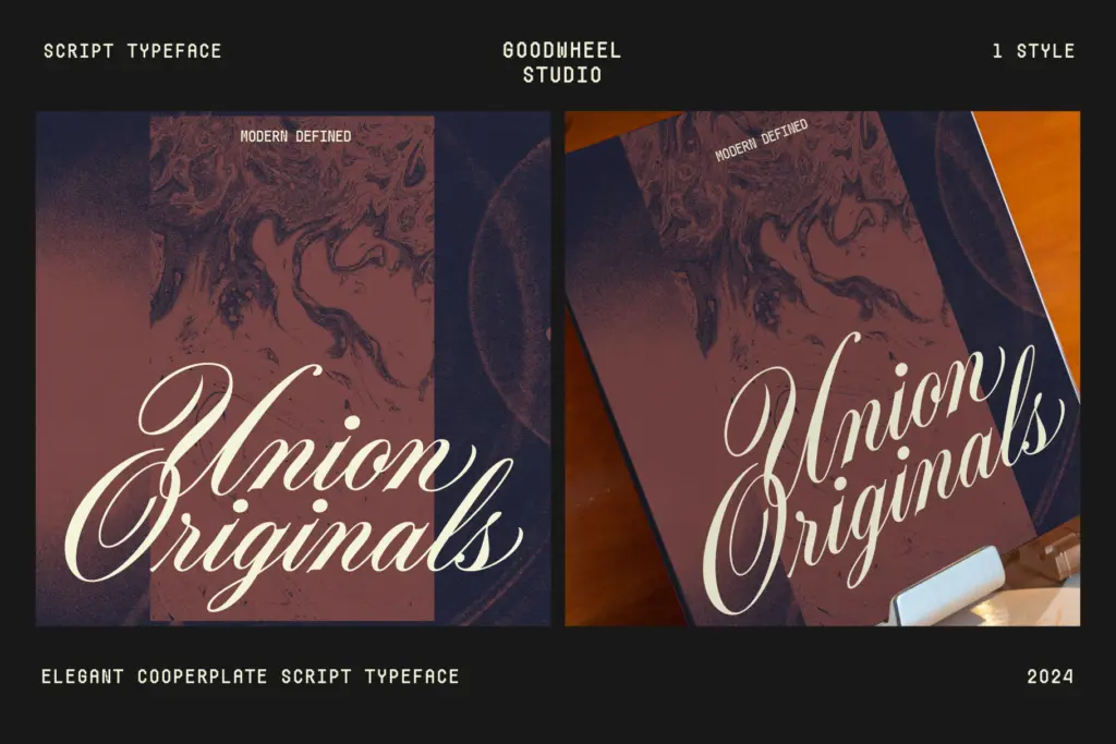
Bantley Script sits comfortably in the same territory as most copperplate-inspired scripts: wedding stationery, invitation suites, monogram-style logotypes, and packaging that wants to signal craft or heritage rather than speed. The swash capitals make strong opening initials or short signature-style lockups — a name, a single word, a short phrase set large.
It’s less suited to anything that needs to run as a sentence or paragraph. The contrast and swash reach that make it distinctive at display sizes will blur and tangle at small ones, so pair it with a plain sans or serif for supporting text rather than asking it to do double duty. For logo work, give the swashes space to breathe — cramping this font against other elements undoes the formality it’s built around.
What we liked, and what we didn’t
Strengths
- Contextual stroke endings and alternates for n, m and x reduce awkward collisions between swashes
- Ascender and descender swashes give strong options for short display settings and monograms
- Fraction glyphs are a practical extra for menus, labels and packaging
Trade-offs
- Long swashes make the font unreadable at body copy sizes and unforgiving in tight layouts
- Windows 1252 character coverage means non-Western diacritics should be checked before use
Bantley Script is a well-drawn take on copperplate calligraphy, with genuine attention paid to how strokes meet rather than just how flamboyant they look. It's built for short, large-scale settings — logotypes, monograms, invitation headers — and will struggle anywhere it's asked to run as continuous text.
Verdict

Tantype reviews typefaces in depth — every font is tested in real branding, editorial and screen layouts before a word gets written. 555+ fonts reviewed and counting.