
JA Jayagiri: A Rough Hand-Lettered Display Face for Badges and Streetwear
Design style
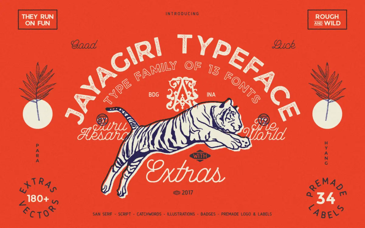
JA Jayagiri is a brush-inflected display face built on a rough, hand-drawn skeleton. The strokes carry uneven edges and inconsistent pressure marks that read as marker or brush work rather than a cleaned-up vector outline. There’s a deliberate distressed quality throughout: stroke joins are ragged, terminals fray rather than taper cleanly, and the baseline wanders in a way that feels intentional rather than sloppy. This puts it in the same broad territory as the badge and patch lettering that’s common in streetwear and motorcycle graphics, where texture is the point rather than a flaw to be smoothed out.
The letterforms lean condensed and upright, with a slight forward energy in the diagonals that gives the face some motion without tipping into full script territory. It’s closer to lettering than typography in spirit — you can feel the hand behind it — and that’s both its appeal and its limitation.
Character set and features
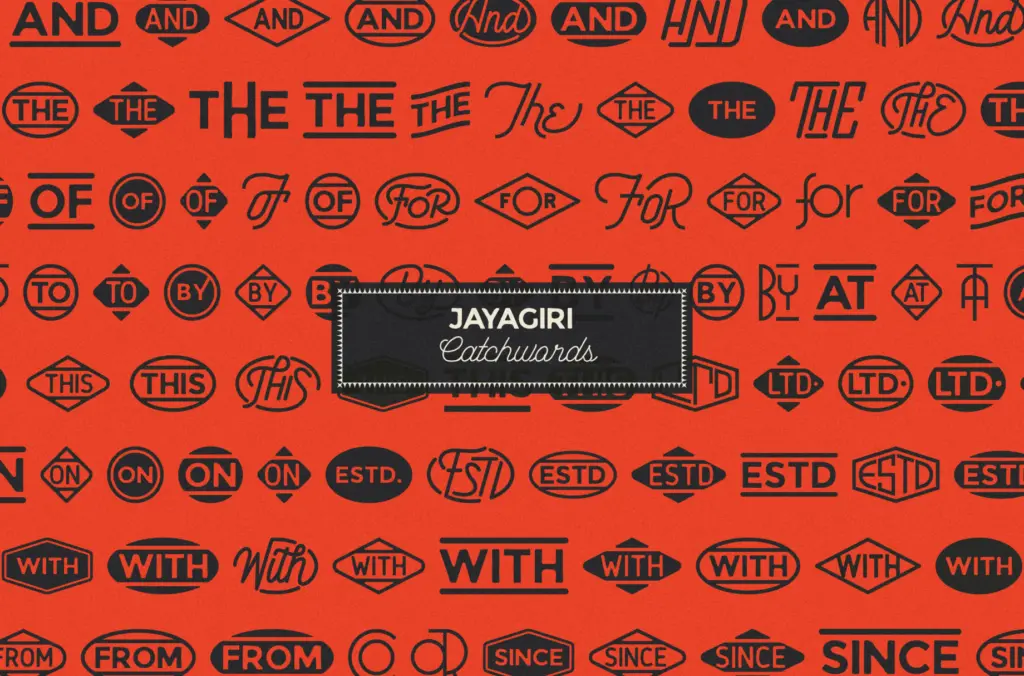
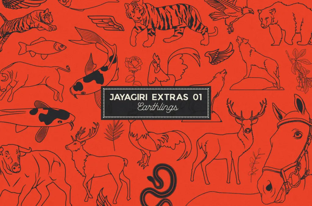
The ‘Extras’ portion of the package suggests supplementary glyphs, ligatures, or ornamental marks beyond the base alphabet, which is typical for this kind of hand-lettered release. Fonts in this category usually ship with basic Latin coverage, alternate letterforms for key characters, and sometimes a set of catchwords, badges, or decorative flourishes to bolt onto a composition. Treat any multilingual or extended-character claims cautiously unless you’ve confirmed the glyph list yourself — rough, gestural faces like this one often prioritise a strong core alphabet over exhaustive diacritic support.
The rough texture that gives the face its character also means kerning and spacing need attention. Distressed strokes can create visual gaps or collisions depending on letter pairing, so this isn’t a typeface you drop into a paragraph and walk away from — it wants a hands-on eye at the point of use, especially in tight word marks or logotypes.
Use cases
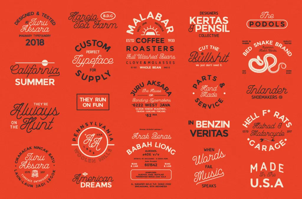
This is a display face, full stop. It belongs on badges, patches, stamps, T-shirt graphics, and short logotypes where a handmade, worn-in feel is the goal. Motorcycle branding, outdoor and adventure labelling, and urban or streetwear apparel are the natural home for something this textured — anywhere a design wants to look carved, stamped, or scrawled rather than typeset.
It is not built for body copy, long-form editorial work, or anything requiring sustained reading. At small sizes the rough edges and irregular strokes will blur into noise rather than character; save it for headlines, single words, or short phrases set large. Pair it with a plain, quiet sans or serif for supporting text rather than asking it to do double duty as both display and body face — it doesn’t have the range for that, and it isn’t trying to.
Designers looking for a controlled, corporate-friendly hand-lettered face should look elsewhere; this one is rough by design and won’t clean up nicely under a client who wants
What we liked, and what we didn’t
Strengths
- Distressed, brush-like texture gives it an authentic handmade feel
- Condensed, upright structure suits badges and stamp-style lockups well
- Extras package likely adds decorative or alternate glyphs for composition flexibility
Trade-offs
- Irregular strokes make it unreadable at small sizes or in long text
- Rough texture demands manual kerning attention in tight word marks
JA Jayagiri is a solid choice if you need a rough, hand-carved feel for badges, patches, and apparel graphics. It's a one-trick face, but the trick is executed with enough texture and personality to be genuinely useful in that narrow lane. Don't expect it to flex into body text or polished corporate branding.
Verdict

Tantype reviews typefaces in depth — every font is tested in real branding, editorial and screen layouts before a word gets written. 555+ fonts reviewed and counting.