Serif
3.9
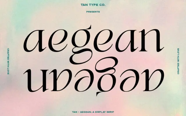
TAN Aegean: a display serif with classic bones and a wink of attitude
Design style TAN Aegean sits in that familiar territory of high-contrast display serifs built on classical proportions, but it doesn’t…
 Tantype

Design style TAN Aegean sits in that familiar territory of high-contrast display serifs built on classical proportions, but it doesn’t…
Tantype
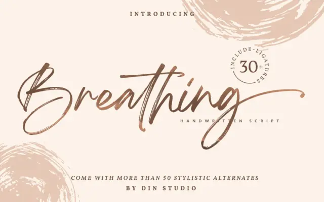
Design style Breathing sits in the crowded field of brush signature scripts, the kind built to look like a felt-tip…
Tantype
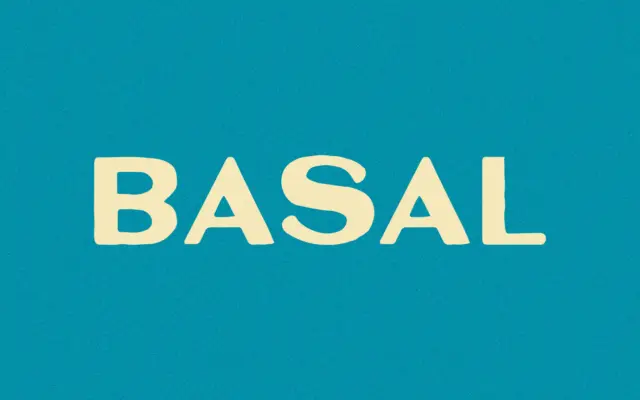
Design style Basal is a bold sans with a blunt, condensed-adjacent posture that reads more like a stencil-plate mark than…
Tantype
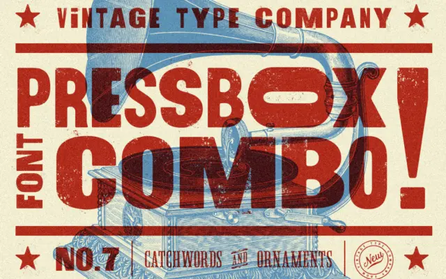
Design style PressBox belongs to the well-worn tradition of American wood-type revival: thick, confident sans-serif letterforms that lean on the…
Tantype
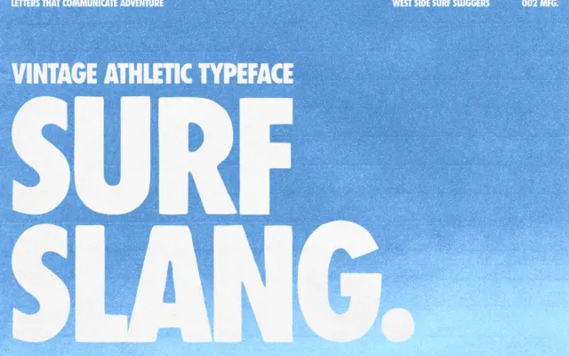
Design style Surf Slang is a bold, condensed sans built for shouting rather than reading. The letterforms are tall and…
Tantype
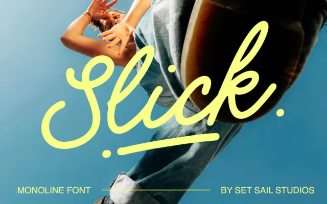
Design style Slick is a monoline script, meaning the stroke doesn’t swell and taper the way a brush or pointed-pen…
Tantype
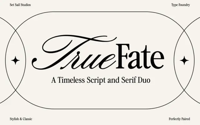
Design style True Fate arrives as two fonts asked to do one job together. The script half is a roundhand…
Tantype
Design style Qualy is a geometric sans reduced to its bare structural bones. Circles read as circles, verticals are dead…
Tantype
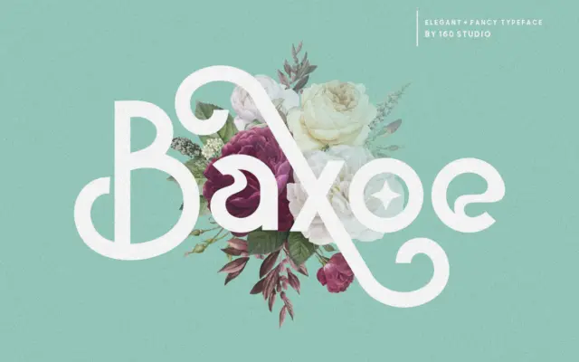
Design style Baxoe sits in an odd but interesting corner of the sans serif category. The skeleton is simple and…
Tantype