
Ethic Light: a crisp display serif for restrained, editorial branding
Design style
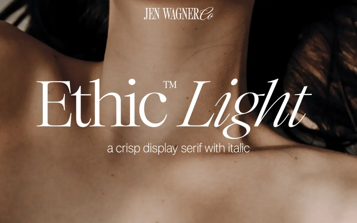
Ethic Light sits in the lineage of high-contrast display serifs, the kind that look like they were cut with a scalpel rather than a pen. The strokes swing from thin to thick with real conviction, and the thin strokes are drawn genuinely thin, not just thinner. That contrast gives the letterforms a cool, formal air rather than a bookish one. The serifs themselves are flat-bracketed and short, almost bracket-free in places, which keeps the whole face feeling tight and controlled rather than ornamental.
What stands out is restraint. Nothing about the design reaches for attention through flourish; the personality comes entirely from the stroke contrast and the crispness of the cuts. Curves are kept fairly narrow, counters are a touch closed, and the x-height sits on the shorter side, which pushes the face further into display territory than text territory despite the name suggesting a lighter, more general-purpose weight.
Character set and features
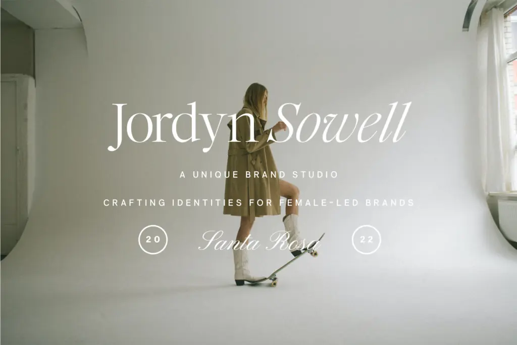
The face includes an italic, which leans more calligraphic than the upright, loosening the geometry a little and giving the family somewhere to go when the upright starts to feel too stiff on the page. Pairing the two within a single piece of copy — upright for a headline, italic for a supporting line — is really the intended rhythm of the family, and it works better than either style used entirely on its own.
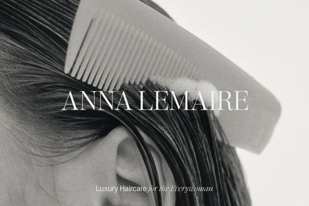
As with most single-weight display serifs sold this way, don’t expect a full range of optical sizes or weights baked in. This is one instrument, tuned for a specific job: short lines, generous point sizes, plenty of surrounding white space. Push it into a paragraph of body copy and the high contrast starts to flicker and vibrate, thin strokes dropping out at smaller sizes. That’s not a flaw so much as a boundary — the name says Light, but it behaves like a display cut, and treating it as one is what gets the best out of it.

Use cases
Ethic Light is well suited to branding work that wants a serif with edge rather than warmth: masthead logotypes, editorial titles, packaging that needs a single strong word to carry the design. It reads well as a pull quote treatment too, where the italic can do quiet work alongside a plainer sans for body text. On social graphics, a short phrase set large in Ethic Light photographs cleanly, and the contrast holds up even when compressed for screen.
Where it struggles is in longer-form settings. Book interiors, dense paragraphs, anything under about 14pt on screen — the thin strokes get lost and the rhythm that makes it distinctive at large sizes just reads as uneven at small ones. Treat it strictly as a headline or accent face, keep the tracking generous, and it earns its keep. Ask it to do a text face’s job and it will show you why it’s called a display serif.
What we liked, and what we didn’t
Strengths
- High stroke contrast gives headlines real presence at large sizes
- Italic is genuinely distinct from the upright, useful for pairing within one layout
- Clean, restrained serif cuts avoid feeling dated or overworked
Trade-offs
- Thin strokes break down at body-text sizes, limiting it to display use
- Single weight means no built-in range for hierarchy within a project
Ethic Light is a confident, tightly cut display serif that photographs well at large sizes and adds edge to branding and editorial headlines. It's not built for body copy or small sizes, and the single weight limits how far it can stretch across a project. Used within its lane — short lines, generous space, a supporting italic — it does exactly what it promises.
Verdict

Tantype reviews typefaces in depth — every font is tested in real branding, editorial and screen layouts before a word gets written. 555+ fonts reviewed and counting.