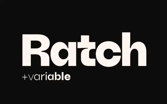
Ratch: A Geometric Grotesk with Personality for Brand Systems
Design style Ratch sits in familiar geometric grotesk territory but doesn’t stay quietly there. The circular bowls, near-monolinear strokes, and…
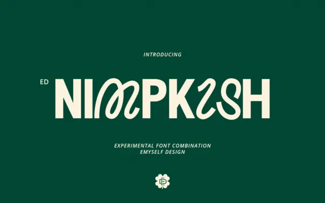
Design style ED Nimpkish is built on a single, slightly odd premise: the uppercase and lowercase don’t belong to the…
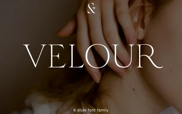
Design style Velour sits in that familiar territory of thin, bracketed serif display faces built for headlines rather than paragraphs.…
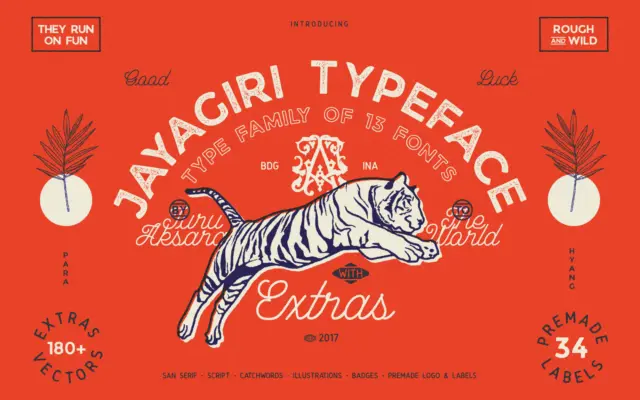
Design style JA Jayagiri is a brush-inflected display face built on a rough, hand-drawn skeleton. The strokes carry uneven edges…
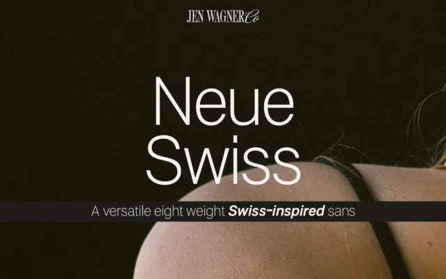
Design style Neue Swiss sits in the well-worn tradition of the neo-grotesque revival: closed apertures, low stroke contrast, a quiet…
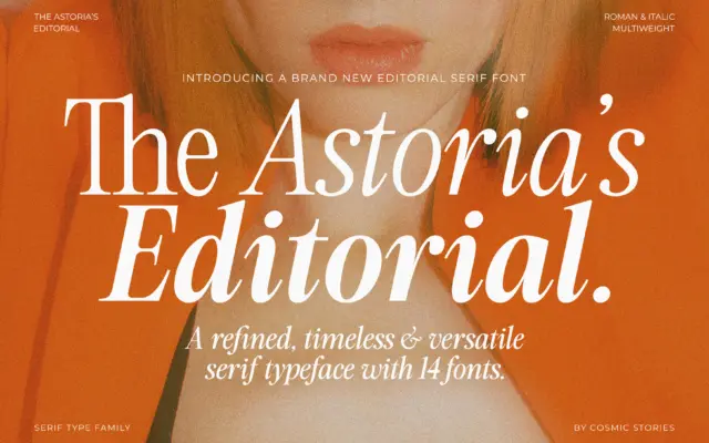
Design style The Astoria’s Editorial Serif sits in a familiar but well-populated lane: the advertising-inspired serif that borrows its bones…
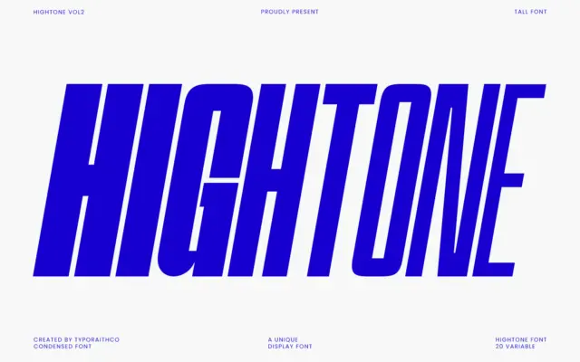
Design style Hightone is a condensed sans pushed hard toward the vertical. Letters are narrow, strokes are even, and the…
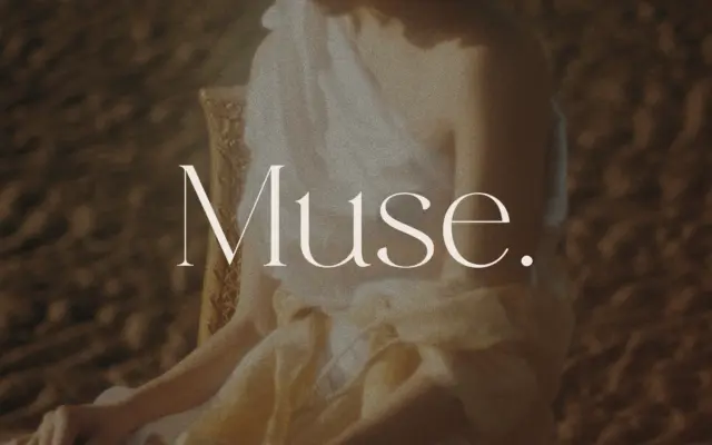
Design style Muse belongs to the modern-serif family that fashion branding has leaned on for years: hairline serifs, dramatic thick-thin…
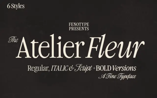
Design style Atelier Fleur takes Garamond’s old-style bones and squeezes them into a condensed frame built for headline duty rather…