
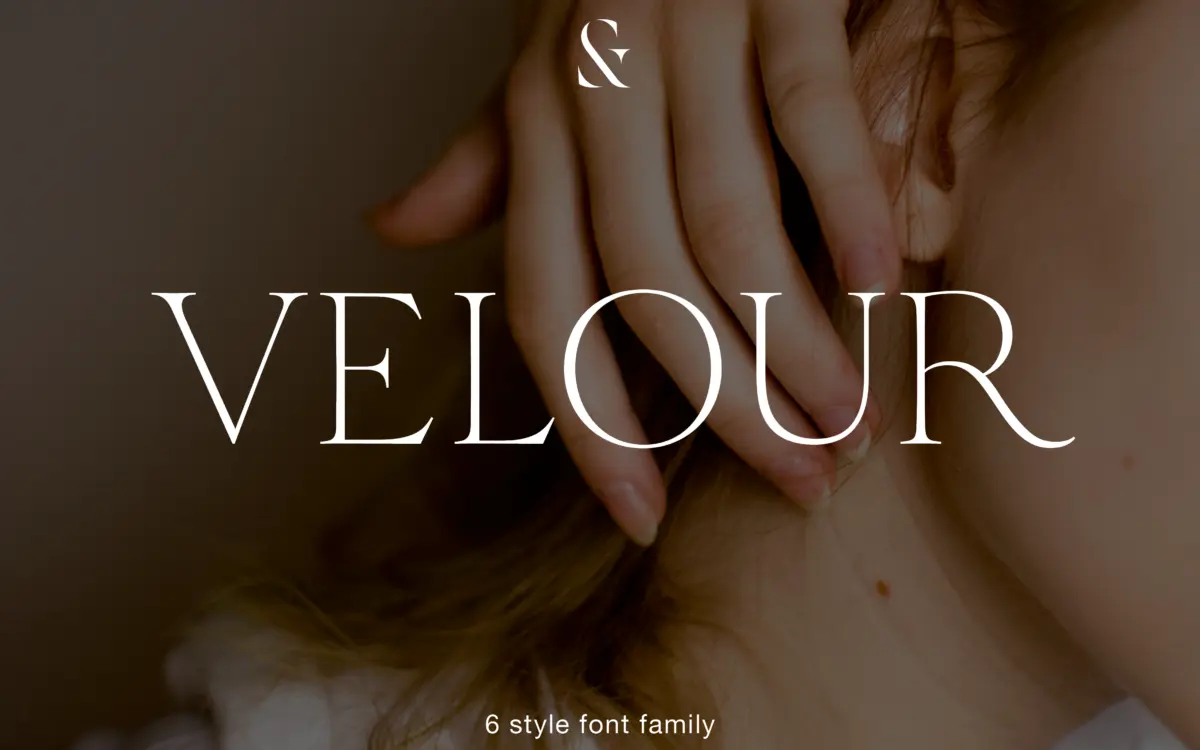
Velour: a six-weight editorial serif with romantic, curved-crossbar detailing
Design style
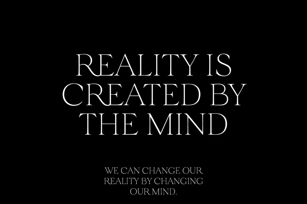
Velour sits in that familiar territory of thin, bracketed serif display faces built for headlines rather than paragraphs. What separates it from the crowd of similar releases is a set of small, deliberate curves: the crossbars on ‘A’ and ‘H’ bow rather than sit flat, and the legs of ‘K’ and ‘R’ extend further than structural necessity would demand. These are the kind of details that read as flourish at large sizes and disappear at small ones, which tells you exactly where this typeface wants to live.
The contrast is high but not brittle — hairline serifs paired with strokes that swell just enough to keep letterforms from looking starved. Across six weights, from Thin to Bold, that contrast scales sensibly. The Thin weight is genuinely thin, verging on fragile in tight settings, while the Bold holds its shape without losing the delicacy that defines the family. It’s a serif with a point of view, but that point of view is narrow: romantic, slightly theatrical, unmistakably editorial.
Character set and features
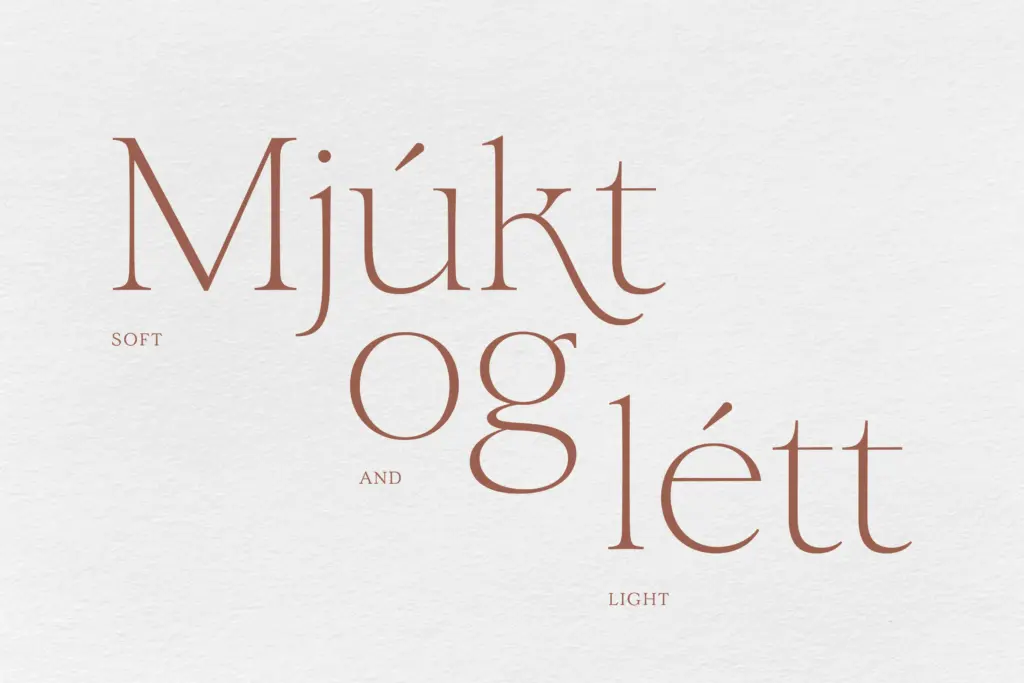
Velour ships with both standard and old-style figures, which is a genuine convenience — old-style numerals sit better in running text and captions, standard ones in headlines and pull quotes needing more punch. Two ampersands give some flexibility for masthead work or wedding-adjacent layouts where a single glyph might otherwise repeat awkwardly across a spread.
The alternate lowercase ‘k’, which substitutes automatically in the right contexts, is a nice piece of engineering rather than a gimmick — it smooths out a letter that otherwise fights the long-legged energy of the capitals. There are also simplified alternates for letters whose default forms are more ornamented than a given layout might want, which is useful when the display flourish of the capitals starts to feel like too much in a subhead or logotype. Language support extends across Western, Central and South Eastern European character sets, which covers most editorial and branding briefs without needing a fallback.
What’s missing, predictably for a display face like this, is any real provision for long-form reading. There’s no indication of features built for body text — no small caps, no extended punctuation set beyond the basics implied. This is a headline and identity tool, not a text family, and it doesn’t pretend otherwise.
Use cases
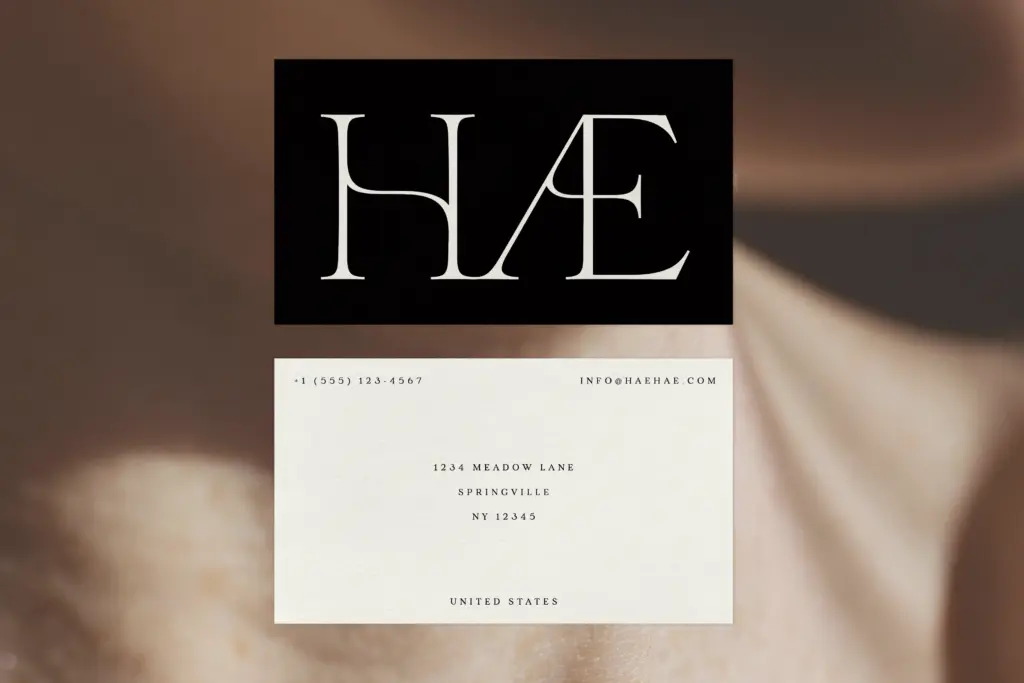
Velour is well suited to masthead type, magazine feature titles, and the kind of luxury or lifestyle branding that wants a serif with some emotional temperature rather than a neutral one. The alternates and dual ampersands make it useful for wedding stationery and invitation work, where a single hero word often carries the whole design. Packaging for cosmetics, fragrance, or anything trading on a sense of old-world craft would also suit its character.
It’s less useful anywhere text needs to run long — body copy, dense UI, anything read rather than glanced at. At small sizes the thinner weights lose their hairlines and the alternates lose their point. Treat it as a display and identity typeface, pair it with a plain-spoken sans or text serif for supporting copy, and it does its job well without overreaching into territory it wasn’t drawn for.
What we liked, and what we didn’t
Strengths
- Automatic alternate 'k' smooths a letter that would otherwise clash with the long-legged capitals
- Dual ampersands and simplified alternates give real flexibility for headline and identity work
- Old-style and standard figures both included, useful across captions and display numerals
Trade-offs
- Thinner weights lose definition and hairline serifs at small sizes
- No features aimed at body text, so it needs pairing for anything beyond short-form copy
Velour is a well-drawn display serif with genuine character in its curves and alternates, best reserved for headlines, branding and invitation work rather than continuous text. The old-style figures and automatic k-substitution show real craft, but the thinner weights struggle at small sizes. A strong choice for editorial mastheads and luxury branding, not a general-purpose text family.
Verdict

Tantype reviews typefaces in depth — every font is tested in real branding, editorial and screen layouts before a word gets written. 555+ fonts reviewed and counting.