
Atelier Fleur: a condensed Garamond-inspired serif for editorial headlines
Design style
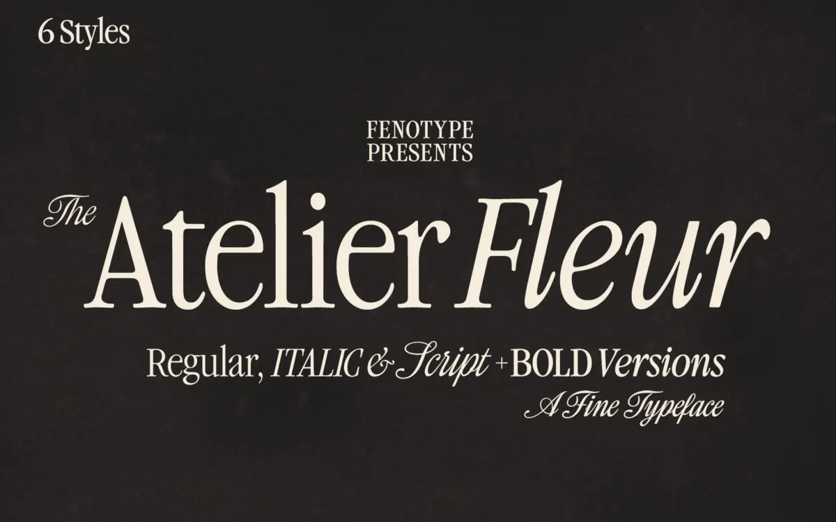
Atelier Fleur takes Garamond’s old-style bones and squeezes them into a condensed frame built for headline duty rather than long reading. The proportions are narrow but not cramped—strokes retain enough contrast between thick and thin to keep the letters from collapsing into stripes at small sizes, though this is clearly a display-first design. The serifs are trimmed and slightly bracketed, giving the face a set-in-stone editorial feel rather than the softness of a full book serif. It reads as a family with a point of view: dressy, a little formal, comfortable in fashion and lifestyle contexts where a condensed serif is asked to carry a lot of type in a small column width.
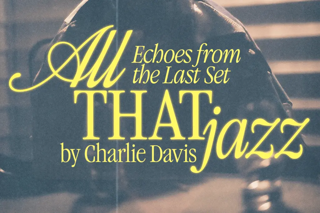
The Script companion is the more interesting design decision. Rather than a generic flourish script bolted on for variety, it’s drawn to share the serif’s stress and rhythm, so the two feel like siblings rather than a mismatched pairing. It’s connected, moderately slanted, and confident enough to stand alone as a display script if you never touch the serif at all.
Character set and features
The family spans Serif, Italic, and Script, each in Regular and Bold, which gives a reasonable amount of room to build hierarchy without leaving the family. Language coverage is described as extensive, which matters for a headline face likely to be set in European markets with accented characters.
The OpenType feature set is where the family earns its keep. Script and Italic styles carry swash characters, stylistic alternates, titling alternates, and several stylistic sets, so a single word can be dressed up for a title card or dialed back for running headlines without switching fonts. The Script style goes further, mapping decorative pen-stroke elements to the numerals through Stylistic Set 1—a nice touch for anyone setting dates, prices, or editions where the numbers need the same handmade quality as the letters. None of this works without an application that exposes OpenType panels properly; anyone stuck in a stripped-down design tool will only see the default glyphs, which is worth knowing before you commit a layout to the swash forms.
Use cases
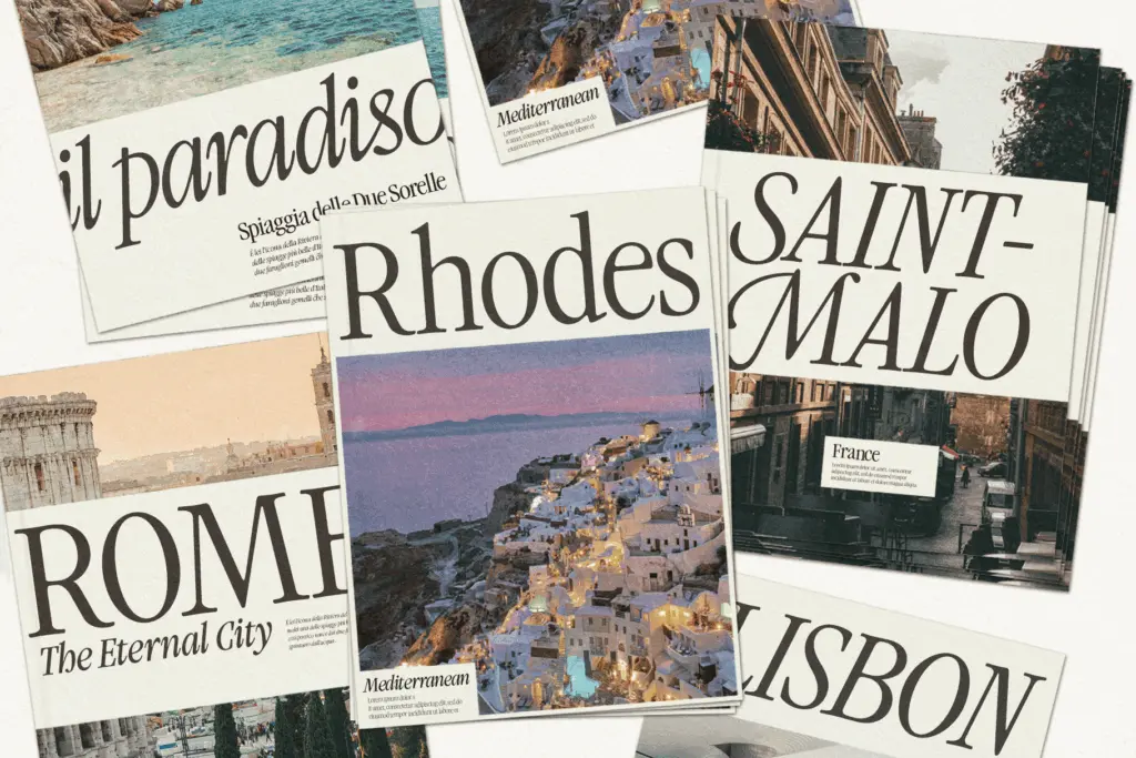
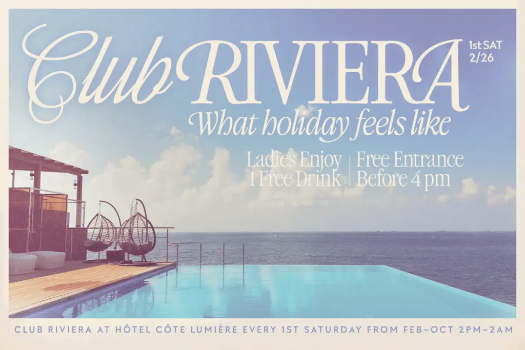
This is a headline and display family first. It’s well suited to editorial mastheads, magazine spreads, fashion and beauty branding, packaging call-outs, and invitation suites where a condensed serif with some old-style character is wanted. The Script style extends that into wedding stationery and monogram-style logotypes, particularly where the numeral alternates can be put to use on save-the-dates or anniversary pieces.
It is not a text face. The condensed width and the display contrast mean it tires the eye well before a paragraph is finished, so pair it with a plain text serif or sans for body copy. Anyone leaning heavily on the swash and alternate sets should also budget time to manage them by hand—automated contextual substitution isn’t part of the feature list here, so consistency across a layout is a manual job, not a given.
What we liked, and what we didn’t
Strengths
- The Script style shares proportions and stress with the Serif, so the pairing feels designed rather than bundled
- Decorative pen-stroke numerals mapped through a stylistic set are a genuinely practical detail for dates and editions
- Six styles across three faces give real hierarchy options for editorial and branding layouts
Trade-offs
- The condensed, high-contrast build makes it unsuitable for anything beyond short text
- Getting consistent results from the alternates and swashes requires manual glyph substitution, not automatic contextual rules
Atelier Fleur is a confident condensed serif with a script companion that actually feels related to it, backed by a genuinely useful set of OpenType alternates. It's built for headlines and branding, not paragraphs, and the swash-heavy features need manual attention to look intentional rather than random.
Verdict

Tantype reviews typefaces in depth — every font is tested in real branding, editorial and screen layouts before a word gets written. 555+ fonts reviewed and counting.