
Neue Swiss: an 8-weight grotesque built for branding and system work
Design style
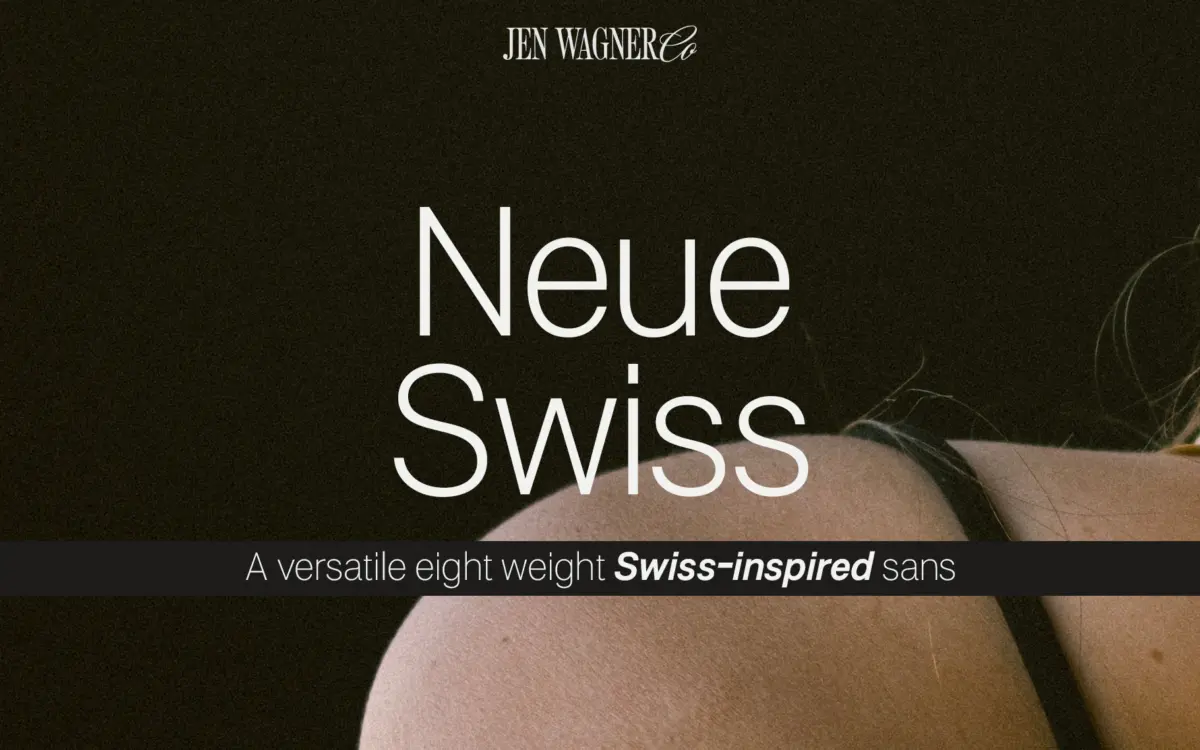
Neue Swiss sits in the well-worn tradition of the neo-grotesque revival: closed apertures, low stroke contrast, a quiet geometric backbone that never tips into the mechanical rigidity of a true geometric sans. Nothing about the drawing asks for attention. Terminals are cut straight, curves are restrained, and the whole thing reads as a competent, contemporary take on Swiss-style sans construction rather than a reinvention of it. That’s the point of a typeface like this — it isn’t trying to be a personality, it’s trying to be infrastructure.
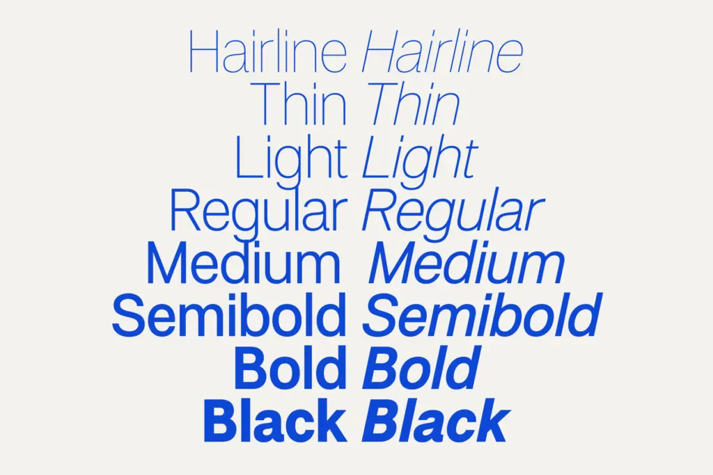
Where the design earns its keep is in the weight range. Eight weights from Hairline through Black is a genuine spread, and the interpolation holds up: the Hairline doesn’t go brittle, the Black doesn’t clog at the joins, and the middle weights (the ones you’ll actually use for body copy) keep consistent proportions rather than drifting wider or narrower as the strokes thicken. That consistency across a full weight axis is harder to get right than it looks, and it’s the strongest argument for this family over a single-weight grotesque.
Character set and features
Each of the eight weights ships with a matching italic, giving sixteen fonts total — uppercase and lowercase, full numerals and punctuation, and foreign language support for setting beyond a basic English character set. There’s no mention of small caps, alternates, tabular figures, or OpenType stylistic sets, so treat this as a straightforward, no-frills family rather than a feature-rich one. That’s not a knock — plenty of working typefaces don’t need a discretionary ligature set — but if your project depends on fraction bars or case-sensitive punctuation, you’ll need to build around the gap.
The italics are worth a look before committing a whole system to them. In grotesque families, italics are often true obliques rather than redrawn cursive forms, and that’s the more likely construction here given the overall restraint of the design. Obliques are fine for emphasis and captions but won’t carry the same warmth as a cursive italic if you’re leaning on it for editorial pull quotes.

Use cases
This is a branding and identity typeface first. The weight range makes it genuinely useful for building a visual hierarchy inside a single family — Hairline for oversized display treatment, mid-weights for body text and UI, Black for logotypes and section markers — without reaching for a second typeface to cover the extremes. That’s the practical case for buying an 8-weight family instead of picking up three separate fonts: everything shares the same skeleton, so nothing feels bolted on.
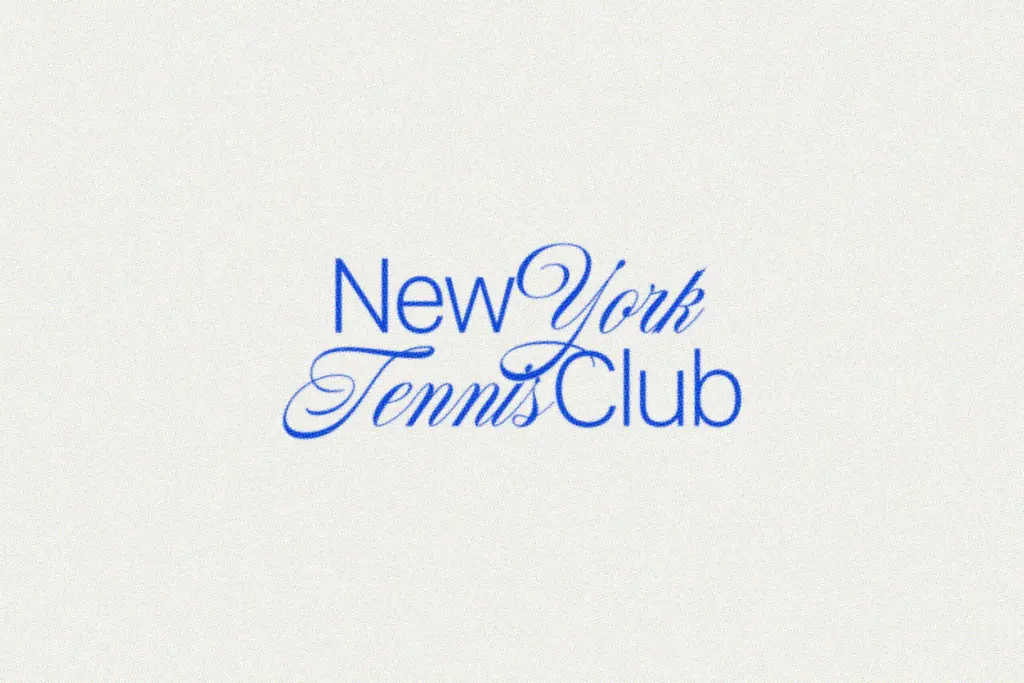
It’ll do fine work in web design, packaging, signage, and social graphics where a clean, low-personality sans is the brief. It’s less suited to anything that wants texture, warmth, or a distinct voice — this is a workhorse, not a statement piece. Pair it with a serif or script for contrast if the project needs one; on its own, it will hold a system together quietly rather than lead it.
What we liked, and what we didn’t
Strengths
- Eight weights interpolate cleanly from Hairline to Black without distorting proportions
- Matching italics across the full weight range give a complete, self-contained system
- Restrained, low-contrast grotesque forms make it easy to slot into existing branding work
Trade-offs
- No stated OpenType extras like alternates or small caps for more demanding typesetting
- The design is deliberately generic, so it offers little distinct character of its own
Neue Swiss is a competent, unpretentious grotesque that does exactly what an 8-weight branding sans should do: hold a hierarchy together without drawing attention to itself. It won't surprise anyone, but the weight range is well built and genuinely useful. Buy it for systems work, not for a typeface with a voice.
Verdict

Tantype reviews typefaces in depth — every font is tested in real branding, editorial and screen layouts before a word gets written. 555+ fonts reviewed and counting.