
The Astoria’s Editorial Serif: a retro-inflected serif family for magazine work
Design style
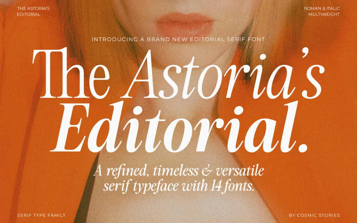
The Astoria’s Editorial Serif sits in a familiar but well-populated lane: the advertising-inspired serif that borrows its bones from mid-century publishing and signage rather than from book typography. The contrast is moderate, the terminals have a slight flare rather than a hard slab, and there’s a bit of swagger in the curves that keeps it from reading as a neutral text face. It’s clearly built to be looked at, not just read through.
Across the seven weights, the retro character holds up reasonably well at the lighter end, where the strokes thin out and the letters start to feel closer to a display sans with serifs bolted on. At the heavier weights the personality comes through more convincingly — the counters tighten, the contrast becomes more pronounced, and the whole thing starts to feel like something you’d see on a record sleeve or a 1970s magazine masthead. The italics lean cursive rather than simply oblique, with entry strokes that give them a written quality distinct from the uprights. That’s a nice touch, though it also means the italics don’t always sit quietly next to the romans — they call attention to themselves, which is fine for a pull quote and less fine for a footnote.
Character set and features
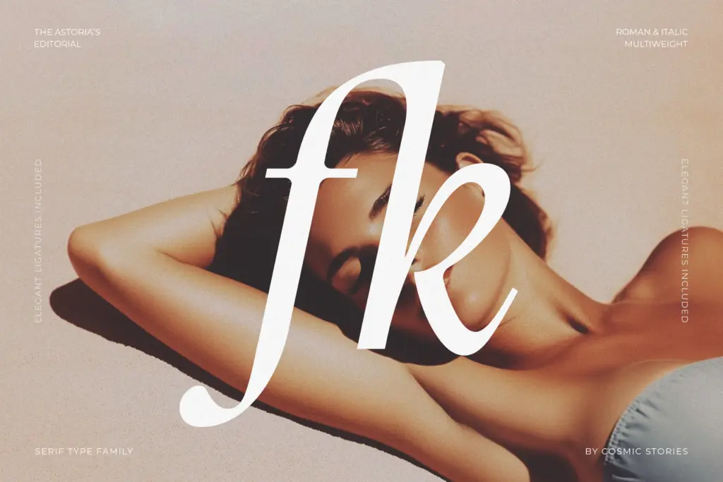
Fourteen styles in total — seven weights with matching italics — gives you real range for a single family, more than most editorial serifs bother with. That’s genuinely useful: you can build a whole masthead-to-body hierarchy without reaching for a second typeface. The ligatures are a highlight in the display weights, where the extra flourish reads as intentional rather than decorative filler; in the lighter weights they’re less necessary and occasionally look like an afterthought grafted onto a plainer letterform.
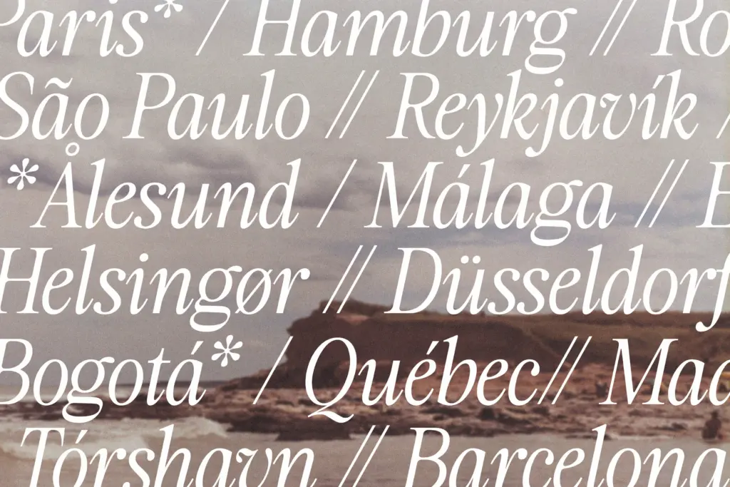
Where the set is thinner is in the workhorse details. There’s no strong sense of how it handles extended running text — tight tracking, long paragraphs, that sort of thing — and the brief doesn’t specify what’s covered for accented characters or non-Latin scripts beyond a general nod to multilingual support. Numerals and punctuation follow the general retro cue but don’t do anything unexpected. This is a family built around its display weights, and the text weights read more like scaled versions of that idea than a from-scratch text design.
Use cases
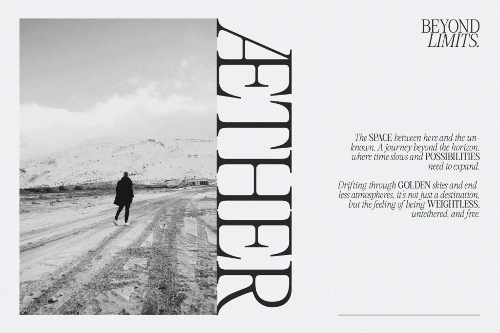
Headlines, magazine spreads, and brand identities that want a heritage feel without going full vintage-pastiche are the obvious targets, and the family is well equipped for them. A packaging label, a masthead, a logotype with some retro warmth — all plausible, all places where the bold weights and the ligatures earn their keep. It also does reasonably well as a short-copy serif: pull quotes, subheads, callouts, anywhere the type is meant to be noticed rather than disappear.
Push it into long-form body copy and the retro flourishes that make it interesting at large sizes start to work against comfortable reading. This isn’t a book serif, and treating it as one will expose the parts of the design that were drawn for headlines. Used within its lane — display and short editorial copy — it does what it sets out to do.
What we liked, and what we didn’t
Strengths
- Seven weights plus italics give real hierarchy options within one family
- Ligatures add genuine flair in the heavier display weights
- Bold weights carry a distinct retro-advertising voice that stands out in branding work
Trade-offs
- Lighter weights thin out and lose the retro character that defines the family
- Not suited to long-form body text despite being labelled editorial
The Astoria's Editorial Serif is a confident display-first serif with real range across its seven weights and matching italics. It earns its keep in headlines, mastheads and branding work, but it's not built for long-form reading and the lighter weights lose some of the character that makes the bolder ones interesting.
Verdict

Tantype reviews typefaces in depth — every font is tested in real branding, editorial and screen layouts before a word gets written. 555+ fonts reviewed and counting.