
Ratch: A Geometric Grotesk with Personality for Brand Systems
Design style
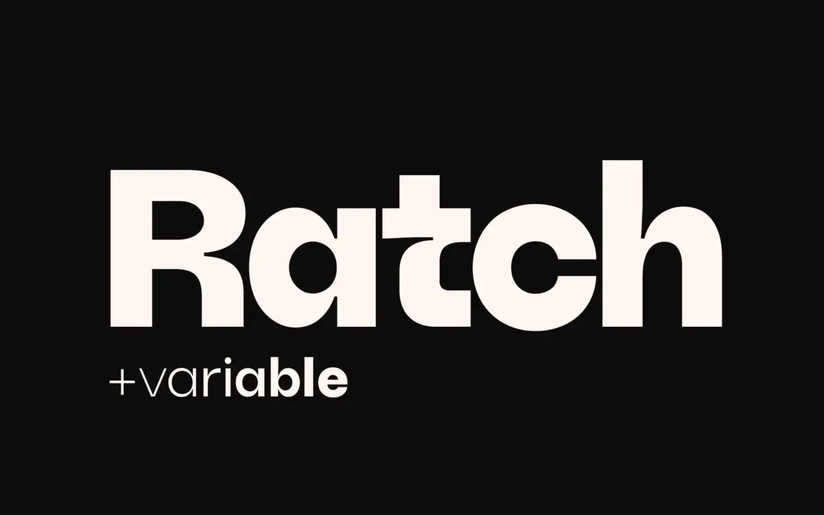
Ratch sits in familiar geometric grotesk territory but doesn’t stay quietly there. The circular bowls, near-monolinear strokes, and low contrast follow the usual formula, but the stylistic alternates push against the genre’s cool neutrality. Letters like a, e, g, and the numerals carry alternate forms that swap out standard curves for sharper angles or asymmetric cuts, giving the face a bit of edge without tipping into novelty territory.
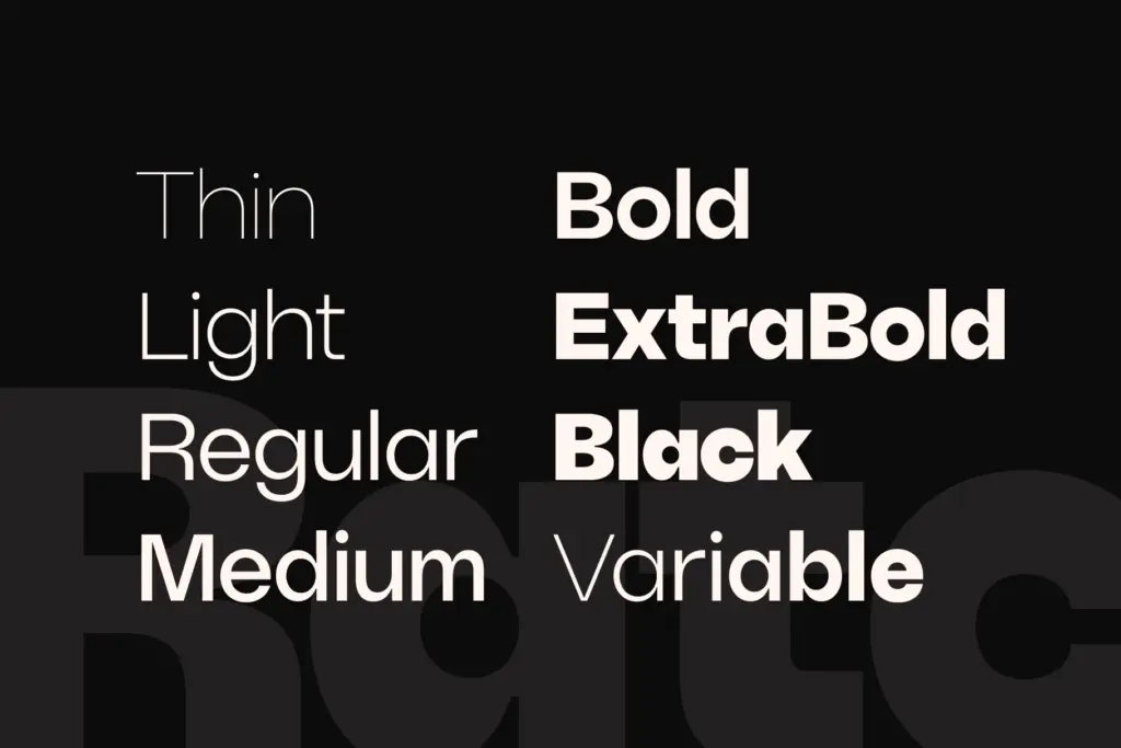
The seven weights, from Thin to Black, hold their proportions consistently across the range. Thin gets delicate without losing its geometric bones, and Black thickens up without the counters closing in on themselves — a common failure point in grotesks pushed to extremes. The variable font axis means you’re not locked into the seven static instances; you can dial in exactly the weight a layout calls for, which is useful when a brand system needs a very specific in-between.
Where Ratch distinguishes itself from the crowded geometric-sans field is in tone rather than structure. The default character is clean and slightly cold, appropriate for tech or corporate contexts, but flip on the alternates and the same words read as more idiosyncratic, almost hand-adjusted. That range — buttoned-up by default, characterful on request — is the real selling point.
Character set and features
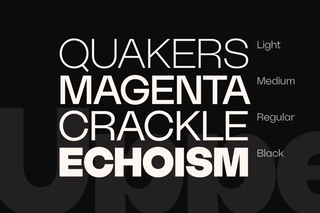
Each weight ships with a full uppercase and lowercase set, numerals, punctuation, and a set of symbols and miscellaneous glyphs. Extended Latin diacritic support broadens the language coverage beyond basic English typesetting, which matters if a brand identity needs to work across European markets.
The OpenType alternates are the feature worth building a workflow around. They’re accessed through the Glyphs panel in Illustrator, Photoshop, or similar tools rather than through automatic stylistic sets, so applying them is manual — fine for a logotype or headline, tedious if you’re hoping to swap every instance of a letter across a long document. Designers doing wordmark work will find this an acceptable trade for the control it gives; those setting long-form text should treat the alternates as an occasional accent rather than a default.
The variable font instance is worth asking for if geometric precision across many weight steps matters to your project — it’s the more flexible way to work with this family, though it’s not bundled by default and requires reaching out to the designer directly.
Use cases
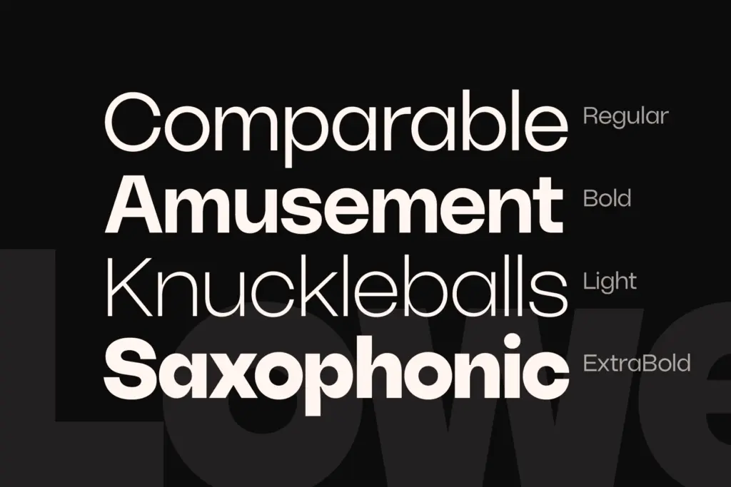
Ratch is built for brand and identity work first. The alternates make it well suited to logotypes and short-form lockups where a handful of altered letters can carry a brand’s whole personality without redrawing anything from scratch. The Black and Bold weights hold up fine in display and headline settings, packaging front-of-pack type, or app icons where geometric clarity reads at a glance.
For body copy, stick to the middle weights — Regular through Medium keep the geometric letterforms from feeling too rigid at paragraph sizes, though this isn’t a face built for dense, long-form reading. It’s a brand typeface, and it performs best when treated as one: headlines, wordmarks, UI labels, and the occasional alternate-laden flourish rather than the whole editorial system.
What we liked, and what we didn’t
Strengths
- Alternate glyphs give logotypes and headlines a distinct character without leaving grotesk territory
- Seven weights plus a variable font option offer real flexibility for brand systems
- Extended Latin diacritic support broadens usability across European languages
Trade-offs
- Alternates require manual glyph-panel access rather than automatic OpenType substitution
- Not built for dense body text — better suited to headlines, logos, and short-form display
Ratch is a solid geometric grotesk with a genuine trick up its sleeve: alternates that let a brand mark feel less generic without abandoning the clean grotesk foundation. It's built for identity and headline work rather than long-form text, and the alternates take manual effort to apply, but for wordmarks and short display copy it earns its keep.
Verdict

Tantype reviews typefaces in depth — every font is tested in real branding, editorial and screen layouts before a word gets written. 555+ fonts reviewed and counting.