
ED Nimpkish: a mismatched-case display sans built for punchy headlines
Design style
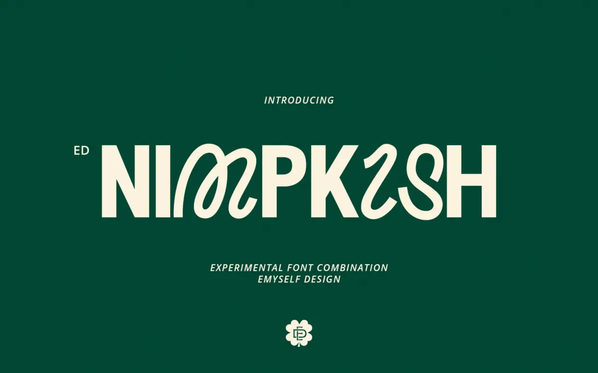
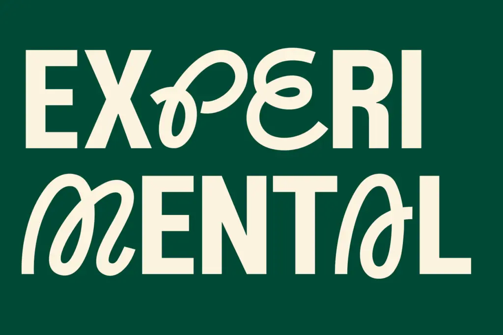
ED Nimpkish is built on a single, slightly odd premise: the uppercase and lowercase don’t belong to the same typeface. Capitals arrive as a bold, angular display form with sharp cuts and unusual proportions, while the lowercase settles into a plain, even-weight sans with rounded terminals and a quieter rhythm. Put together in a word, the effect is intentionally jarring — a heavy, decorative cap dropping into a calm lowercase line. It reads as a stunt more than a typeface system, and it mostly works as one.
The two halves are drawn competently on their own terms. The caps have enough personality to anchor a headline by themselves; the lowercase is generic enough to stay legible once the novelty of the caps wears off. What’s missing is a real bridge between them — stroke contrast and letter width jump noticeably at the case change, so mixed-case setting always announces itself. That’s clearly the point, but it means the font has one trick, and it plays it every time you type a capital letter.
Character set and features
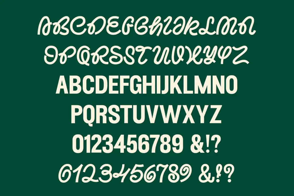
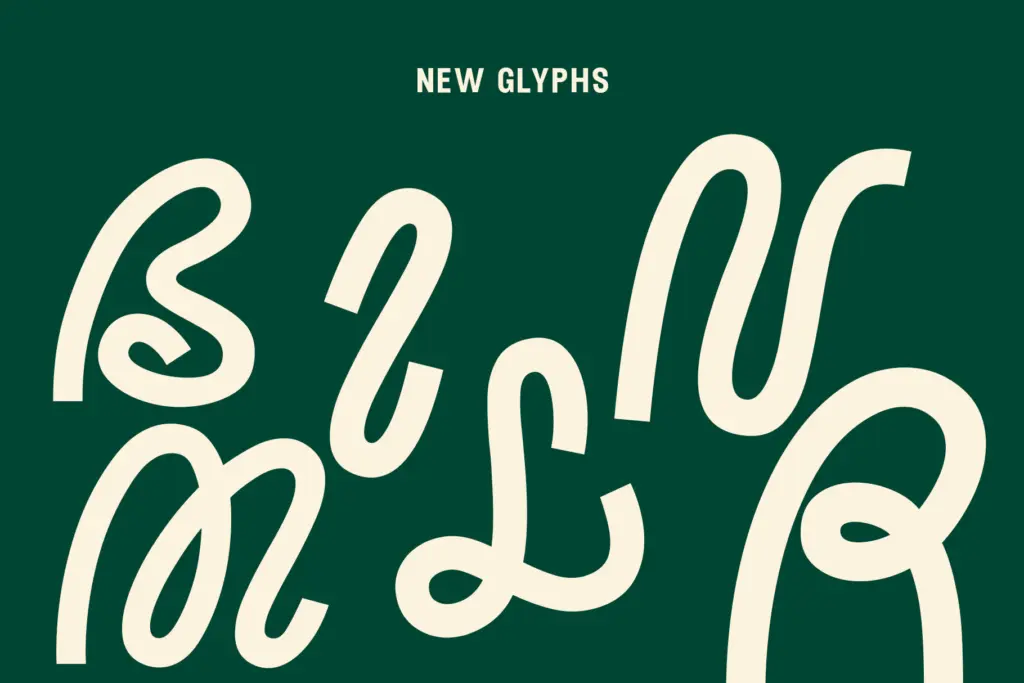
The set runs to 357 glyphs, which covers a reasonable spread of punctuation, symbols and accented characters for multi-language use, plus stylistic sets and ligatures. In practice these extras function as a way to soften the caps/lowercase clash rather than as a fully separate voice — alternate letterforms and ligated pairs give you options when the base combination reads as too aggressive for a given line. They’re worth digging into via OpenType-aware software rather than expecting default typing to surface them.
Spacing is even and the lowercase in particular sits comfortably at small sizes, which is more than you’d guess from looking at the caps alone. But because the two cases carry such different weight and structure, kerning between a capital and the lowercase letter that follows needs watching — pairs can look loose or crowded depending on the specific letters involved, and there’s no way to fully automate around that without touching tracking case by case.
Use cases
This is a display font for short bursts of text: logotypes, poster headlines, social graphics, packaging call-outs, apparel prints. Anywhere a single word or short phrase needs to look assembled rather than typed, the built-in tension between the two cases does real work. It’s less suited to anything that needs to read as a coherent typographic voice across a page — body copy, long headlines, editorial running text — because the case mismatch that makes it distinctive at word length becomes fatiguing at sentence length.
Treat it as a logotype or headline device rather than a general-purpose family. Set it big, set it short, and lean on the stylistic alternates when the clash gets too loud for the job. Used that way it earns its place; asked to do more, it starts to feel like a novelty stretched past its natural length.
What we liked, and what we didn’t
Strengths
- The angular capitals give short headlines instant character without extra styling
- Stylistic sets and ligatures offer real ways to soften the case contrast when needed
- Lowercase stays clean and legible even at smaller sizes
Trade-offs
- The stark difference between caps and lowercase makes it unsuitable for continuous text
- Kerning between the two cases needs manual attention rather than relying on defaults
ED Nimpkish is a one-trick display font that plays its trick well: bold, angular caps against a calm lowercase for short, punchy headlines. It's not built to carry a page of text, and the case contrast can feel repetitive once you've seen it a few times, but for logos, posters and social graphics it does a specific job cleanly.
Verdict

Tantype reviews typefaces in depth — every font is tested in real branding, editorial and screen layouts before a word gets written. 555+ fonts reviewed and counting.