Handwritten
4.0
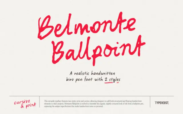
Belmonte Ballpoint: a two-style biro font with real handwriting variance
Design style Belmonte Ballpoint sets out to look like actual ballpoint ink rather than a vectorised idea of it. The…
 Tantype

Design style Belmonte Ballpoint sets out to look like actual ballpoint ink rather than a vectorised idea of it. The…
Tantype
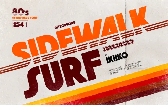
Design style Sidewalk Surf is a heavyweight display letterform built to sit inside the 1980s retrowave revival — the world…
Tantype
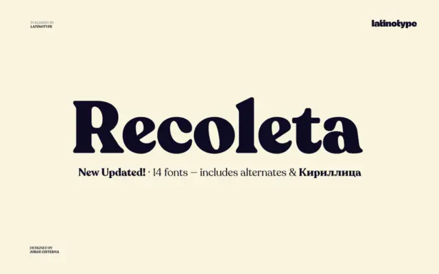
Design style Recoleta belongs to the family of soft slab serifs that took cues from 1970s display faces like Cooper…
Tantype
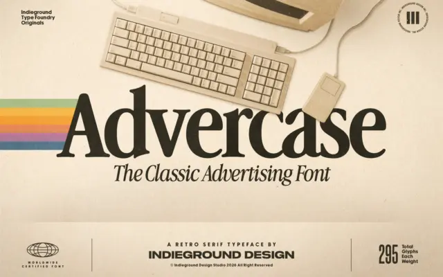
Design style Advercase is a serif built on a specific reference point: the Garamond-derived face Apple used in its print…
Tantype
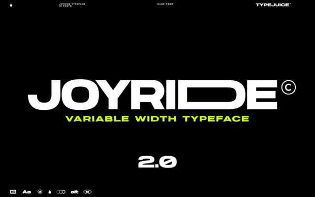
Design style Joyride is a geometric sans that leans into its extended width rather than apologizing for it. The letterforms…
Tantype
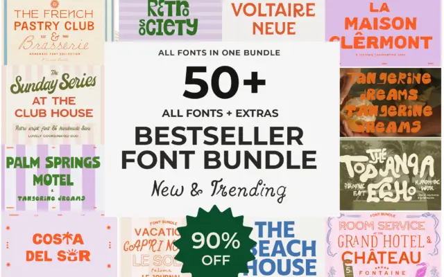
Design style This isn’t one typeface, it’s a shop’s worth of them bundled together — more than fifty fonts from…
Tantype
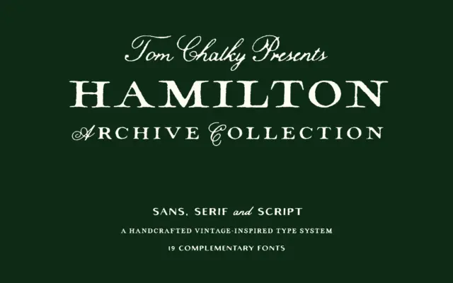
Design style Hamilton Archive is built around a printer’s-drawer idea of early 20th-century type: a serif and a sans that…
Tantype
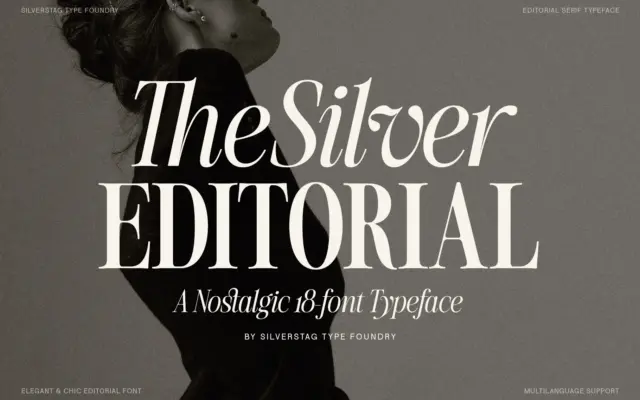
Design style The Silver Editorial sits in the high-contrast editorial serif tradition — thick vertical stems, hairline-thin horizontals, and bracketed…
Tantype
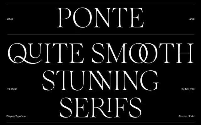
Design style Ponte belongs to the current wave of high-contrast display serifs that lean on the fashion-editorial look: thin hairlines,…
Tantype