Sans Serif
4.1
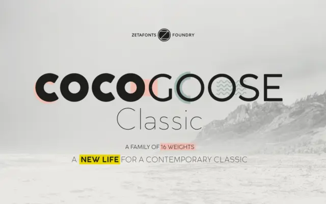
Cocogoose Classic: a geometric sans built for oversized, confident headlines
Design style Cocogoose Classic is the more restrained sibling in a family that started life in 2012 as an unapologetically…
 Tantype

Design style Cocogoose Classic is the more restrained sibling in a family that started life in 2012 as an unapologetically…
Tantype
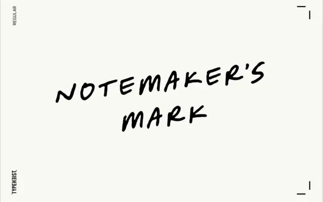
Design style Notemaker’s Mark reads like handwriting produced at speed rather than handwriting produced for show. The letters lean forward…
Tantype
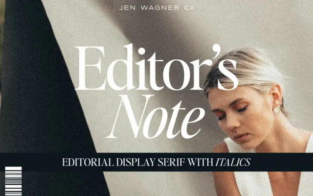
Design style Editor’s Note belongs to the current wave of pared-back editorial serifs — the kind built for masthead headers…
Tantype
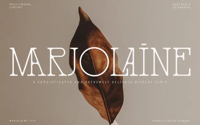
Design style Marjolaine works a narrow seam between two references that don’t usually meet: the delicate slab serif and the…
Tantype
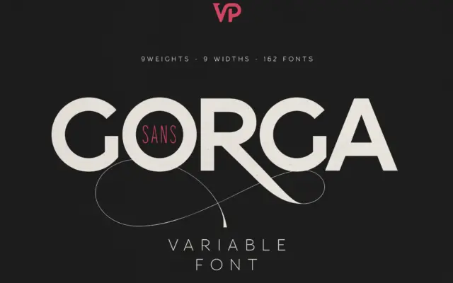
Design style Gorga Sans sits in familiar territory for a large-scale grotesque system: even stroke contrast, closed apertures, a fairly…
Tantype
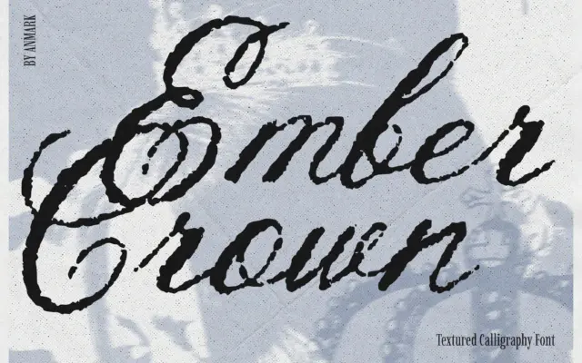
Design style Ember Crown is a brush-driven script built on a rough, distressed surface rather than a clean calligraphic line.…
Tantype
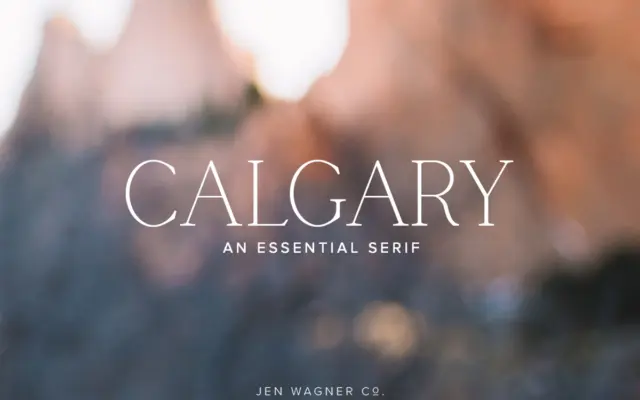
Design style Calgary is a narrow serif built for restraint rather than flourish. The letterforms are tall and condensed, with…
Tantype
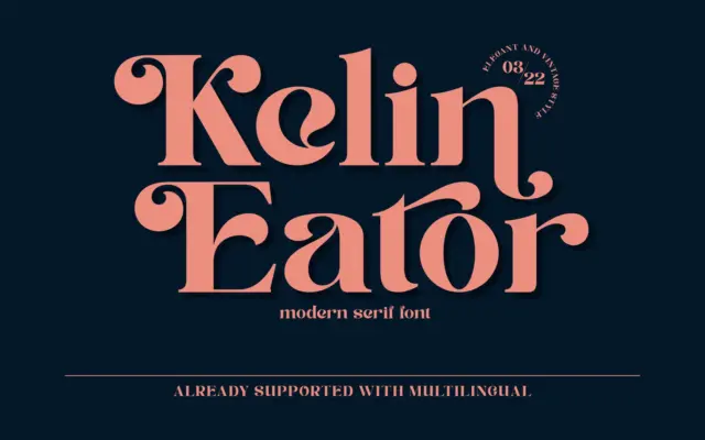
Design style Kelin Eator sits in the well-worn territory of vintage-inspired display serifs: moderate contrast, bracketed serifs, and a general…
Tantype
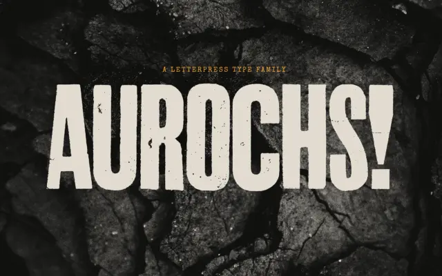
Design style Aurochs is a display sans drawn from scans of old letterpress and woodblock capitals, and it wears that…
Tantype