
Aurochs: a capitals-only letterpress sans built for rough, mismatched headlines
Design style
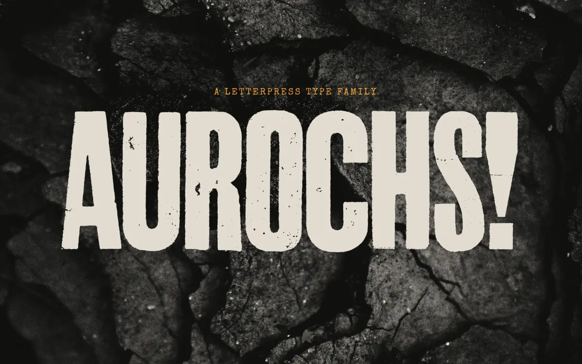
Aurochs is a display sans drawn from scans of old letterpress and woodblock capitals, and it wears that origin openly. The strokes aren’t clean vector arcs, they carry the bruises of metal type and worn wood: uneven stroke edges, corners that don’t quite meet, ink that looks like it pooled slightly at the joins. Rather than smoothing this out, the family leans into it, giving each weight its own texture instead of one uniform grain applied across the board.
The letterforms themselves are plain, blunt sans capitals — nothing eccentric in the skeleton, no unusual apertures or flared terminals. The character comes entirely from surface: the imperfections in the outlines do the work that a script or a slab would normally do with structure. That’s a deliberate trade, and it mostly pays off. Where it gets less convincing is at very large sizes, where the ‘damage’ can start to read as a texture effect rather than a typeface, and the illusion of handset type gives way to something closer to a Photoshop filter.
Character set and features
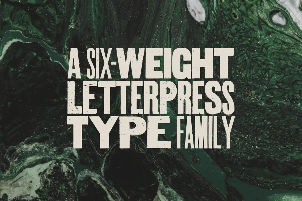
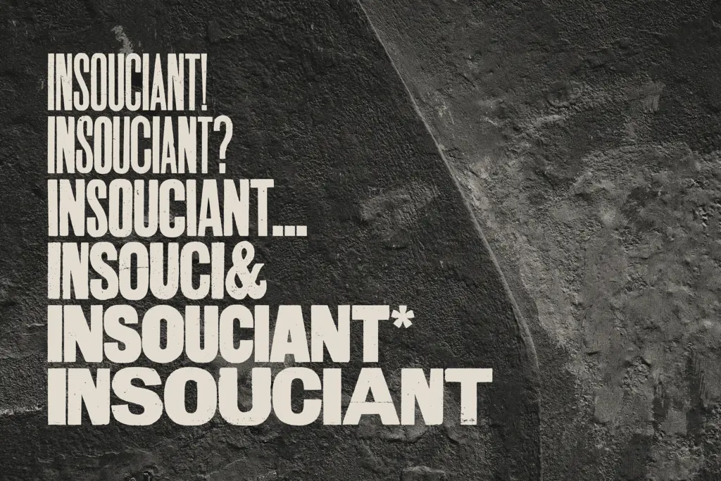
Aurochs ships in six weights: light, regular and heavy, each with a second variation. That’s a smart way to fake the ‘mismatched wood type’ look the seller talks about — you’re not choosing one weight and sticking with it, you’re meant to jumble two or three together on a poster or a masthead, the way a jobbing printer would have combined whatever sorts were on the shelf. Used this way, the family does something a single-weight display face can’t: it generates visual noise and hierarchy at once, without extra ornament.
It’s capitals only, with numerals and standard punctuation but no lowercase. That’s a real limitation, not a stylistic quirk — it rules out body text, captions, or anything that needs sentence case, and it means every layout built with Aurochs has to be designed around all-caps setting from the start. There’s no mention of extended language support, so treat it as a Latin-alphabet tool for English-language work until proven otherwise. Desktop and webfont formats are both provided, so it’s usable across print and screen without conversion headaches.
Use cases
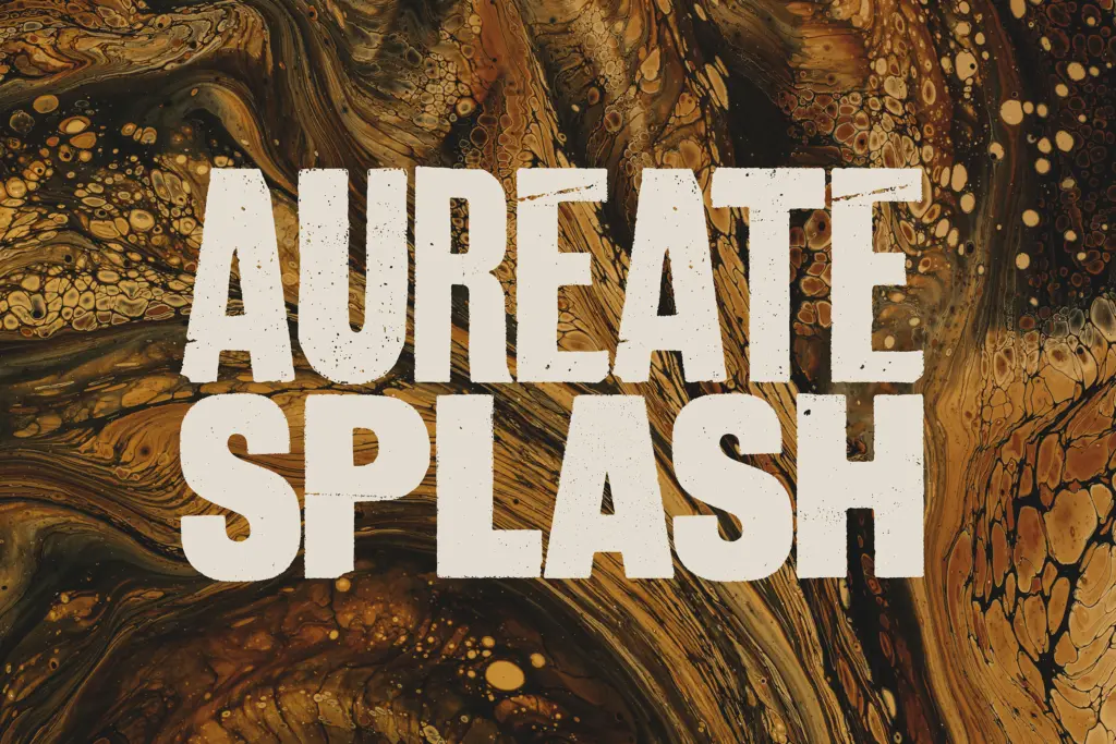
This is a headline and cover typeface, not a workhorse. It suits editorial mastheads, poster type, packaging call-outs, and branding work that wants a handset, letterpress-adjacent voice without the cost of actually printing on a Vandercook. The multiple weights make it good for building type-only compositions where the words themselves carry the design — a single strong word in heavy, a supporting line in light, layered the way old broadsides did.
It’s less useful anywhere text needs to run long or read quietly: no lowercase means no paragraphs, and the roughness that reads as character in a three-word headline can turn to visual static in a dense block of caps. Pair it with a plain, quiet body text elsewhere in the layout and let Aurochs do the shouting.
What we liked, and what we didn’t
Strengths
- Six weights designed to be jumbled together, mimicking genuine mismatched wood type
- Surface imperfections give real letterpress character without gimmicky filters
- Desktop and web formats cover both print and screen projects out of the box
Trade-offs
- Capitals only, so it can't handle body copy or anything needing lowercase
- The letterpress texture can look more like an effect than a typeface at very large sizes
Aurochs is a capable, texture-rich display face built for headlines that want a handset, letterpress feel without much fuss. The capitals-only limitation and the risk of the roughness curdling at large sizes keep it from being an all-purpose tool, but for posters, mastheads and packaging call-outs it earns its keep.
Verdict

Tantype reviews typefaces in depth — every font is tested in real branding, editorial and screen layouts before a word gets written. 555+ fonts reviewed and counting.