
Notemaker’s Mark: a scrawled, forward-leaning script for casual notes and brand voice
Design style
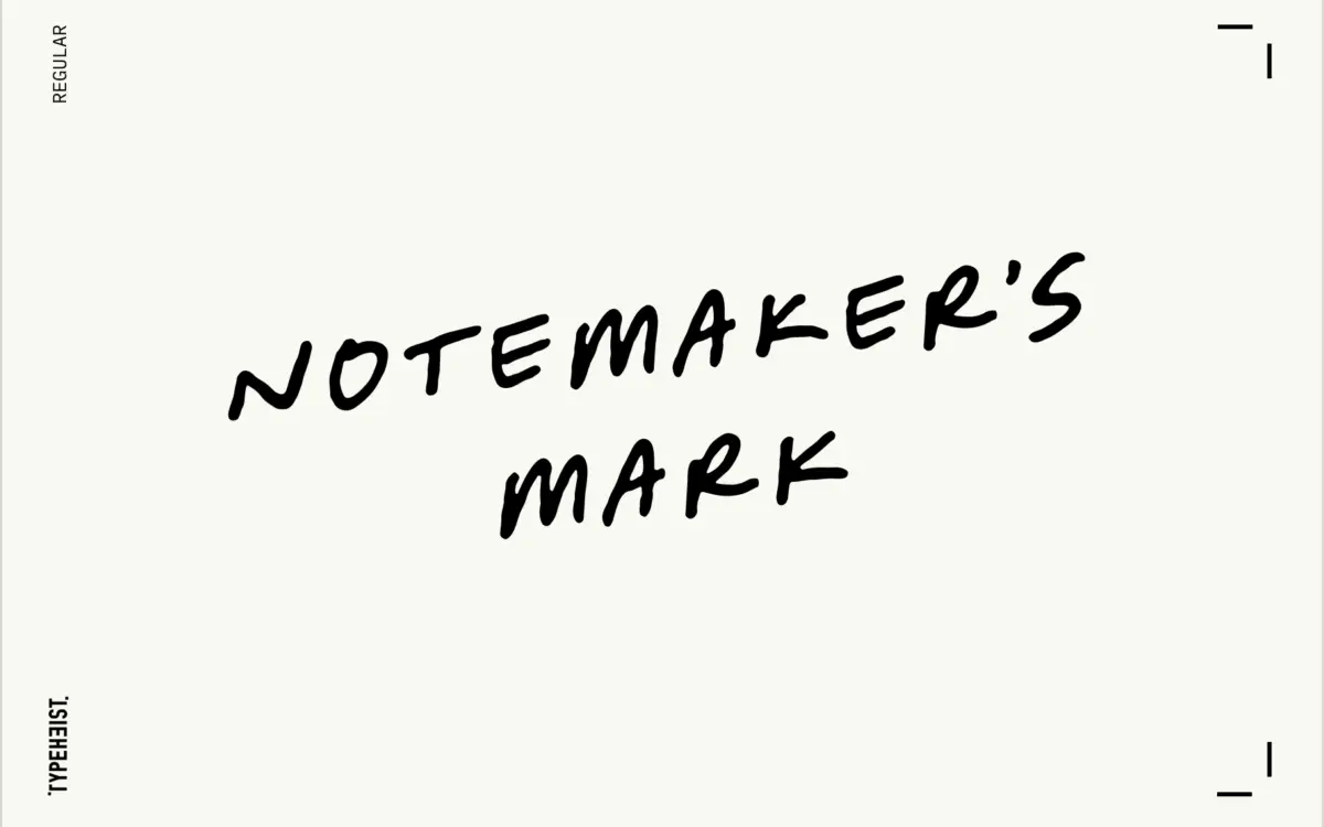
Notemaker’s Mark reads like handwriting produced at speed rather than handwriting produced for show. The letters lean forward with enough consistency to give the whole face a sense of direction, as if the hand writing it was already moving on to the next thought. Strokes are uneven in the way real ballpoint or felt-tip marks are uneven — some thicker where the pen pressed harder, some thinner where it lifted early. That’s the point of the design, and it’s carried off with restraint. Nothing here tips into the exaggerated wobble that some “authentic” scripts use to fake spontaneity.
Where it earns its keep is in the connections between letters. They’re loose rather than fully joined, closer to fast cursive than formal script, which keeps the rhythm irregular without breaking the word shapes apart. It sits in that narrow band of handwriting fonts that manage to look unplanned while still being legible and reasonably even in colour across a line of text.
Character set and features
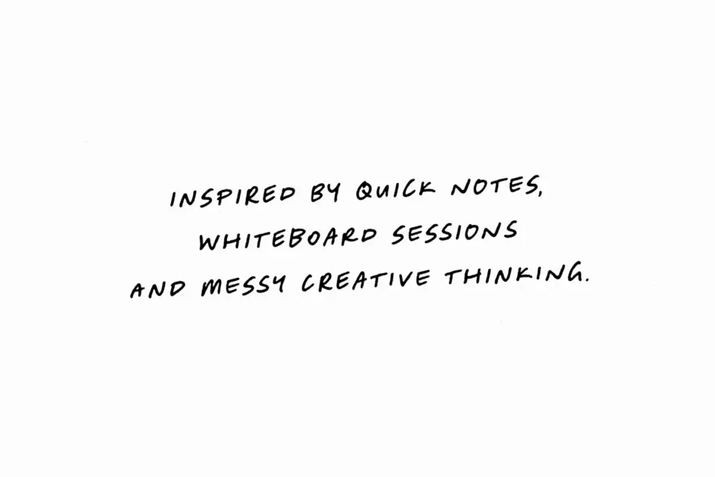
The letterforms are built around natural variation — small differences in slant, weight and baseline placement that mimic the inconsistency of a real hand. This is common in modern handwriting fonts and it’s handled well here: the variation reads as texture rather than noise. Lowercase forms carry most of the character, with looping ascenders and descenders that give the face its casual, notebook-margin feel. Uppercase letters are more restrained, which helps keep headlines and short labels from getting too busy.
The seller doesn’t specify OpenType alternates or ligature sets, so treat any variation you see as baked into the default character shapes rather than something you can swap manually. That’s worth checking before you commit to it for a project that needs letter-by-letter control, like a wordmark that has to repeat identically across applications.

Use cases
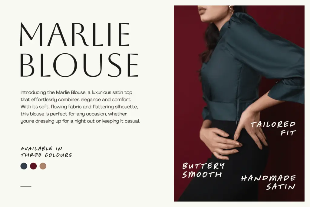
This is a font for the moments in a brand or a layout where you want to sound like a person rather than a system. Packaging call-outs, moodboard annotations, social captions, sticky-note style graphics, editorial pull-quotes that need a handwritten aside — Notemaker’s Mark does all of this comfortably. The forward lean and loose joins give it energy without pushing into chaos, so it works as a secondary voice next to a cleaner sans or serif doing the structural work.
It’s less suited to anything that needs to be read quickly at small sizes or set in long paragraphs — handwriting fonts like this one lose clarity the smaller and denser they get, and the irregular baseline that makes it feel human also makes it tiring to read in bulk. It’s also not the font for a brand chasing polish or formality; the whole appeal here is the opposite of that. Used as an accent — a headline, a note in the margin, a single line on packaging — it does exactly what it sets out to do.
What we liked, and what we didn’t
Strengths
- Forward-leaning letterforms give it a sense of motion without sacrificing word shape
- Irregular stroke weight and baseline feel genuinely handwritten rather than digitally faked
- Works well as a secondary voice alongside a plainer sans or serif
Trade-offs
- No mention of alternates or ligature sets, so repeated letters may look identical where variation would help
- Legibility drops quickly at small sizes or in longer passages of text
Notemaker's Mark does one job well: it looks like a genuine, fast handwritten note without tipping into illegible scrawl. It's best used sparingly, as an accent voice next to cleaner typefaces, rather than for anything that needs sustained reading.
Verdict

Tantype reviews typefaces in depth — every font is tested in real branding, editorial and screen layouts before a word gets written. 555+ fonts reviewed and counting.