
Calgary: A Narrow Serif for Clean, Understated Branding

Design style
Calgary is a narrow serif built for restraint rather than flourish. The letterforms are tall and condensed, with thin, clean serifs that keep the overall texture light on the page. Where a lot of branding serifs lean on high contrast or ornamental swashes to signal luxury, Calgary gets there through proportion alone: the letters are slender, upright, and evenly spaced, so a word set in Calgary reads as considered rather than decorative.
The recent addition of a lowercase is worth noting on its own terms. A caps-only serif is a limited tool — fine for a logotype or a headline, useless for a paragraph. With lowercase now in the set, Calgary shifts from a monogram-and-title font into something you could actually set a few lines of copy in, provided the copy is short and the point size generous. The lowercase follows the same narrow, upright logic as the capitals, so the two cases sit together without any visible seam, which isn’t always true when a foundry bolts a lowercase onto an existing caps design.
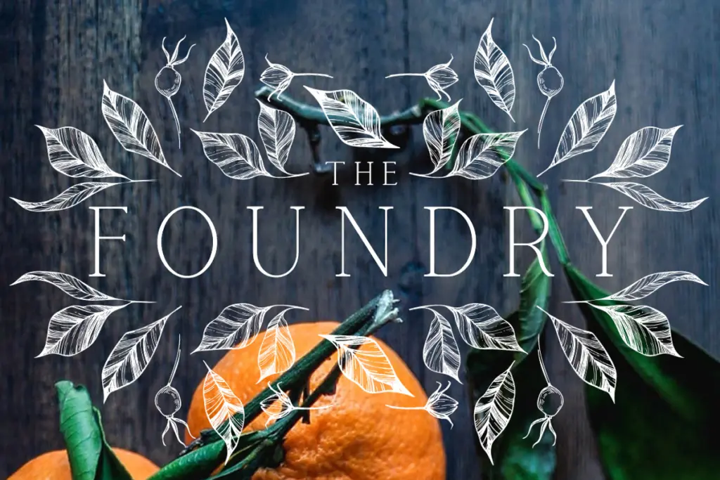
Character set and features
The set covers uppercase and lowercase, numerals, punctuation, and non-English characters, which gives it reasonable reach beyond a single-language market. There’s no mention of alternates, ligatures, or a display weight alongside a text weight — this is a single-style serif, not a family with multiple registers to move between. That’s not a criticism so much as a scope note: buyers expecting stylistic sets or swash variants for flourish work should look elsewhere.
Because the design is narrow and the serifs are fine, letterspacing matters more here than it would in a sturdier serif. At small sizes, the thin serifs and tight fit can start to close up, particularly in print or on low-resolution screens. This is a font that wants a bit of air around it and a size that lets the serifs stay crisp — it isn’t built to disappear into a body-text block at 10px.
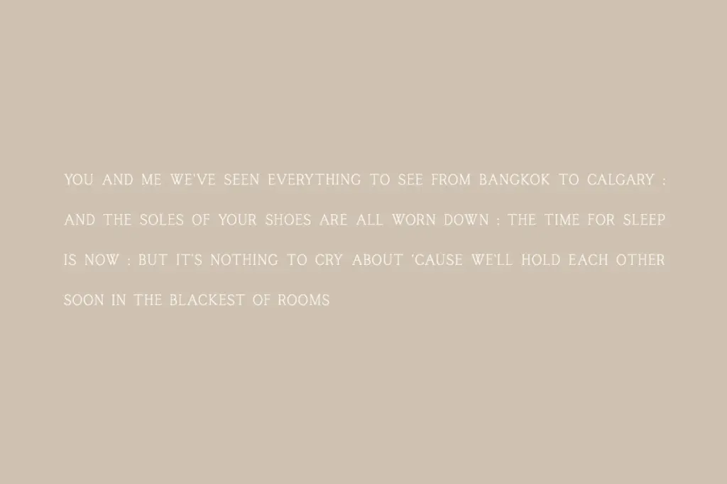
Use cases
Calgary’s natural home is short-form branding: logotypes, wordmarks, business cards, packaging labels, and title treatments where a handful of words need to look composed and slightly formal without tipping into ornate. The narrow width is also useful anywhere horizontal space is tight — a vertical lockup on packaging, a narrow header on a business card, a stacked logo where a wider serif would crowd the layout.
With the lowercase now available, it can stretch into short editorial uses too — a pull quote, a subhead, a few lines on an invitation — as long as the setting stays generous with size and leading. It’s less suited to dense text, long-form reading, or anything that needs a heavy, confident presence; the thinness of the strokes works against it there. Think of Calgary as a finishing font for identity work rather than a workhorse for body copy, and it does that narrower job cleanly.
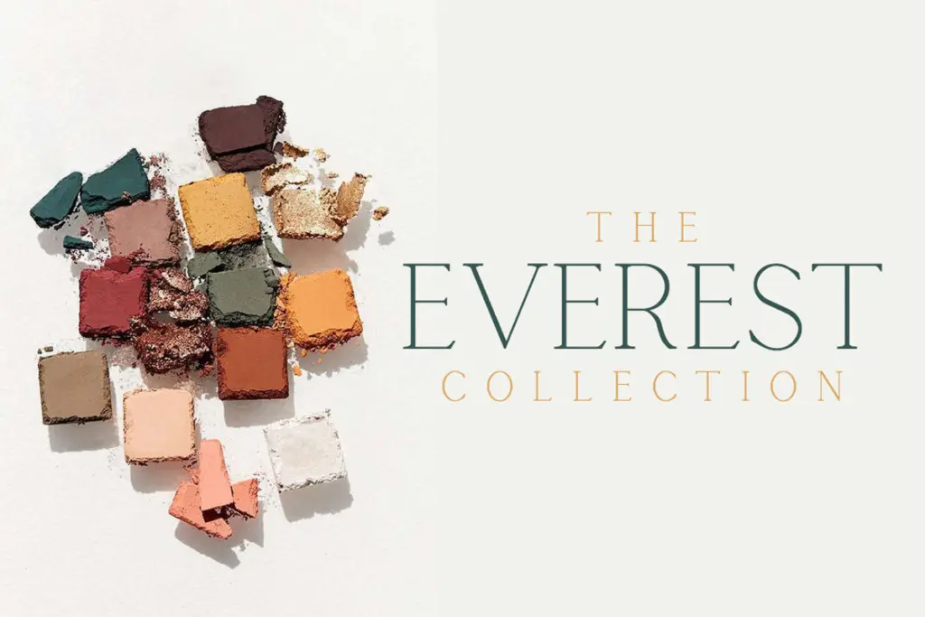
What we liked, and what we didn’t
Strengths
- Narrow, upright proportions suit tight logo lockups and vertical packaging layouts
- New lowercase integrates cleanly with the existing capitals, no visible mismatch
- Non-English character support extends its use beyond a single market
Trade-offs
- Fine serifs and narrow fit lose clarity at small sizes or low resolution
- Single style with no alternates or weight variation limits its range beyond short-form branding
Calgary is a tidy, narrow serif that does one job well: short, composed branding text. The new lowercase widens its use slightly, but thin strokes and tight fit still limit it to larger sizes and shorter settings.
Verdict

Tantype reviews typefaces in depth — every font is tested in real branding, editorial and screen layouts before a word gets written. 555+ fonts reviewed and counting.