Serif
4.1
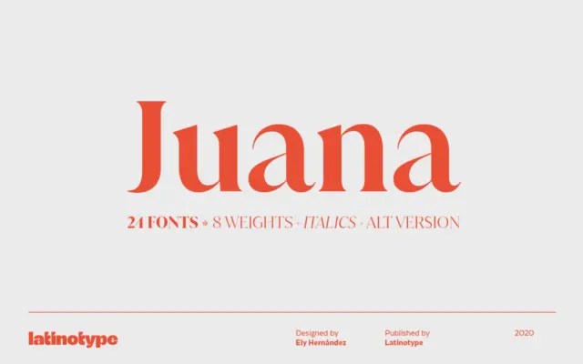
Juana: a high-contrast serif family built for editorial headlines
Design style Juana belongs to the family of high-contrast serifs that trade the calm rhythms of text faces for something…
 Tantype

Design style Juana belongs to the family of high-contrast serifs that trade the calm rhythms of text faces for something…
Tantype
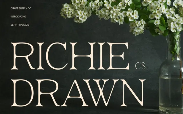
Design style CS Richie Drawn sits in that increasingly crowded corner of the market where a minimalist modern serif is…
Tantype
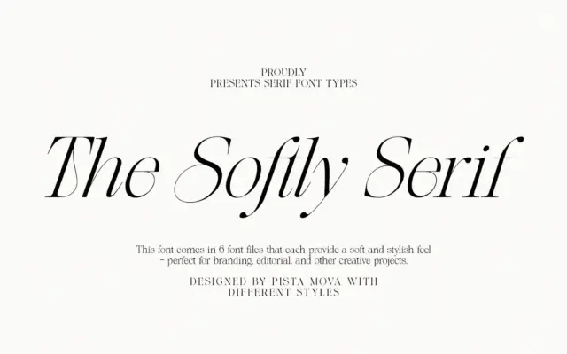
Design style The Softly Serif is an italic-only serif built around the kind of high-contrast strokes that read as fashion-editorial…
Tantype
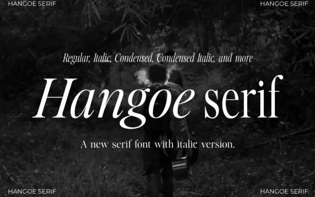
Design style Hangoe sits in the old-style serif tradition, with the kind of restraint that reads as confident rather than…
Tantype
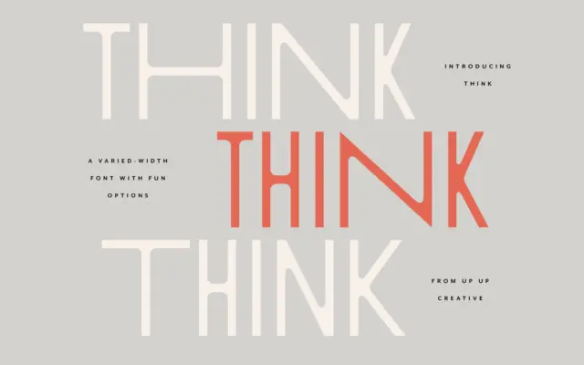
Design style Think Sans starts from a simple premise: a monoweight, all-caps sans serif, then breaks its own rules by…
Tantype
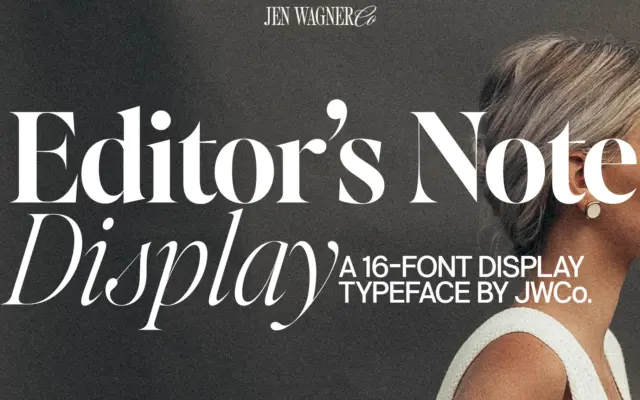
Design style Editor’s Note Display is a companion to a text-oriented family, and it reads that way: the letter skeletons…
Tantype
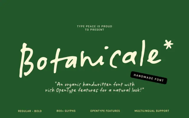
Design style Botanicale sits in the loose, unfiltered end of the handwritten category. The strokes wobble slightly, baselines drift, and…
Tantype
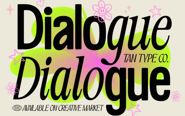
Design style TAN – Dialogue is built as a two-voice system rather than a single typeface. The first voice is…
Tantype
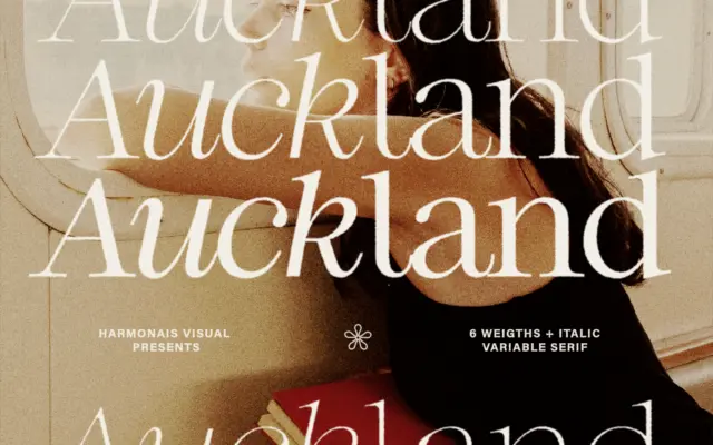
Design style Auckland sits in the modern-serif camp: moderate contrast between thick and thin strokes, bracketed serifs that are trimmed…
Tantype