
Editor’s Note: a tidy editorial serif for headlines and quote cards
Design style
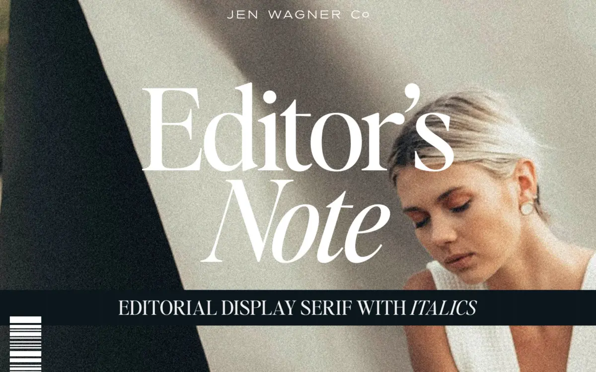
Editor’s Note belongs to the current wave of pared-back editorial serifs — the kind built for masthead headers and Instagram quote graphics rather than long-form text. The letterforms are narrow and upright, with tight curves and short bracketing on the serifs that keep the whole face feeling crisp rather than decorative. There’s not much contrast between thick and thin strokes, which gives it a flatter, more graphic presence than a classic transitional serif. It reads as restrained rather than expressive, which is exactly the point.
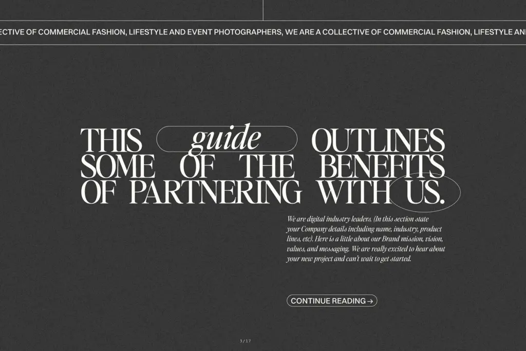
The default spacing is generous, built for comfortable reading at body sizes rather than the squeezed-tight look you see in a lot of display work right now. That’s a sensible default, but it does mean the face needs a hand on the tracking dial to hit the trendier, tighter-set look — something to know going in rather than discover after the fact.
Character set and features
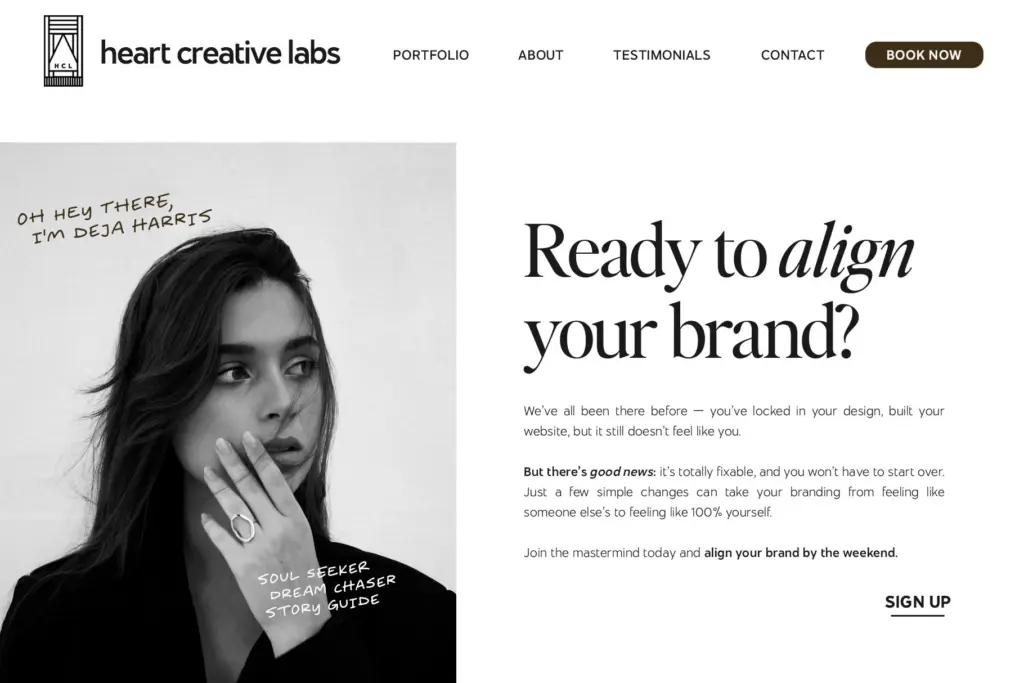
Both upper and lowercase are drawn with the same restraint: minimal flourish, closed apertures, simple terminals. An italic is included and pairs cleanly with the upright — the two sit well together in a single line of type, one carrying a quote and the other an attribution, which is a genuinely useful pairing rather than a gimmick. There’s no indication of extended language support or a large glyph set of alternates and ligatures, so treat this as a solid, functional serif rather than a feature-rich display family. It does what it does without much ornamentation, which is a fair trade for a face this clean.
Because the contrast is low and the shapes are simple, the letterforms hold up reasonably well at smaller sizes too — this isn’t a face that falls apart the moment you drop it below a headline point size, though it was clearly drawn with larger settings in mind first.
Use cases
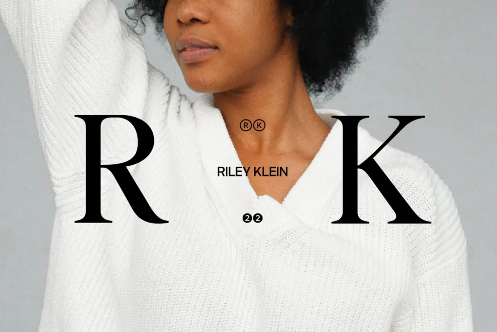
This is a font for brand headers, blog titles, pull quotes, and the kind of Canva-style quote graphic that circulates on social feeds. It suits fashion, lifestyle, and editorial brands going for a clean, slightly minimal,
What we liked, and what we didn’t
Strengths
- Low-contrast, tight-curved letterforms give it a crisp, graphic presence at display sizes
- Italic and upright pair naturally, useful for quote-plus-attribution layouts
- Holds up decently at smaller sizes despite being drawn for headlines
Trade-offs
- Default spacing is loose and requires manual negative tracking to get the trendy tight look shown in marketing images
- Limited apparent feature set — no sign of extensive alternates, ligatures, or broad language support
Editor's Note is a competent, clean editorial serif that does headline and quote-card work well but doesn't try to be much more than that. It needs manual tracking adjustments to hit the tighter display look shown in its own promotional images. A safe, useful choice for lifestyle and editorial branding rather than a distinctive one.
Verdict

Tantype reviews typefaces in depth — every font is tested in real branding, editorial and screen layouts before a word gets written. 555+ fonts reviewed and counting.