
Kelin Eator: a vintage serif with swash alternates for logos and editorial headlines
Design style
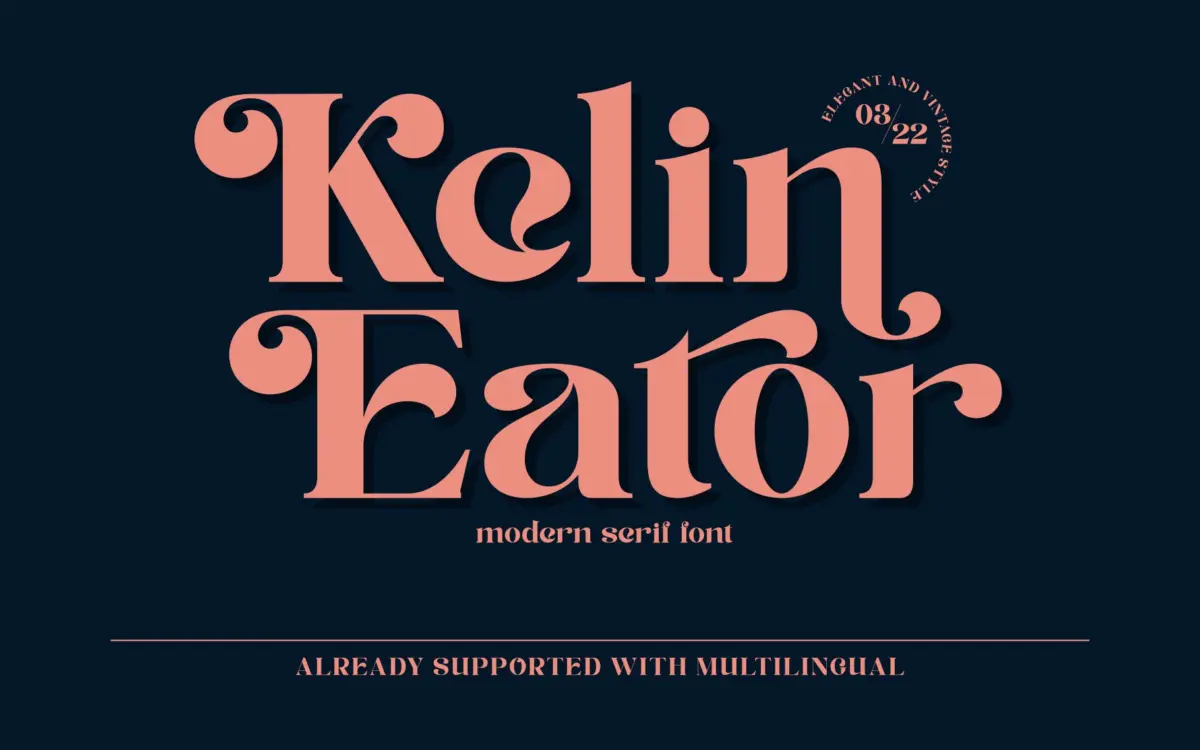
Kelin Eator sits in the well-worn territory of vintage-inspired display serifs: moderate contrast, bracketed serifs, and a general air of hand-finished lettering rather than a purely constructed letterform. It leans on the aesthetic of old badge lettering and letterpress ephemera without going fully script or fully blackletter. The result is a serif that feels drawn rather than drafted, with slight irregularities in stroke weight that give it warmth.
The letterforms are upright rather than italic, which sets it apart from the many script-adjacent ‘vintage’ fonts crowding this category. That upright stance makes it more useful as a structural serif than as a flourish font, even though the alternates give it some of that flourish character when you want it.
Character set and features
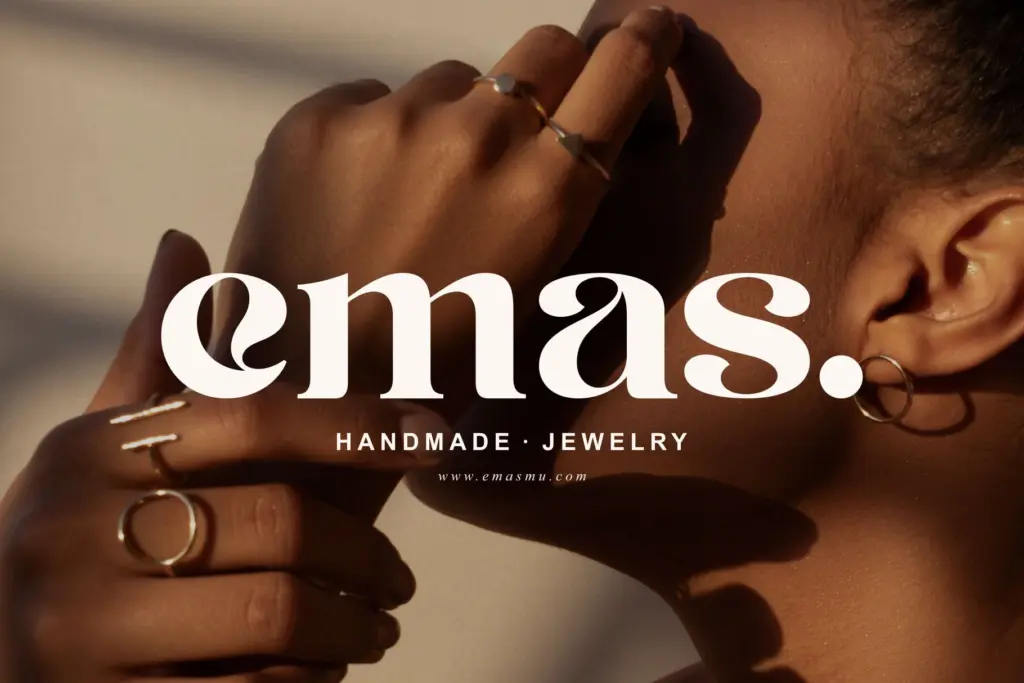
The font ships with built-in alternate characters, which is the main functional feature worth noting. These give you variation in a handful of letters so that repeated characters in a word or logotype don’t look mechanically identical — a small trick, but one that matters a great deal in short-word logo settings where repetition is the enemy of a handmade feel. The seller also claims multilingual support, so extended character coverage should be available for setting text beyond basic English, though the exact language list isn’t specified.
There’s no indication of a full weight range or companion italic in the material provided, so treat this as a single-style display serif rather than a family with a full editorial toolkit. That’s fine for its intended purpose, but it means you shouldn’t expect it to carry long-form body text or complex hierarchy on its own.
Use cases
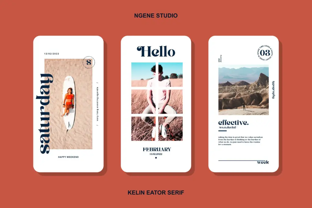
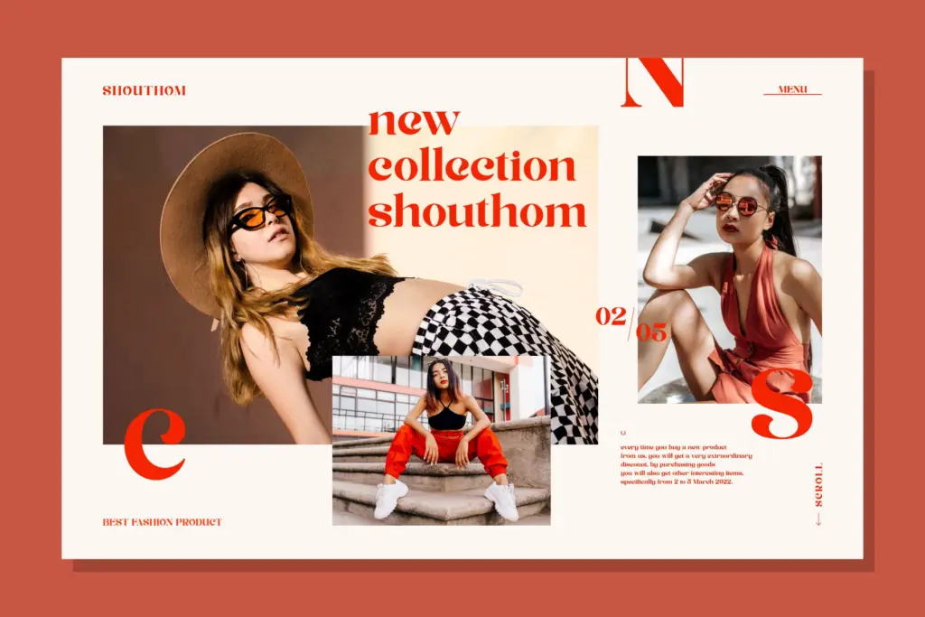
This is a logo and badge font first. The alternates make it genuinely useful for wordmarks, where you want a handful of letters to feel less repetitive and more considered. It also does reasonable work on Instagram graphics, quote cards, and short editorial headlines — anywhere a single word or short phrase needs a vintage, slightly artisanal feel without tipping into full script territory.
For packaging and label work, it should read well at moderate sizes, particularly on badges, stamps, or product labels where the serif detail can survive some texture or print roughness. Invitation and stationery designers looking for something with a bit more backbone than a script font could also find use here, provided the rest of the layout carries elegant supporting type rather than asking Kelin Eator to do everything.
Where it will struggle: body copy, dense paragraphs, or any context needing a full family of weights and styles. It’s a single-purpose display tool, and it should be treated as one — paired with a plain, quiet sans or serif for supporting text rather than asked to flex into multiple roles within the same design.
What we liked, and what we didn’t
Strengths
- Built-in alternates reduce repetition in short logo-type settings
- Upright serif structure gives it more backbone than typical script alternatives
- Reads well at badge and label scale with some print texture
Trade-offs
- No indication of a full weight range or italic companion for building hierarchy
- Not suited to body text or long-form editorial layouts
Kelin Eator is a competent vintage display serif that earns its keep through alternate characters rather than any dramatic reinvention of the genre. It's well suited to logotypes, badges and short headline work, but it's not a font family you build an entire brand system on. Treat it as one tool among several rather than the whole toolkit.
Verdict

Tantype reviews typefaces in depth — every font is tested in real branding, editorial and screen layouts before a word gets written. 555+ fonts reviewed and counting.