
CS Richie Drawn: a slim serif display face with a hand-finished edge
Design style
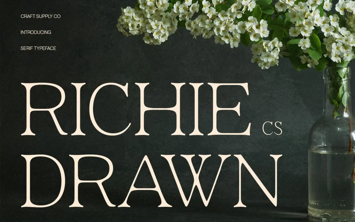
CS Richie Drawn sits in that increasingly crowded corner of the market where a minimalist modern serif is given just enough hand-drawn irregularity to stop it feeling clinical. The proportions are slim, the stroke contrast is restrained, and the curves are drawn with a deliberate lightness rather than the geometric snap you’d get from a straight didone. What separates it from a purely digital serif is a slight roughness at the edges of the strokes — not texture in the grunge sense, more a faint unevenness that reads as handmade at larger sizes.
That drawn quality is subtle rather than showy. It doesn’t wobble or distress the letterforms; it just takes the mechanical polish off. This is a font that wants to look considered rather than constructed, and at display sizes it mostly succeeds. The serifs are small and understated, terminals are gently rounded rather than sharp, and the overall rhythm favours elegance over character. It’s a quiet typeface, and it knows it.
Character set and features
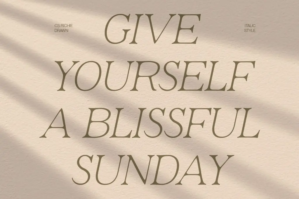
As a display serif, CS Richie Drawn is built for short-form use: headlines, wordmarks, single lines of type rather than paragraphs. The letter spacing has been set generously, which suits the slim strokes and stops the drawn edges from muddying together at smaller sizes. Uppercase forms carry most of the personality here — they’re where the handcrafted texture and the refined curves are most visible — while lowercase forms lean more conventional, keeping the face legible when it needs to do more than just look good.
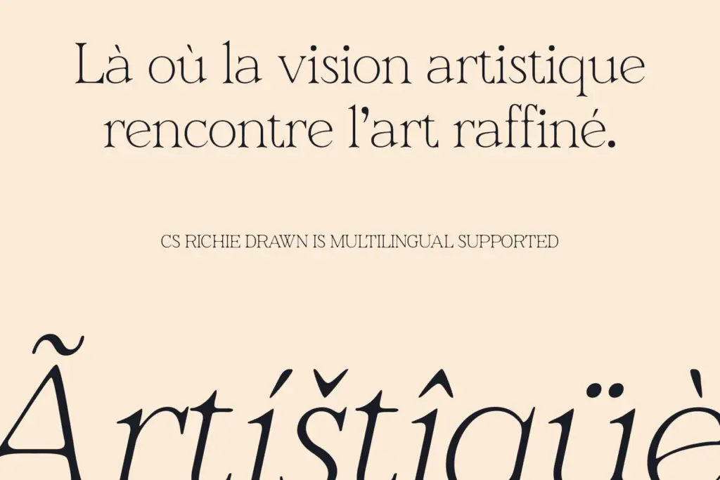
There isn’t much room in a font like this for elaborate alternates or swash flourishes, and that’s consistent with its stated aim: quiet, luxurious, understated. Designers looking for a font with a large stylistic set or extensive ligatures should look elsewhere; this one earns its keep through consistency rather than variety. The drawn effect is baked into the letterforms themselves rather than offered as an optional layer, so what you see in the specimen is what you get across the whole set.
Use cases
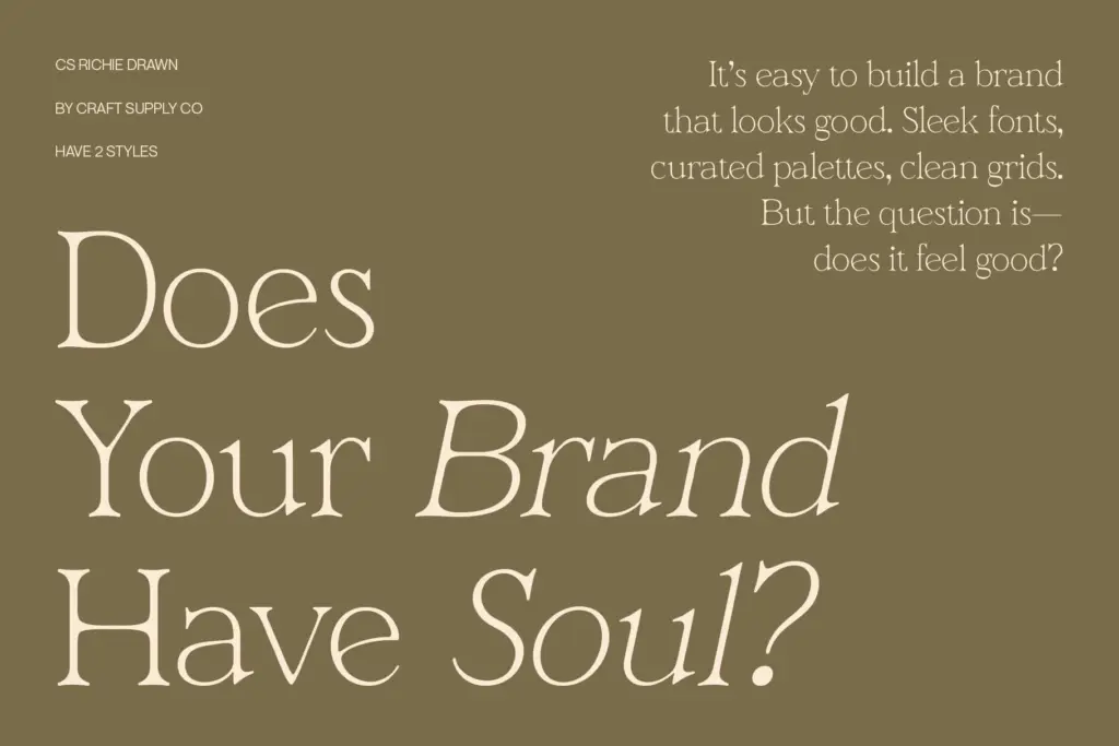
This is a font for branding and editorial work that wants to feel premium without shouting about it — fashion headlines, lifestyle mastheads, packaging typography, logotypes for businesses that want warmth alongside polish. It reads well as a display face on business cards, invitation headers, and product labels where a single word or short phrase needs to carry tone rather than information.
It is not built for body copy. The slim strokes and drawn irregularities that give it character at large sizes will blur and lose definition in a paragraph of text, so pair it with a plain, well-behaved text face for anything longer than a line or two. Used within its intended range — headlines, logos, short editorial statements — it does a genuinely good job of feeling handmade without feeling amateurish.
What we liked, and what we didn’t
Strengths
- The drawn texture reads as genuinely handcrafted rather than distressed or gimmicky
- Generous letterspacing keeps the slim strokes legible at display sizes
- Uppercase forms carry real personality without tipping into decorative excess
Trade-offs
- Strokes are too fine and irregular to hold up in paragraph-length text
- Limited alternates or stylistic variation mean less flexibility for varied branding systems
CS Richie Drawn does a competent job of blending a minimalist serif skeleton with a quietly handmade texture, and it looks genuinely good in short-form branding and editorial headlines. It's not built for body text or heavy paragraph work, and its restrained character set means it won't surprise you with much beyond what's in the specimen. A solid, if narrow, tool for the right job.
Verdict

Tantype reviews typefaces in depth — every font is tested in real branding, editorial and screen layouts before a word gets written. 555+ fonts reviewed and counting.