
Hangoe: An Eight-Style Serif for Editorial and Branding Work
Design style
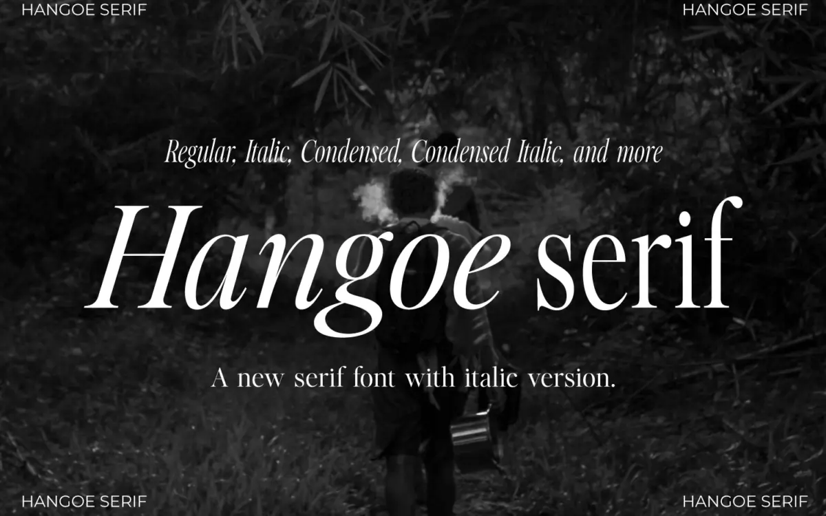
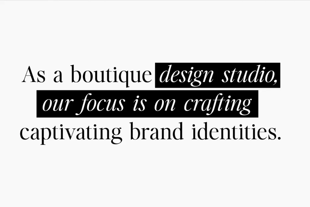
Hangoe sits in the old-style serif tradition, with the kind of restraint that reads as confident rather than cautious. The contrast between thick and thin strokes is moderate — enough to give the letters some personality on a page, not so much that it turns fragile at small sizes. Serifs are bracketed and slightly blunt, which keeps the whole thing feeling grounded rather than fussy. There’s a tallness to the proportions, and the condensed styles push that further, giving Hangoe a slightly formal, upright bearing that separates it from the rounder, friendlier old-style serifs you see everywhere on branding decks right now.
The italic is where the design earns its keep. It’s not just a slanted version of the roman — the curves loosen up, entry strokes get a bit more calligraphic, and the whole thing feels like it was drawn rather than algorithmically skewed. That’s not always true of serif families sold as complete packages, so it’s worth noting here.
Character set and features
Eight styles come bundled: Regular, Italic, Condensed, Condensed Italic, and a Text set that mirrors all four for smaller-size use. That’s a sensible structure — the Text cuts are presumably built with slightly more open spacing and sturdier hairlines for body copy, while the display versions are free to tighten up and get elegant. The seller notes uppercase, numerals, punctuation, ligatures, and multilingual support, along with kerning and stylistic sets through OpenType. There’s no mention of a lowercase-specific character expansion or small caps, so treat the family as solid for headline and short-text use rather than as a fully loaded editorial workhorse with alternates for every occasion.
The ligatures are a nice touch for a serif at this price point — they show up in the classic pairs and help smooth over some of the awkward junctions that condensed serifs are prone to. The stylistic sets presumably offer some swap-in alternates for the italic, though without a full glyph chart it’s hard to say how deep that goes.
Use cases
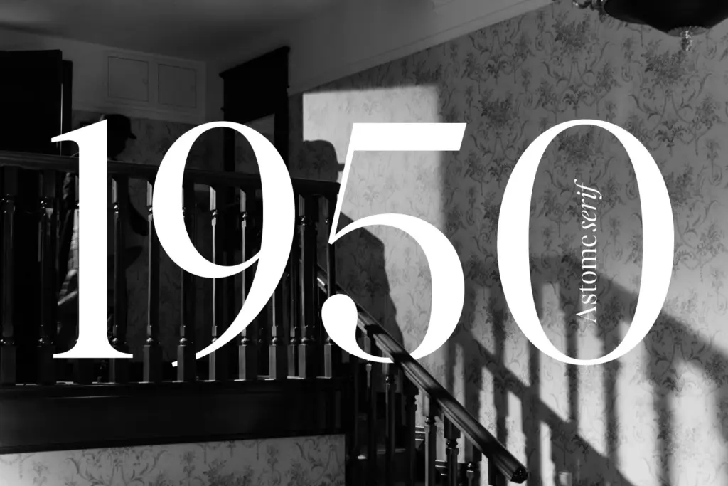
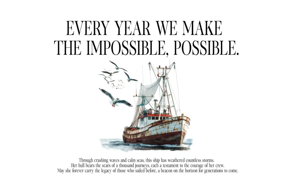
Hangoe is built for exactly the jobs its style list suggests: branding, logotypes, editorial headers, and invitation-style setting. The condensed cuts are strong candidates for magazine mastheads or fashion branding where you need a serif that can stand tall in a narrow column without losing its shape. The Text styles are the ones to reach for in body copy — a blog post, a book’s interior, a quote pulled out in a pull-quote block — while the display cuts do the heavy lifting on covers and title pages.
Where it may struggle is in dense, long-form paragraph setting at very small sizes; the moderate contrast and tall proportions are more suited to headline sizes and short passages than to a full novel manuscript, though the Text cut narrows that gap. For social media graphics and quote cards — a use case the seller pushes hard — it does the job cleanly, though nothing about the letterforms is distinctive enough to make it instantly recognisable as a brand signature on its own.
What we liked, and what we didn’t
Strengths
- The italic is properly redrawn rather than mechanically slanted
- Condensed cuts give it a distinct, tall-standing character for mastheads and logotypes
- Ligatures and stylistic sets add useful polish for headline setting
Trade-offs
- No small caps or extended alternate set limits its depth for serious editorial typesetting
- Moderate contrast makes it less confident at small sizes in dense body paragraphs
Hangoe is a competent old-style serif with a genuinely drawn italic and a sensible eight-style structure covering condensed and text variants. It won't set anyone's portfolio on fire, but it handles branding, editorial headers and invitation work without complaint.
Verdict

Tantype reviews typefaces in depth — every font is tested in real branding, editorial and screen layouts before a word gets written. 555+ fonts reviewed and counting.