
Botanicale: A Loose Handwritten Font With Built-In Repeat-Letter Fixes
Design style
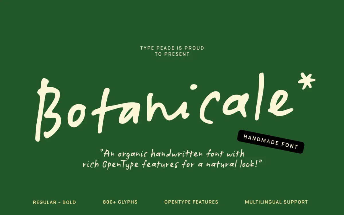
Botanicale sits in the loose, unfiltered end of the handwritten category. The strokes wobble slightly, baselines drift, and the whole thing reads like it was written with a felt-tip on a notepad rather than plotted with a stylus. It doesn’t chase the tidy calligraphic look that a lot of script fonts go for. Instead it leans into the imperfection: uneven pressure, slightly open loops, terminals that taper off rather than finish cleanly. That’s the point of the font, and it mostly delivers on it.
Where it earns some credit is in how it handles repetition. Handwritten fonts fall apart fast when the same letter appears twice in a row — it starts to look like a stamp rather than a hand. Botanicale automatically swaps in an alternate glyph when two identical letters sit next to each other, so words like “letter” or “coffee” don’t feel mechanically duplicated. It’s a small technical fix for a problem that undermines a lot of competing handwritten faces, and it’s the most useful design decision in the whole release.
Character set and features
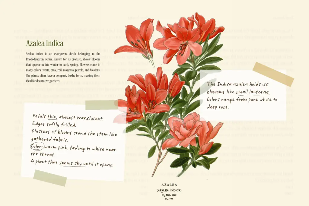
The package comes in two styles — a default Regular set and an Alt set accessible via stylistic set one — across Regular and Bold weights. Each letter and numeral has two drawn versions, which combined with the alternates and ligatures gives you a reasonable amount of variation to work with before repetition becomes obvious. There are marks and symbols included, and the glyph count runs past 800, covering Western, Central and South Eastern European languages, Vietnamese, Oceanian scripts and Esperanto, alongside the base Latin set.
The OpenType feature set is standard for this kind of font: standard and discretionary ligatures, stylistic sets, and stylistic alternates. None of it is groundbreaking, but it’s implemented in a way that actually gets used automatically rather than requiring the user to manually swap every third letter, which is more than some handwritten fonts manage. You do need software that respects OpenType features — anything that ignores ligatures will show a flatter, more repetitive version of the font than intended.
Use cases
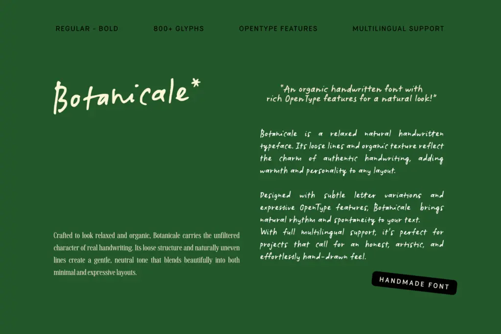
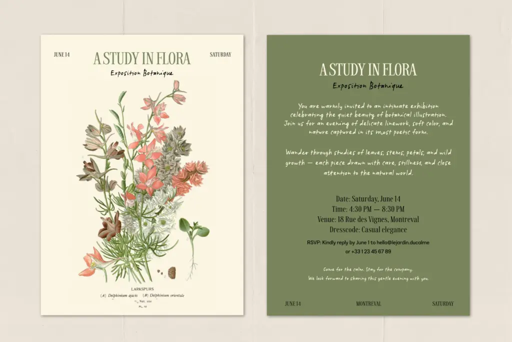
This is a font for warmth over polish. It works well on packaging where you want a product to feel handmade — food labels, small-batch goods, anything trying to signal
What we liked, and what we didn’t
Strengths
- Automatic alternate glyphs prevent repeated letters from looking stamped or robotic.
- Two full drawn versions of each letter and numeral give real variation across longer text.
- Broad multilingual glyph coverage extends past basic Latin into several European scripts and Vietnamese.
Trade-offs
- The deliberately rough, uneven baseline makes it a poor choice for anything that needs to be read quickly or at small sizes.
- Feature-dependent behaviour means the font looks noticeably flatter in apps that don't support OpenType ligatures and stylistic sets.
Botanicale delivers a genuinely loose, unpolished handwritten look with a smart technical fix for repeated letters that a lot of competitors lack. It's not a font for body text or anything requiring crisp legibility, but for packaging, quotes, and casual branding it does its job convincingly.
Verdict

Tantype reviews typefaces in depth — every font is tested in real branding, editorial and screen layouts before a word gets written. 555+ fonts reviewed and counting.