
TAN – Dialogue: a sans-and-italic duo for branding and editorial headlines
Design style
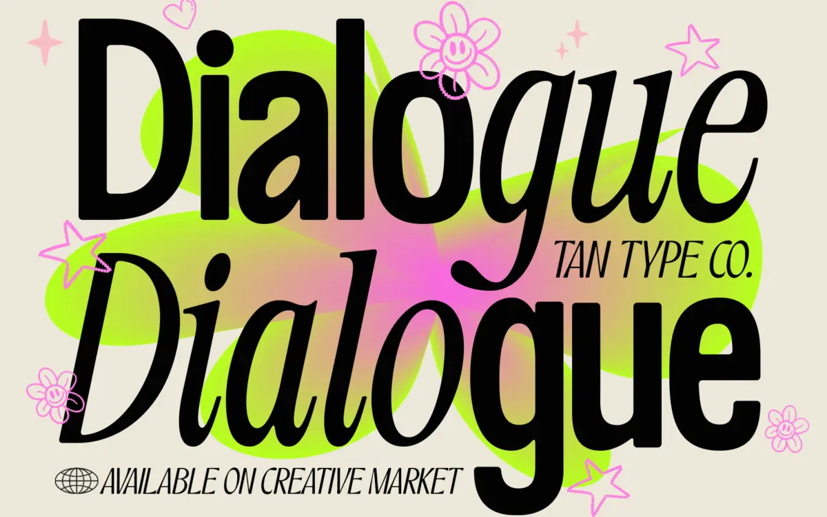
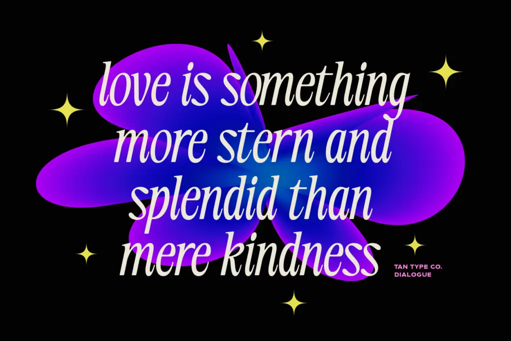
TAN – Dialogue is built as a two-voice system rather than a single typeface. The first voice is a sans with softened corners: strokes are even in weight, terminals are rounded rather than clipped, and the overall structure is geometric enough to read as clean and contemporary without tipping into cold or mechanical. The second voice is a thin classic italic, with more calligraphic flow, tighter joins, and noticeably higher contrast between thick and thin strokes. Set next to each other, the pairing works because the two styles don’t compete for the same job — one carries weight and presence, the other carries flourish and movement.
The sans half draws from the current wave of soft-geometric display sans faces, and it does that job competently rather than distinctively. It’s the italic that has more personality: the thin strokes and slight forward lean give it a hand-finished feel even though the letterforms are clearly drawn rather than lettered. Neither style is loud. Both stay controlled, which is the point of a duo font — it’s meant to be used as a system, not as two unrelated display faces bundled together.
Character set and features
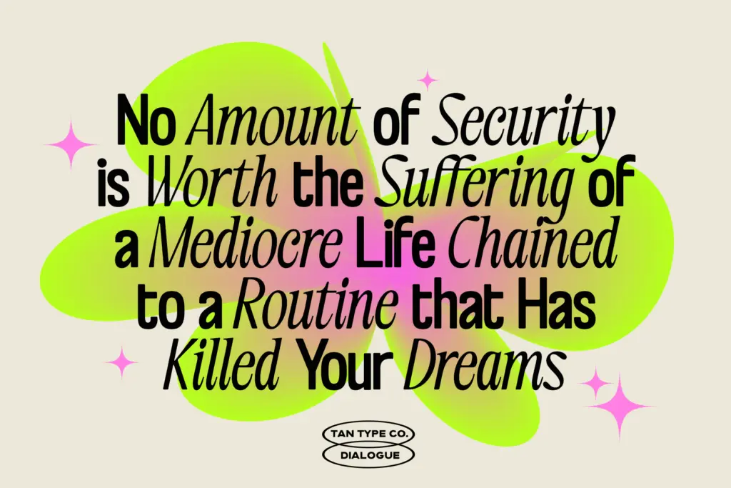
Both styles cover a standard glyph set with multilingual support, so accented characters for major European languages are included alongside the base Latin set. The seller notes OpenType ligatures are available, but accessing them depends on the software — anyone working in Canva should expect the plain glyph set only, since Canva doesn’t expose advanced OpenType features. In a proper OpenType-aware app, expect the usual dressing for a font like this: alternate characters and ligatures that add some of the handwritten warmth back into the italic, which otherwise reads a little plain in its default state.
There isn’t a wide weight range implied by the brief, so this isn’t a face built for long text-heavy hierarchies with six or seven weights to lean on. It’s a two-voice system, and the two voices are what you get. That’s a fair trade for what it’s asking to do, but it does mean the typographic range is narrower than a full family.
Use cases
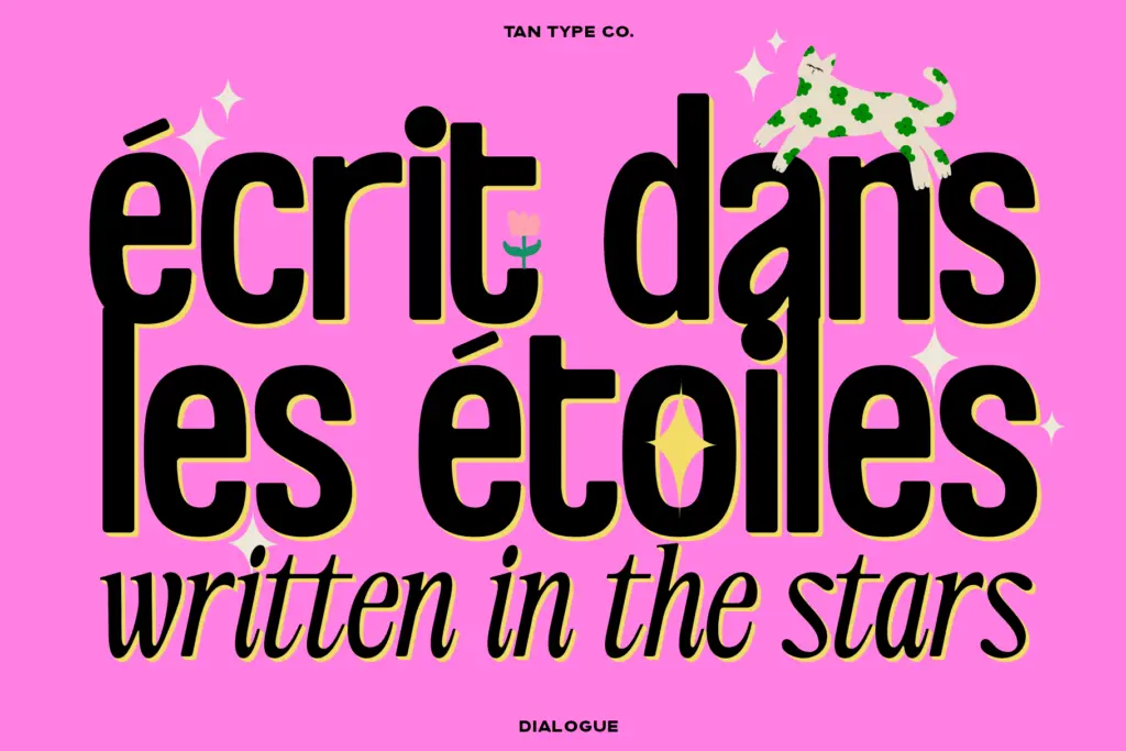
This is a headline and branding tool first. The sans half works for logotypes, packaging lockups, and short editorial headers where you want confidence without harshness — think product labels, section titles, or a masthead that needs to feel current but not brutalist. The italic is better suited to supporting lines: taglines, subheads, pull quotes, or anywhere you want a softer counterpoint under a bold headline set in the sans.
Used together, the pairing suits branding projects that need exactly this kind of built-in contrast — a wordmark plus tagline, a cover plus subtitle, a packaging front plus fine print. It’s less suited to long-form body text; the italic’s contrast will fatigue readers at paragraph lengths, and the sans, while clean, isn’t distinctive enough to want to read pages of it. Treat it as a headline system, not a text family, and it does its job well.
What we liked, and what we didn’t
Strengths
- The italic has real character — thin strokes and calligraphic flow give it warmth the sans lacks on its own.
- The two styles are genuinely built to work together, each staying in its lane rather than competing.
- Multilingual character support extends its use beyond basic English-only branding work.
Trade-offs
- The sans half is pleasant but generic and doesn't stand out much from other soft-geometric display sans faces.
- Advanced OpenType ligatures won't render in software like Canva, so some of the italic's finishing touches may be lost.
TAN – Dialogue is a competent headline pairing: a soft geometric sans and a thin classic italic that complement each other without fighting for attention. It's built for branding and short editorial use, not for setting long text. The sans half is solid but not especially distinctive on its own.
Verdict

Tantype reviews typefaces in depth — every font is tested in real branding, editorial and screen layouts before a word gets written. 555+ fonts reviewed and counting.