
Think Sans: an all-caps sans that plays with width for punchy headlines
Design style
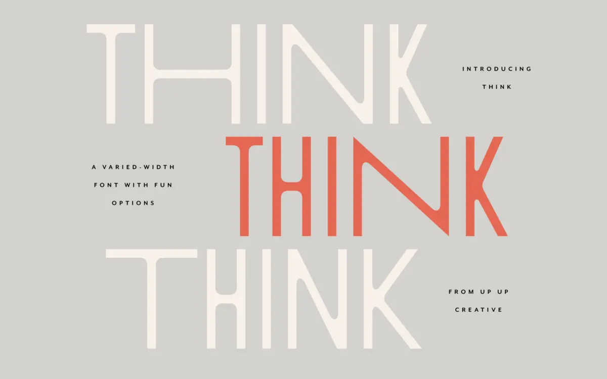
Think Sans starts from a simple premise: a monoweight, all-caps sans serif, then breaks its own rules by pairing wide and narrow characters within the same word. The stroke weight stays constant throughout, so the visual interest comes entirely from proportion rather than contrast. Some letters sit close to a grotesque default, others stretch or compress well past what you’d expect from a geometric sans, and the tension between the two is the whole point of the design.
This is not a font built for quiet paragraphs. It’s built to be looked at. The irregular rhythm across a word gives it a stamped, collage-like quality that reads more like lettering than typesetting, even though it functions as a proper font file. Anyone who’s cut letters from different-sized stencils to build a sign will recognise the effect.
Character set and features
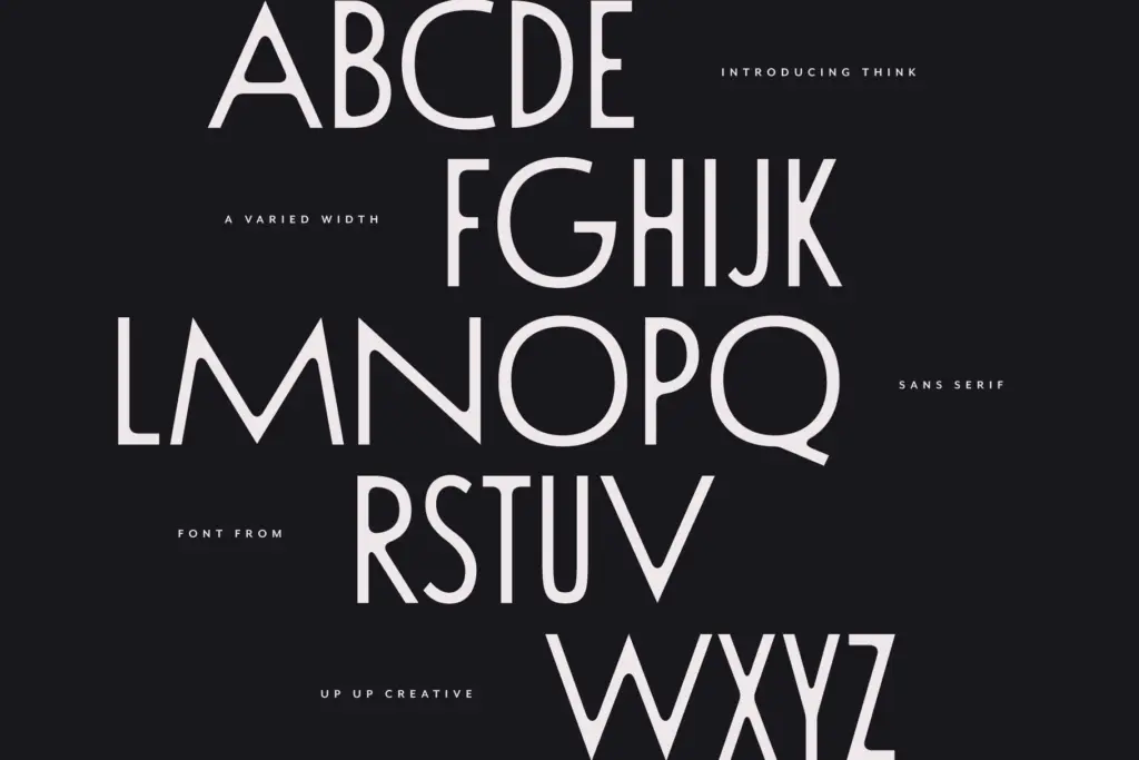
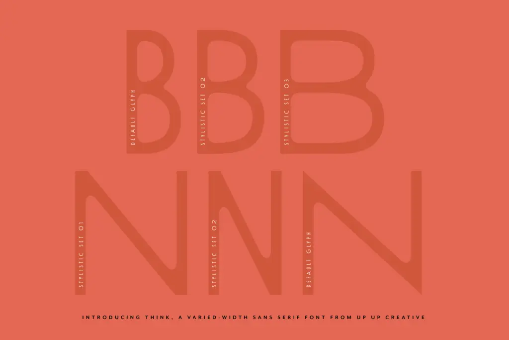
The family ships with over 800 glyphs and four stylistic sets, which is where the width-swapping actually happens. Rather than one fixed shape per letter, you get options to widen or narrow individual characters, meaning the varied-width look isn’t baked into a single static alternate but something you compose yourself, letter by letter, inside an OpenType-aware application. Character variants and multilingual support, including currency symbols, round out the technical spec.
The catch is accessibility. These features only surface properly in software like Illustrator or InDesign; getting them working in Word means digging into the advanced font tab, which is a real barrier for anyone who isn’t already comfortable with OpenType panels. This is a font that rewards a designer willing to sit with the stylistic sets and hand-pick widths letter by letter — it is not a typeface you drop in and walk away from. Left on its defaults, it’s a competent but fairly plain mono-width caps sans; the character comes from active use of the alternates.
Also worth noting: this listing covers the Regular weight only. The seller has since expanded it into a three-style family, so what you get here is the original single-weight version, not the fuller range now available.

Use cases
Think Sans is a headline tool. It’s suited to short bursts of text — mastheads, poster type, logotypes, monograms, packaging front-of-pack lines — where the irregular width pattern can be appreciated as a single visual unit. At editorial scale, a title or pull quote set in Think Sans has genuine presence, especially where a design wants some friction rather than a smooth, corporate feel.
It’s less suited to anything requiring sustained reading. All-caps construction combined with deliberately uneven widths works against the letter-recognition patterns that make lowercase text comfortable at length; use it for a line or two, not a paragraph. Branding work that needs a distinctive wordmark is a strong fit, provided someone on the project is willing to manually tune the stylistic set alternates rather than accept the first output. For teams without OpenType-capable software, or without the patience to hand-adjust letterforms, the appeal drops considerably.
What we liked, and what we didn’t
Strengths
- The wide/narrow letter pairing gives short headline text real visual tension without adding weight contrast.
- Over 800 glyphs and four stylistic sets offer genuine control over individual letter proportions.
- Multilingual and currency symbol support extends its use beyond English-only branding work.
Trade-offs
- The distinctive width-swapping only appears with manual effort in OpenType-aware software, not by default.
- All-caps construction and uneven widths make it unsuitable for anything beyond short lines of text.
Think Sans is a display caps font whose personality comes from manually mixing wide and narrow letterforms rather than from any single fixed design. It earns its keep on headlines, logotypes and posters, but it demands OpenType-savvy software and hands-on adjustment to look its best, and this listing only covers the Regular weight.
Verdict

Tantype reviews typefaces in depth — every font is tested in real branding, editorial and screen layouts before a word gets written. 555+ fonts reviewed and counting.